🍁transform
transform에는 위치, 배율, 회전, 왜곡 변형까지 4가지 변형을 할 수 있다.
translate, scale, rotate를 주로 사용한다.
기본 코드
<!DOCTYPE html>
<html lang="en">
<head>
    <meta charset="UTF-8">
    <meta name="viewport" content="width=device-width, initial-scale=1.0">
    <title>Document</title>
    <link rel="stylesheet" href="css/ex43.css">
</head>
<body>
    <!-- div#box$.box{상자$}*3 -->
    <div id="box1" class="box">상자1</div>
    <div id="box2" class="box">상자2</div>
    <div id="box3" class="box">상자3</div>
</body>
</html>
.box {
border: 1px solid black;
width: 200px;
height: 200px;
margin: 30px;
}
#box1 {
background-color: tomato;
}
#box2 {
background-color: gold;
}
#box3 {
background-color: cornflowerblue;
}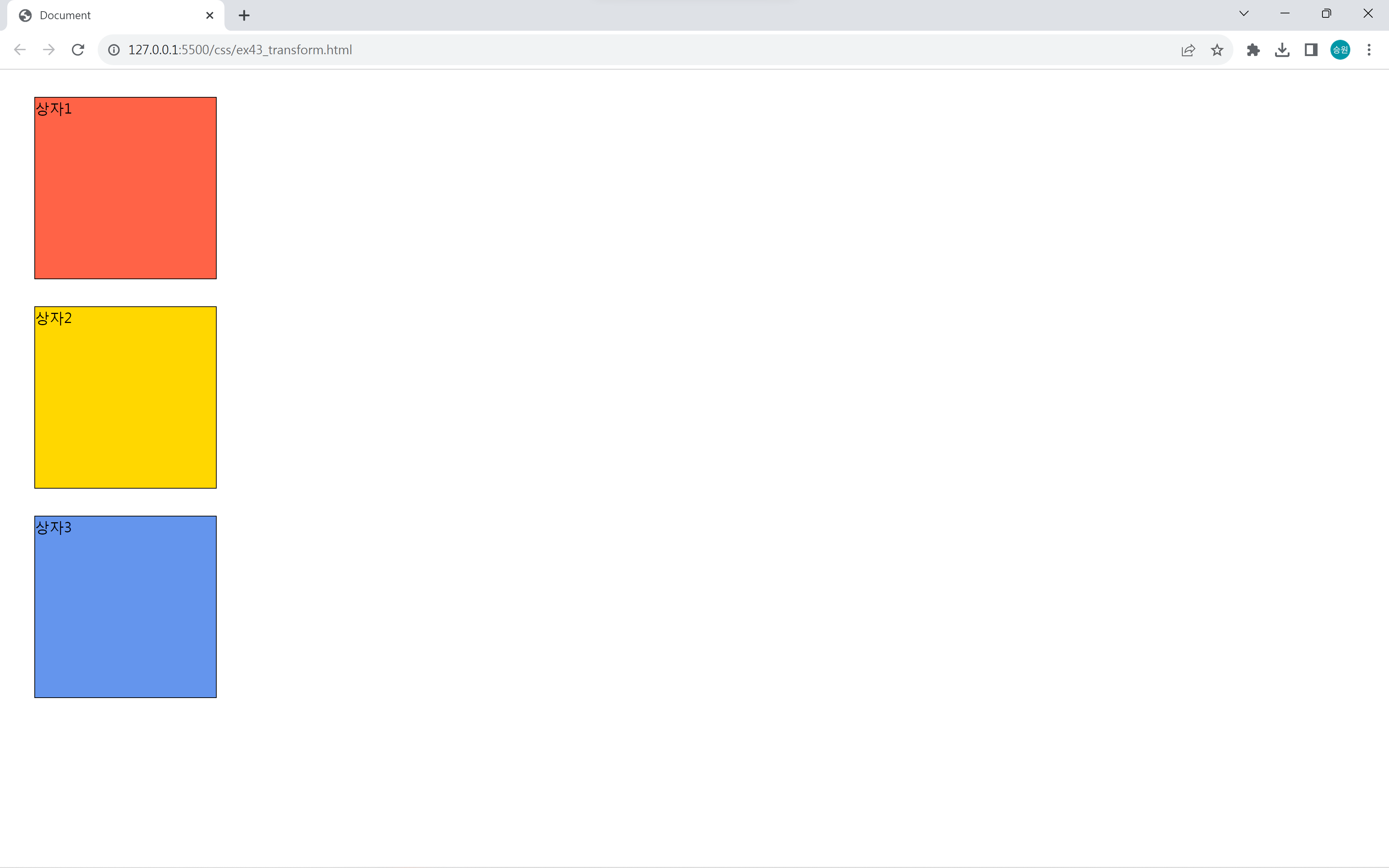
위 코드를 이용하여 transform을 구현해 보도록 하자.
1. translate()
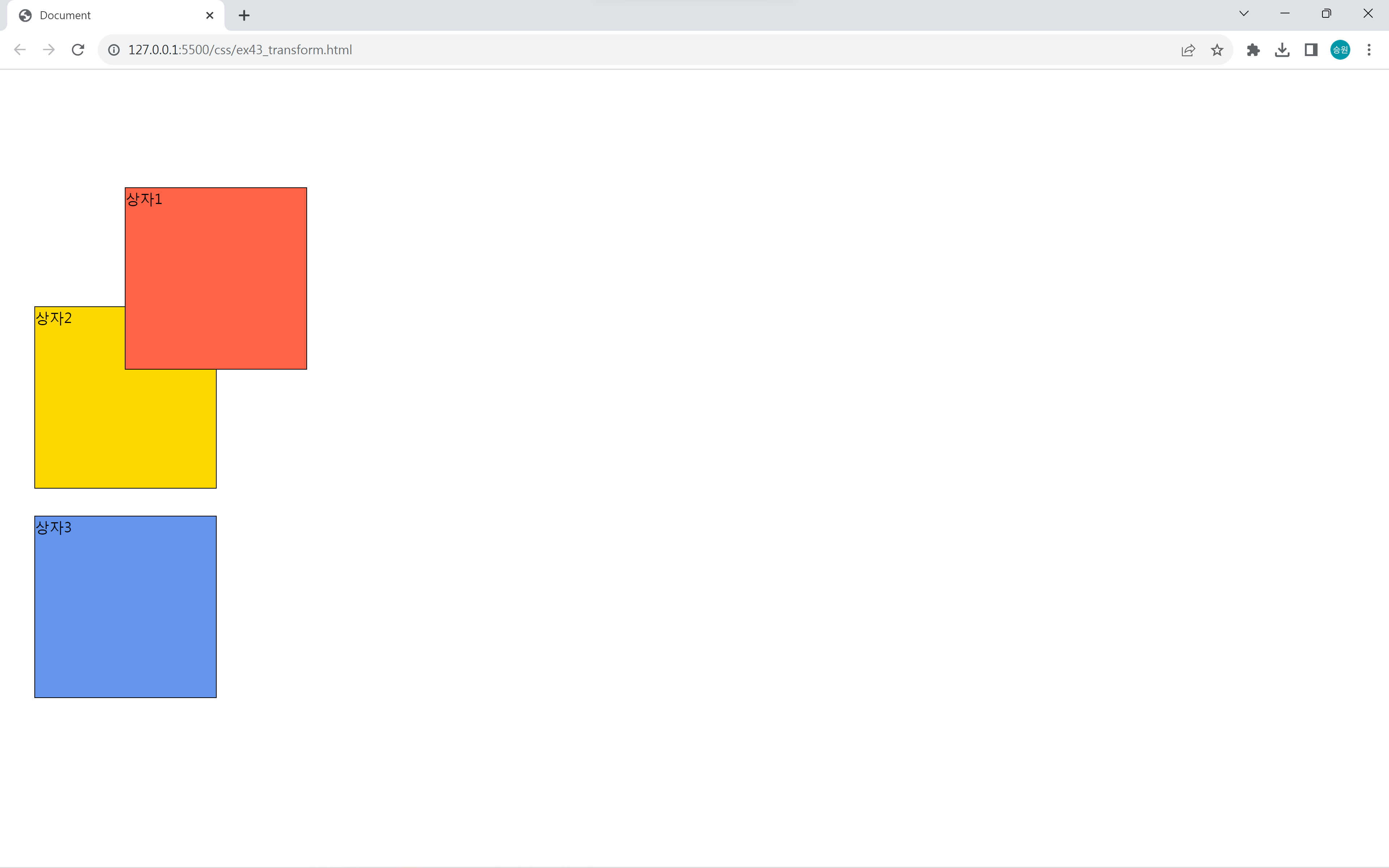
translate는 위치 변형(이동)을 한다.
이동을 하더라도 기존의 공간이 남아있기 때문에 position: relative 속성과 비슷하다.
#box1 {
    transform: translate(100px, 100px);
}
2. scale()
scale은 배울 변형(확대/축소)을 한다.
백분율로 따지며, 1이 100%이다.
#box1 {
    transform: scale(1.3, 1);
}

#box2 {
    width: 260px;
}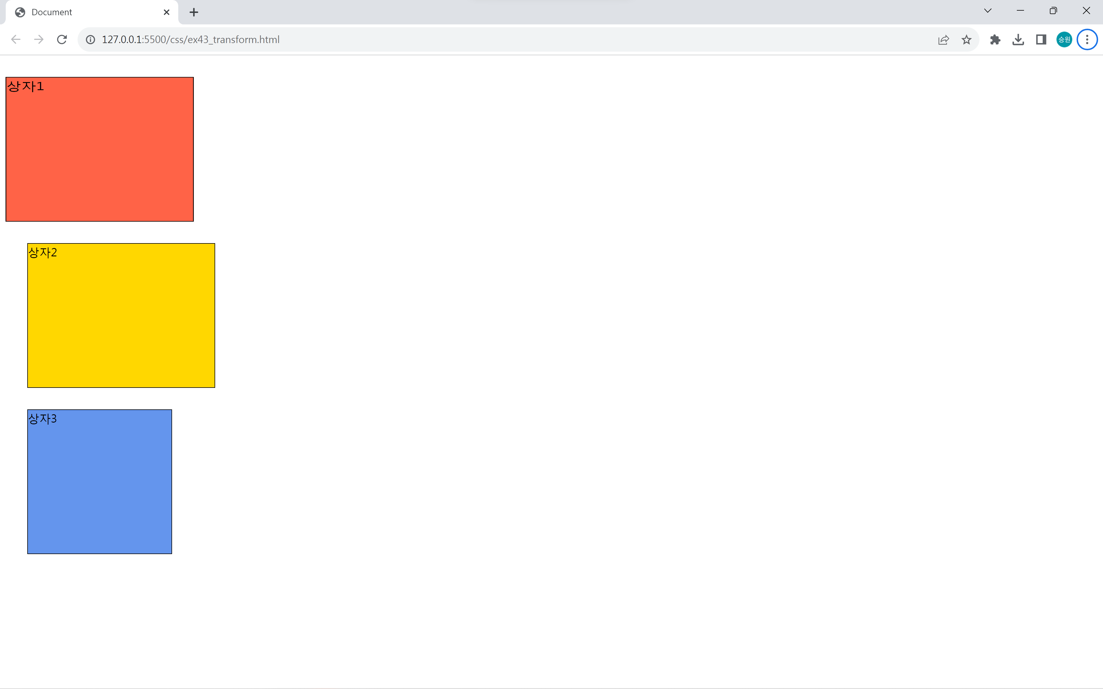
scale로 빨간색 상자(상자1)의 너비가 30% 증가했다.
그런데 width: 260px을 준 노란색 상자(상자2)와 미묘하게 차이가 난다.
scale은 너비를 늘리는 게 아니라 확대를 한다. 그래서 크기는 똑같지만, 글자가 함께 늘어난 것을 확인할 수 있다.
객체의 크기만 늘린 게 아니라 모든 걸 늘린 것이다.
scale 음수값
#box1 {
    transform: scale(0.8, 0.8);
}

#box2 {
    transform: scale(-1, -1);
}

#box3 {
    transform: scale(-1.2, -1.2);
}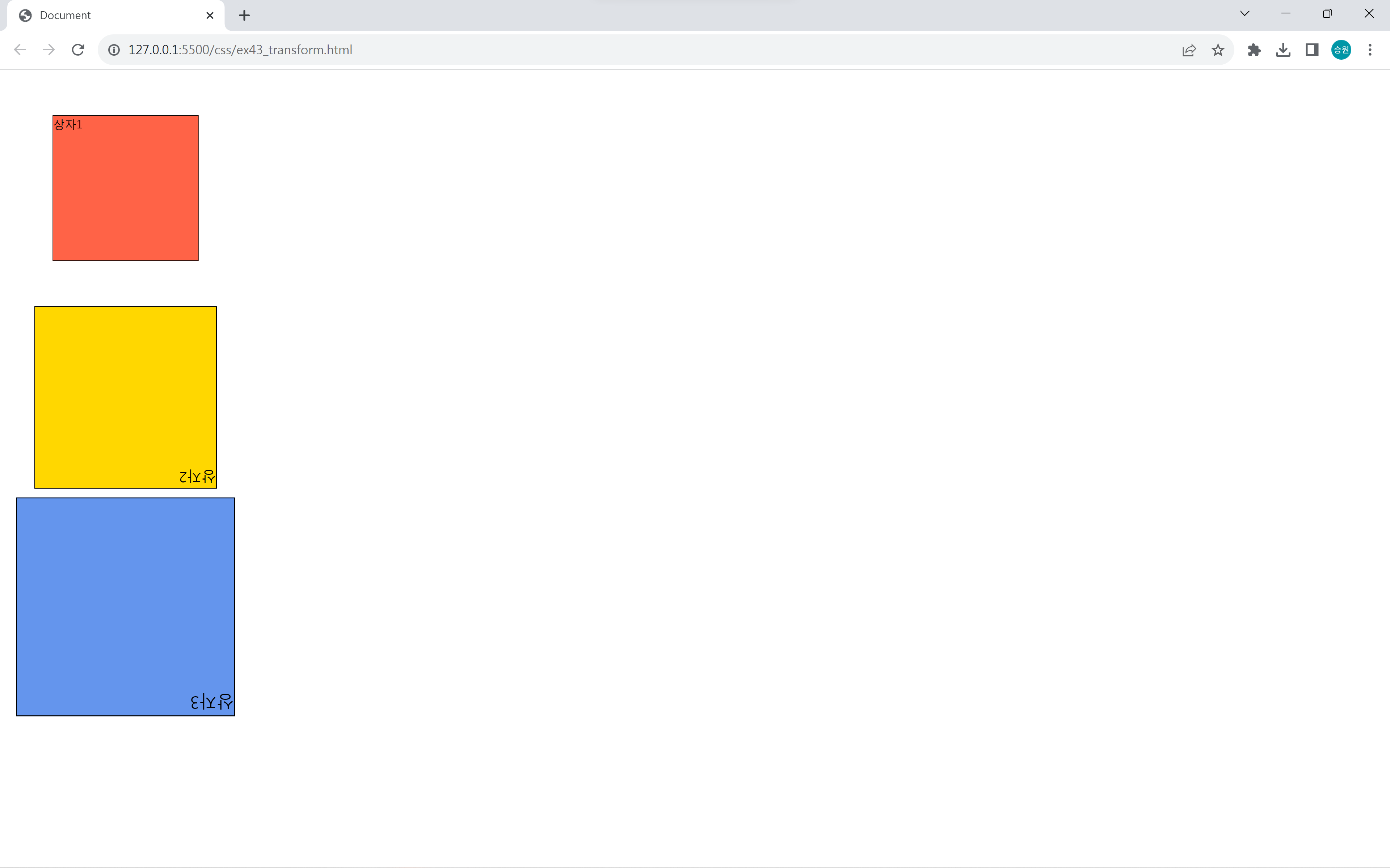
scale을 이용해 상자 크기를 키우는 것 외에도 작게 할 수 있다.
scale을 음수값으로 주면 상자가 뒤집히게 된다.
음수값을 더 크게 주면 상자가 뒤집힌 상태에서 더 커진다.
3. rotate()
rotate는 회전 변형을 한다.
#box1 {
    transform: rotate(45deg);
}

#box2 {
    transform: rotate(90deg);
}

#box3 {
    transform: rotate(-2750deg);
}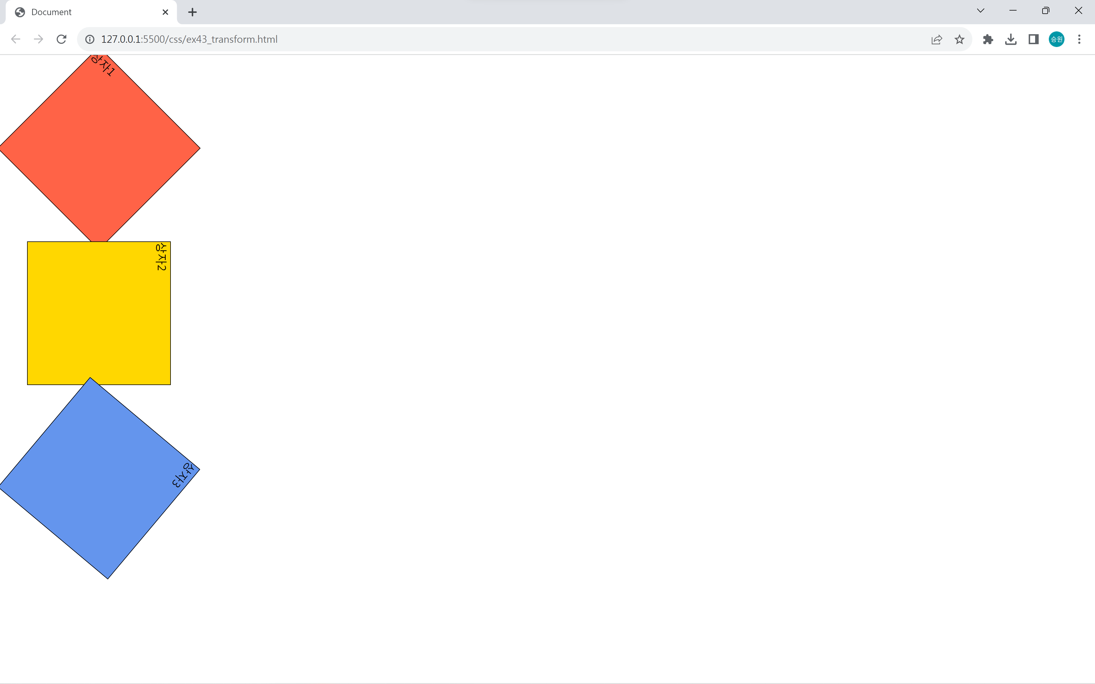
양수는 시계방향, 음수는 반시계 방향으로 돌아간다.
360도는 한 바퀴를 돌린 것이고, 3600도는 10바퀴를 돌린 것이다.
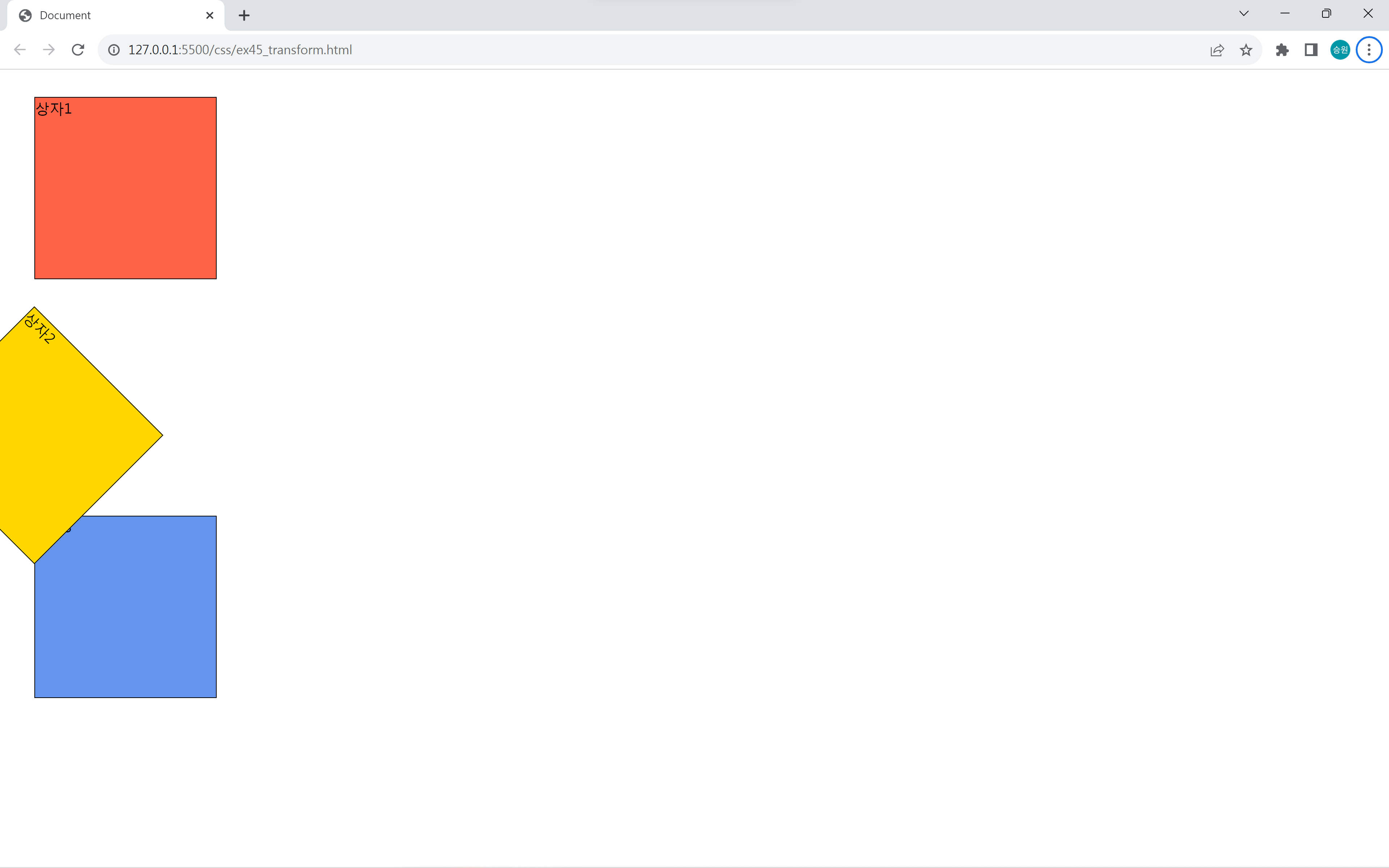
변화 중심축 변경
모든 변화 중심축은 개체의 중앙이다.
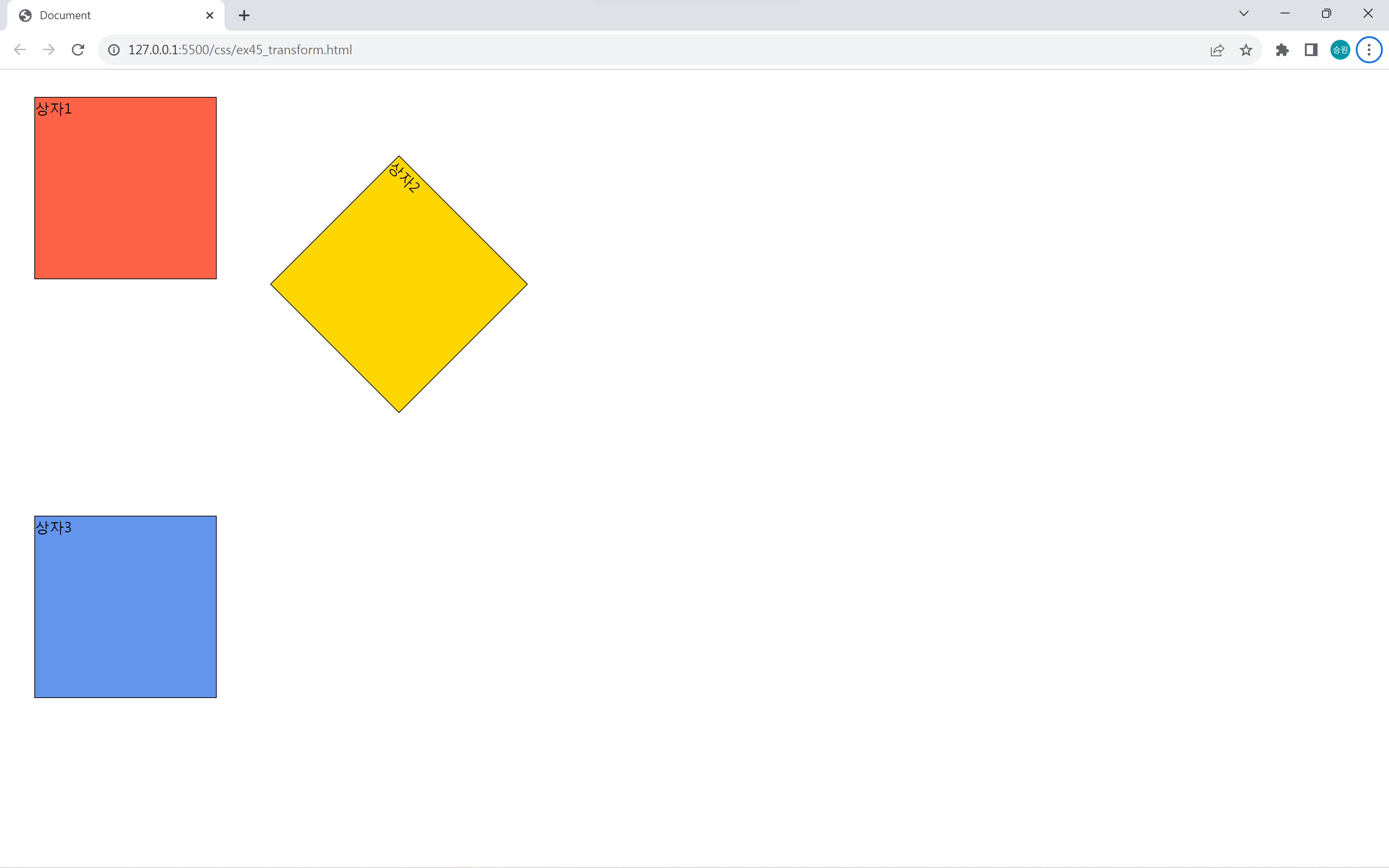
transform-origin으로 중심축을 변경할 수 있으며, 여기에 들어가는 값은 열거형, %, px 모두 사용할 수 있다.
기본값은 transform-origin: center center이다.
body:hover #box2 {
    transform: rotate(45deg);
    transform-origin: 0% 0%;
}
body:hover #box2 {
    transform: rotate(45deg);
    transform-origin: 200% 200%;
}
4. skew()
skew는 왜곡(비틀기)을 한다.
#box1 {
    transform: skew(10deg, 0deg);
}

#box2 {
    transform: skew(0deg, -10deg);
}

#box3 {
    transform: skew(-80deg, 30deg);
}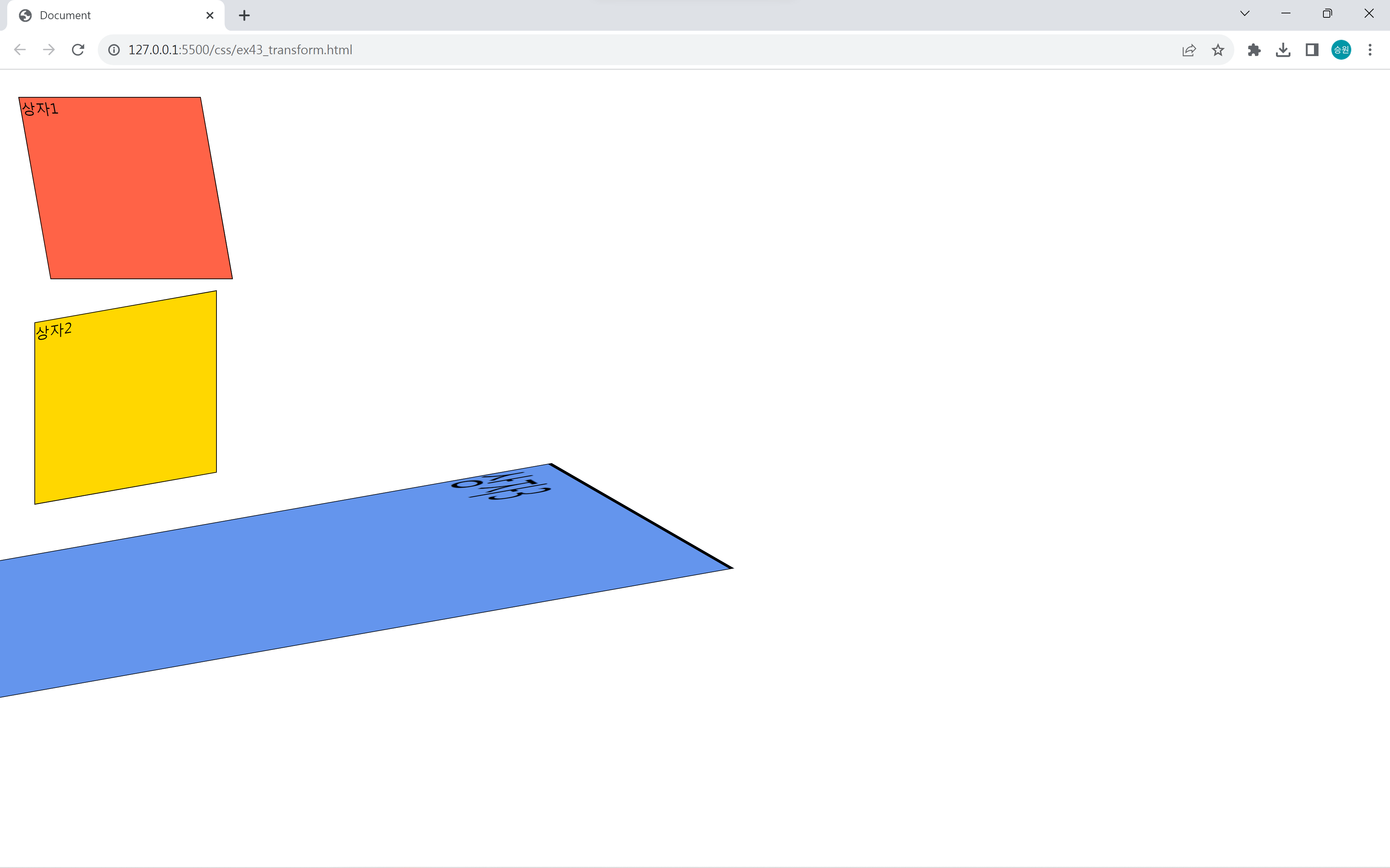
90도(90deg)가 되면 상자가 보이지 않게 된다.
5. matrix()
matrix는 사용자 정의형(1~4번)으로, 사용자 편의에 맞게 사용할 수 있다.
행렬을 기반으로 하므로 사용하기에 난이도가 있는 편이다.
🍁transform의 활용
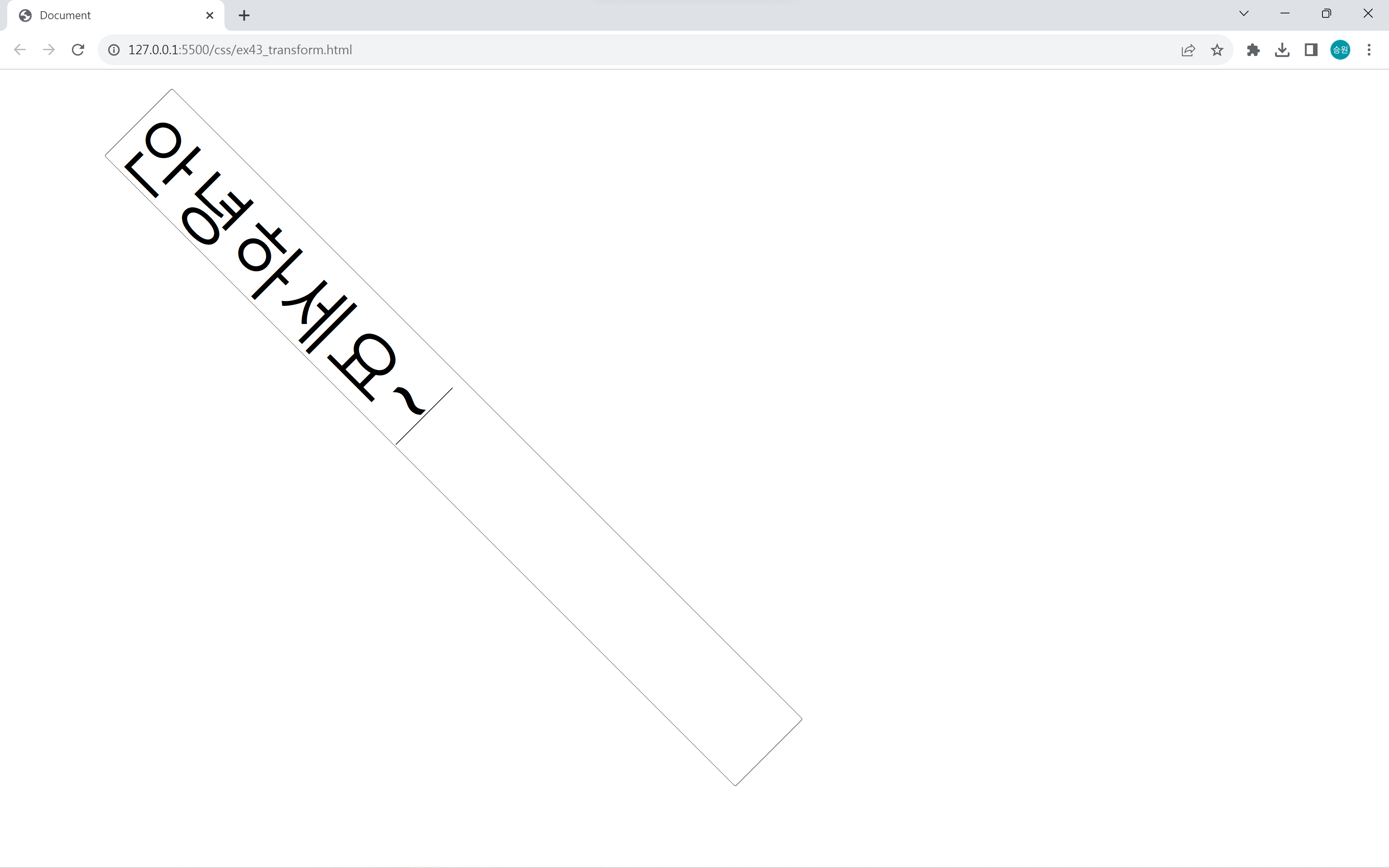
텍스트 박스에 적용
input[type=text] {
    font-size: 5rem;
    padding:5px;
    outline: none;
    transform: rotate(45deg);
}
input[type=text] {
    font-size: 5rem;
    padding:5px;
    outline: none;
    transform: scale(-1, 1);
}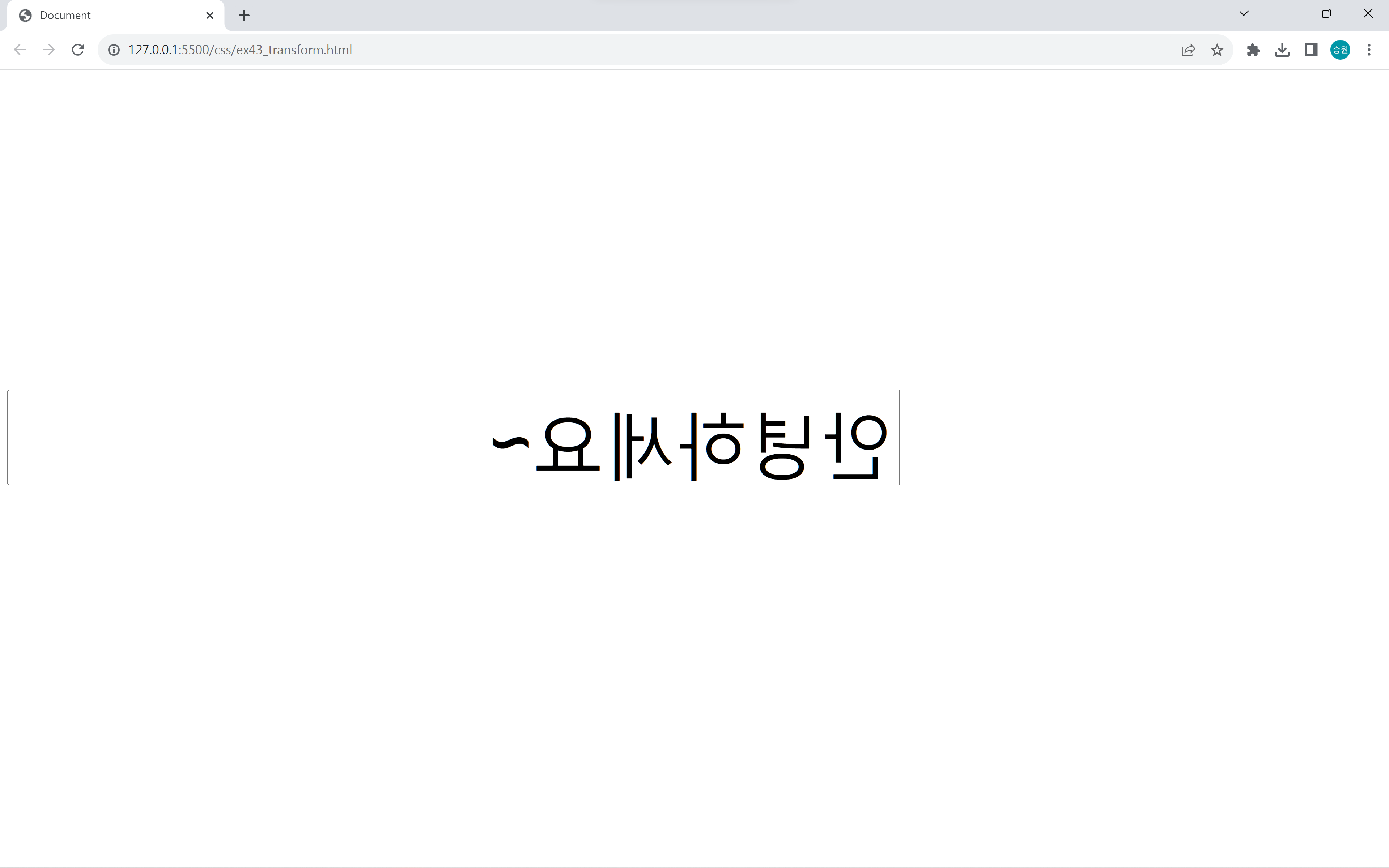
입력 텍스트를 거울에 비춘 것처럼 반대로 출력되게 할 수 있다.
이미지에 적용
#cat > img:hover {
    /* transform: translate(0px, -10px); */
    /* transform: scale(1.2, 1.2); */
    transform: translate(0, -10px) scale(1.2, 1.2);
}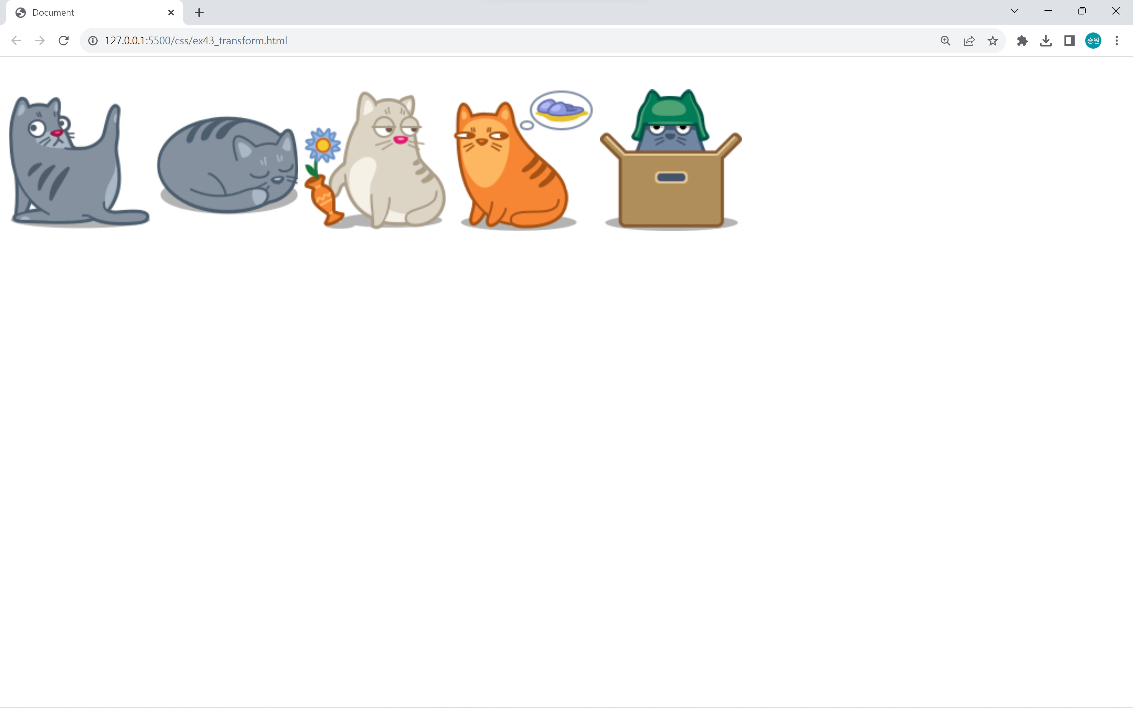

이미지에 hover와 함께 적용할 수 있다.
이때 transform 속성들을 여러 개 동시에 사용할 수 있다.
🍁시맨틱 태그
<div>를 사용해도 되지만 전용 태그를 사용하여 기능을 구현할 수 있다.
1. <main>
전체 틀을 만들 때 사용한다.
2. <header>
머리말을 만들 때 사용한다.
3. <section>
본문(콘텐츠)을 만들 때 사용한다.
4. <article>
반복되는 콘텐츠(항목들)를 만들 때 사용한다.
5. <aside>
보조 콘텐츠를 만들 때 사용한다.
6. <footer>
바닥글을 만들 때 사용한다.
<nav> 태그
<body>
    <div id="menu" class="menu">
        메뉴
    </div>

    <nav>
        메뉴
    </nav>
</body>
<div> 태그로 메뉴를 만들 때와 네비게이션 태그 <nav>로 메뉴를 만들 때 차이가 없다.
<div> 태그는 아무 역할도 하지 않는 태그이다. 그래서 어떤 역할을 하는지를 정해 주어야 하는 반면, <nav>는 메뉴로서 어떤 메뉴인지를 정해주기만 하면 된다.
🍁메뉴 구현
위의 <nav> 태그를 이용하여 붙박이 메뉴를 만들어보도록 하자.
main-menu
<body>
    <nav id="main-menu">
        <img src="../asset/images/rect_icon01.png">
        <img src="../asset/images/rect_icon02.png">
        <img src="../asset/images/rect_icon03.png">
        <img src="../asset/images/rect_icon04.png">
        <img src="../asset/images/rect_icon05.png">
    </nav>
</body>
#main-menu {
border: 0px solid black;
font-size: 0;
width: 630px;
margin: 0 auto;
transform: translate(0px, -100px);
}
#main-menu:hover {
transform: translate(0px, -10px);
}img는 인라인 태그이기 때문에 화면이 메뉴보다 작아지면 자동 줄 바꿈이 된다. 따라서 width를 지정하여 화면에 출력되는 크기를 고정시켜 메뉴가 줄바꿈이 되지 않도록 했다.
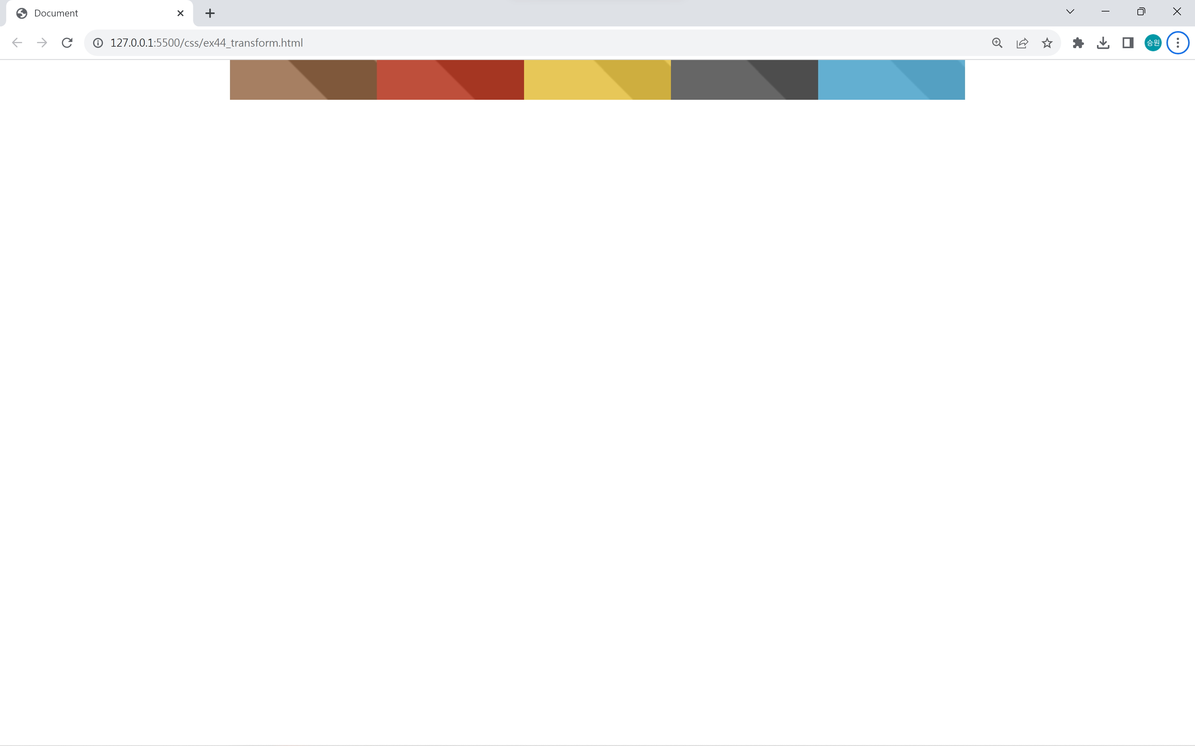

평소에는 메뉴가 보이지 않다가 마우스를 올렸을 때 메뉴 전체가 내려오도록 할 수 있다.
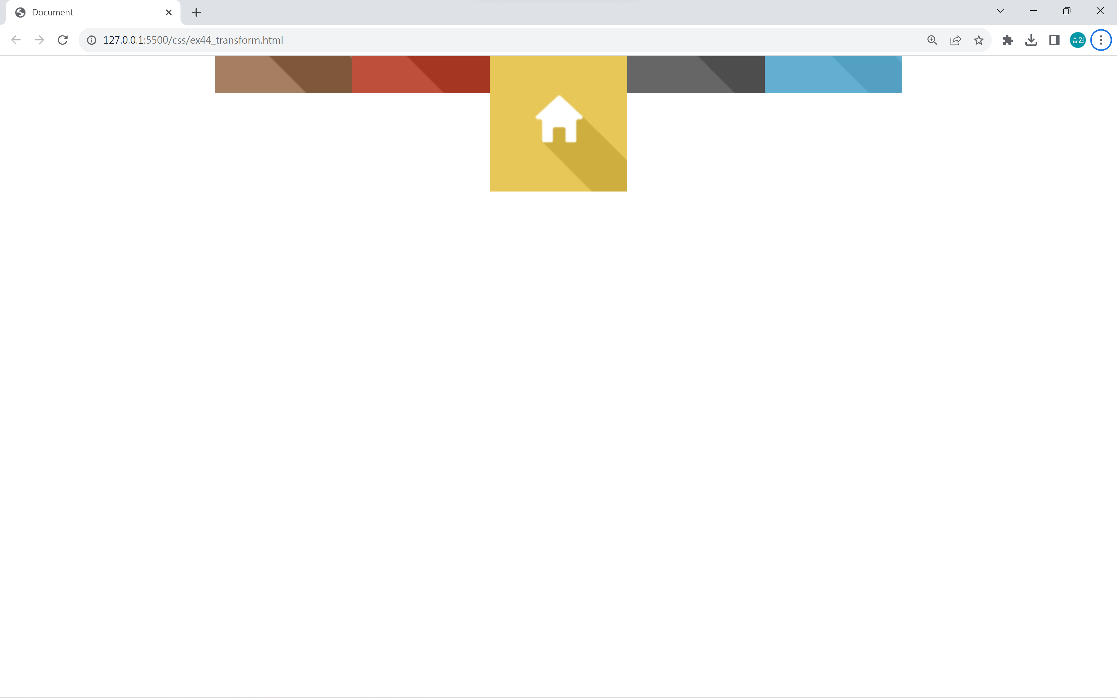
이번에는 메뉴가 하나씩만 내려오게 해 보자.
#main-menu > img:hover {
    transform: translate(0px, 90px);
}
이는 position을 이용해도 똑같이 구현할 수 있지만, translate로 구현하는 게 더 편하다.
side-menu
<body>
    <nav id="side-menu">
        <img src="../asset/images/rect_icon01.png">
        <img src="../asset/images/rect_icon02.png">
        <img src="../asset/images/rect_icon03.png">
        <img src="../asset/images/rect_icon04.png">
        <img src="../asset/images/rect_icon05.png">
    </nav>
</body>
#side-menu {
border: 0px solid black;
font-size: 0;
width: 126px;
/* margin: 0 auto; */
transform: translate(-105px, 0px);
}
#side-menu > img:hover {
transform: translate(95px, 0px);
}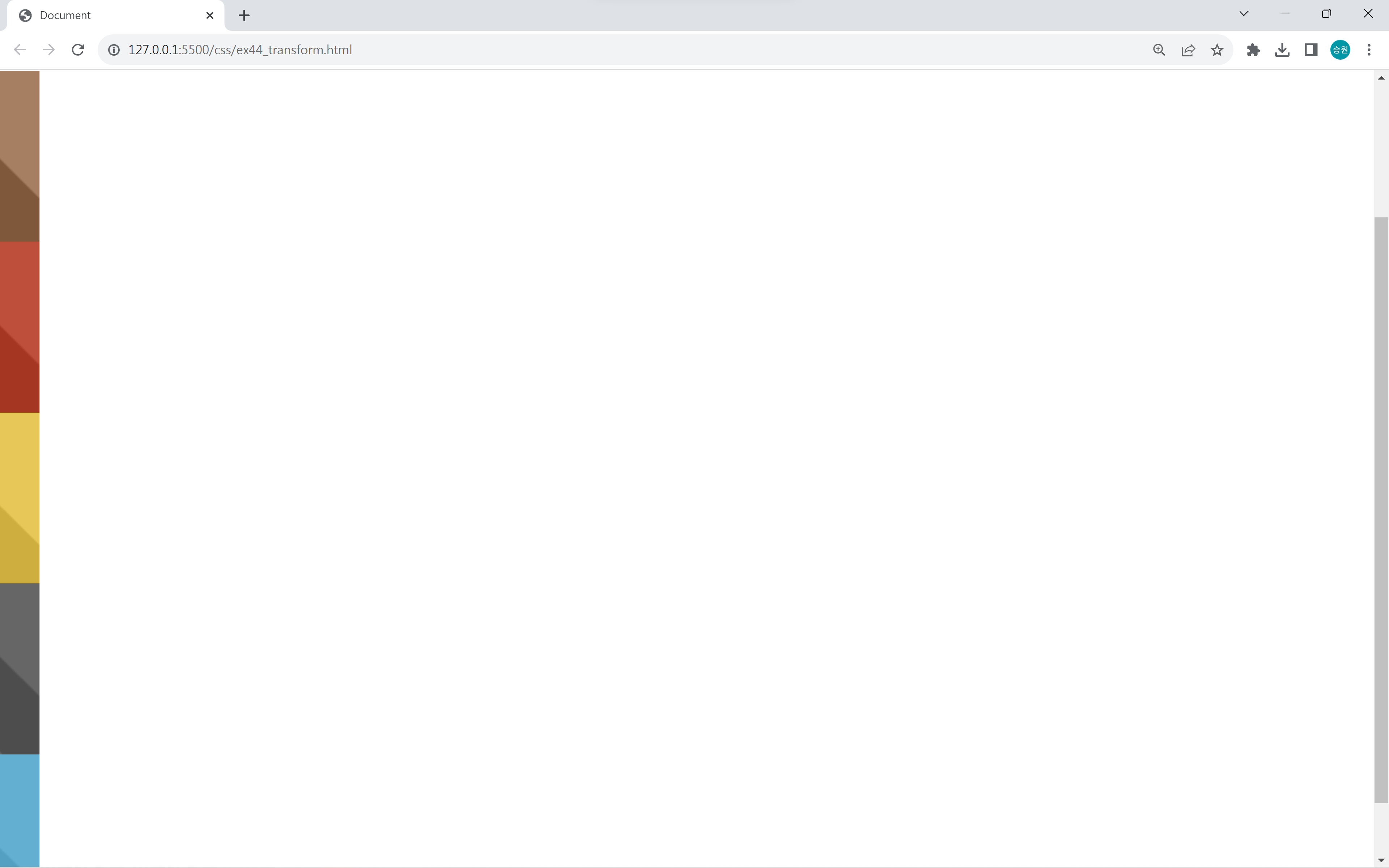
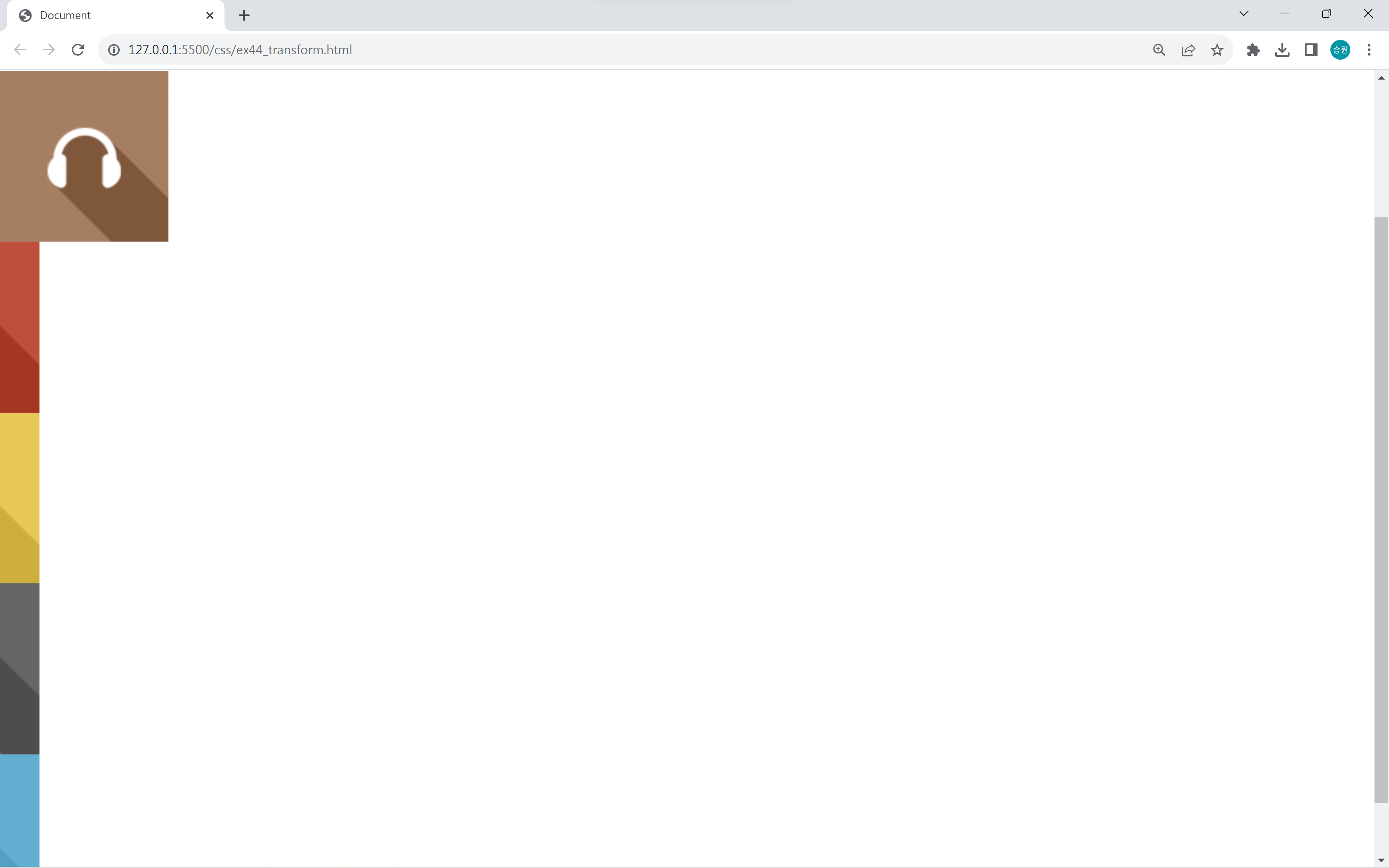
width를 메뉴가 하나만 출력될 정도로만 지정하면 세로 한 줄로 메뉴가 출력된다.
footer-menu
<body>
    <nav id="footer-menu">
        <img src="../asset/images/rect_icon01.png">
        <img src="../asset/images/rect_icon02.png">
        <img src="../asset/images/rect_icon03.png">
        <img src="../asset/images/rect_icon04.png">
        <img src="../asset/images/rect_icon05.png">
    </nav>
</body>
#footer-menu {
position: fixed;
bottom: 0;
left: 0;
right: 0;
border: 0px solid black;
font-size: 0;
width: 630px;
margin: 0 auto;
transform: translate(0px, 90px);
}
#footer-menu > img:hover {
transform: translate(0px, -90px);
}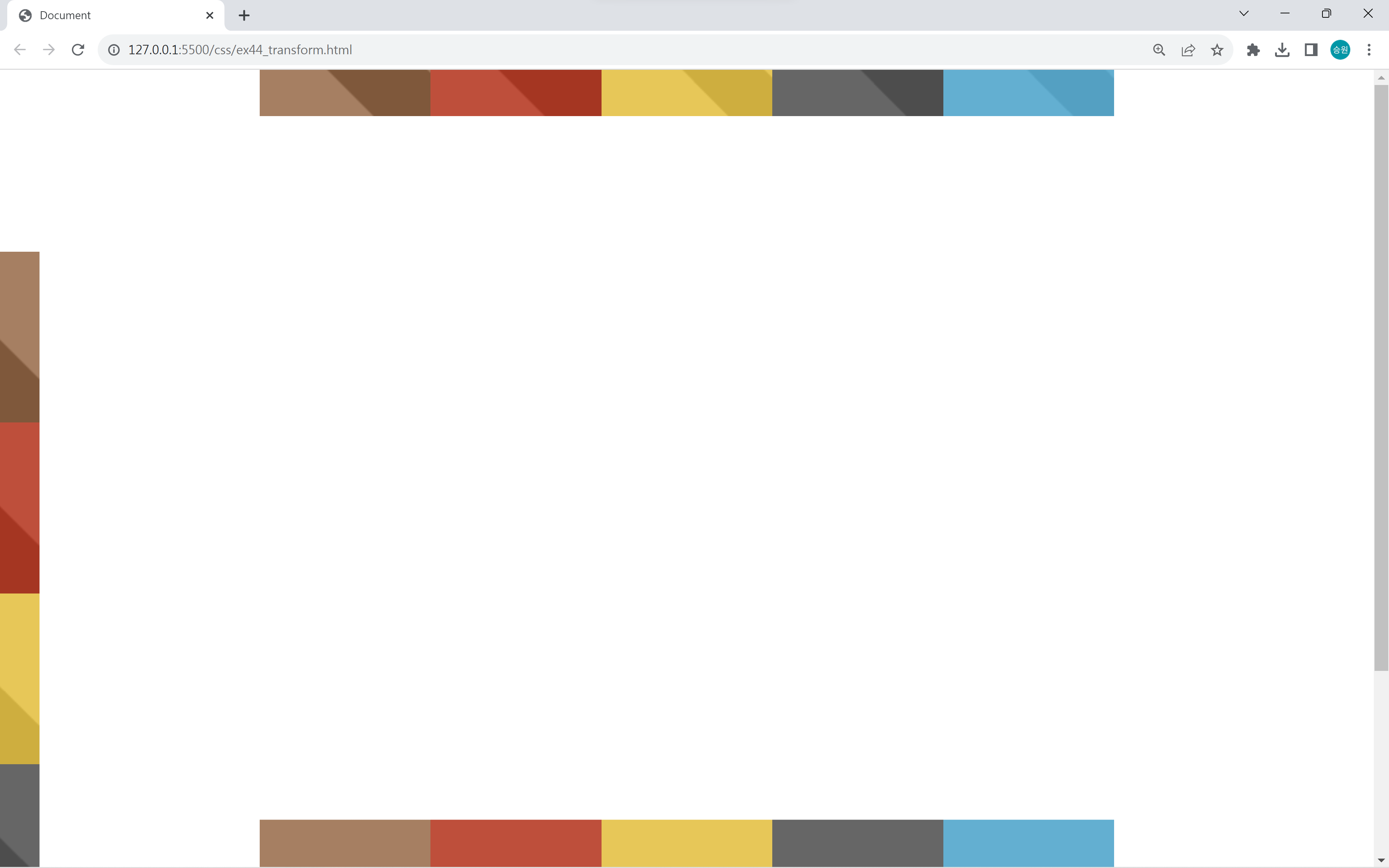
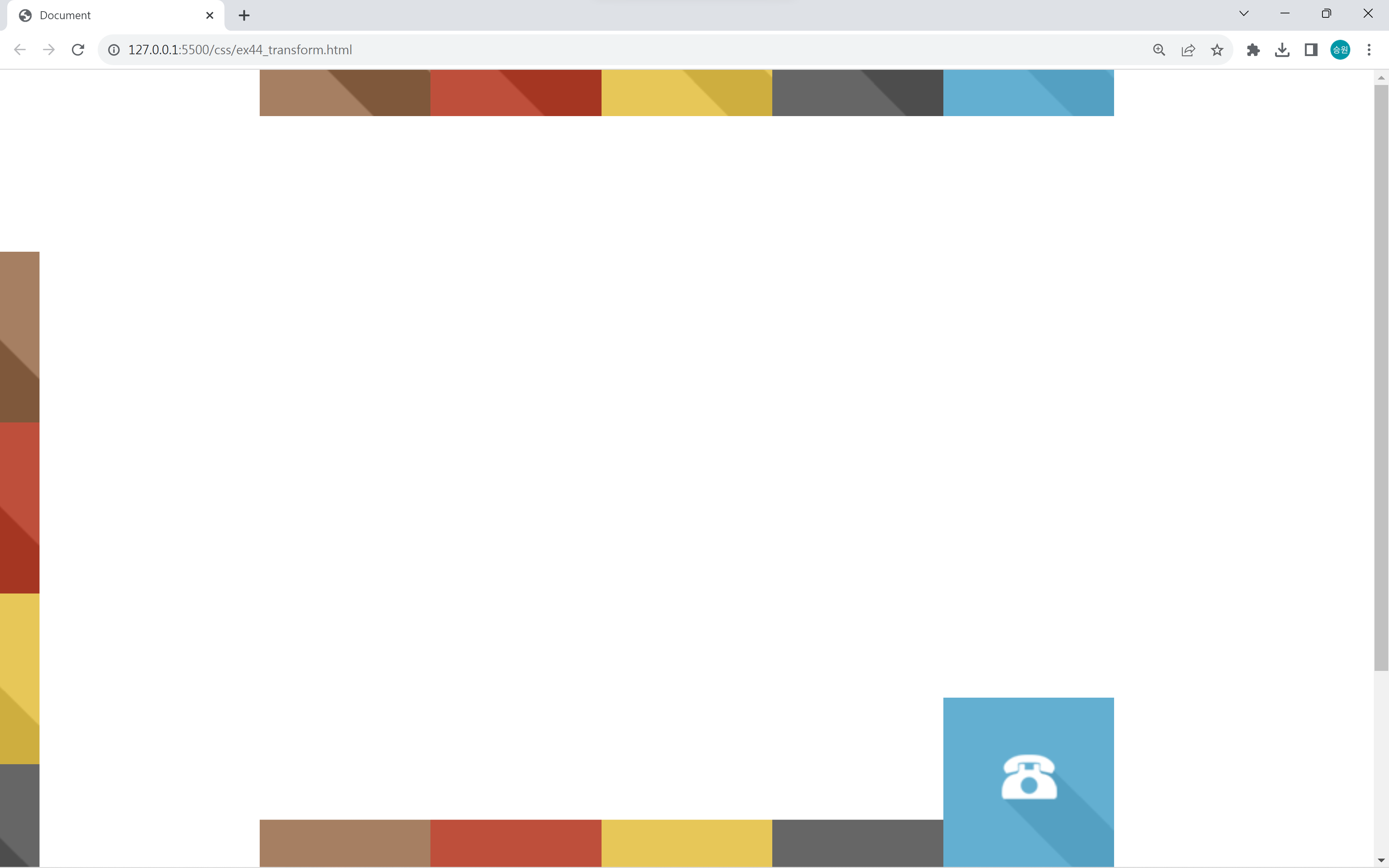
footer-menu는 바닥에 붙어 있어야 하기 때문에 position을 함께 사용해야 한다.
left와 right를 같은 값을 주면 양쪽에 같은 값을 주어서 가운데 정렬이 된다.