[CSS] animation (애니메이션)
🍁animation
CSS 객체의 움직임을 단순하게 표현할 때에는 transition을 사용한다.
animation은 그보다 더 나아가 움직임을 세밀하게 통제할 수 있는 옵션이 존재한다.
[CSS] transition (전환)
🍁transition transition은 객체의 속성(상태) 값이 변화되는 과정을 시간 순서대로 보여주는 애니메이션 속성이다. 이 작업은 본래 JavaScript에서나 할 수 있는 것이었다. 하지만 지금은 CSS에서 간단하
isaac-christian.tistory.com
transition에 대해서는 위 글을 참고하도록 하자.
🍁animation의 사용
- animation-name: 프레임(움직임)을 정의
- animation-duration: 소요 시간
- animaiton-fill-mode: 애니메이션이 끝난 후의 상태
- animation-timing-function: 가속도 제어
- animation-delay: 지연 시간
- animation-iteration-count: 반복 횟수
- animation-direction: 프레임의 재생 방향
- 기타 등등
<!DOCTYPE html>
<html lang="en">
<head>
    <meta charset="UTF-8">
    <meta name="viewport" content="width=device-width, initial-scale=1.0">
    <title>Document</title>
    <link rel="stylesheet" href="css/ex48.css">
</head>
<body>
    <!-- div#box$.box{상자$}*3 -->
    <div id="box1" class="box">상자1</div>
    <div id="box2" class="box">상자2</div>
    <div id="box3" class="box">상자3</div>
</body>
</html>
body {
padding-bottom: 300px;
}
.box {
border: 1px solid black;
width: 150px;
height: 150px;
margin: 30px;
}
#box1 { background-color: tomato; }
#box2 { background-color: gold; }
#box3 { background-color: dodgerblue; }
/* body에 마우스를 올린 상태 */
#box1 {
/* transition: all 1s; */
}
@keyframes key1 {
from {
width: 150px;
}
to {
width: 500px;
}
}
body:hover #box1 {
/* width: 500px; */
animation-name: key1;
animation-duration: 1s;
animation-fill-mode: forwards;
}위 코드는 width라는 속성을 150px로부터 500px까지 1초 동안 변화시키라는 의미이다.
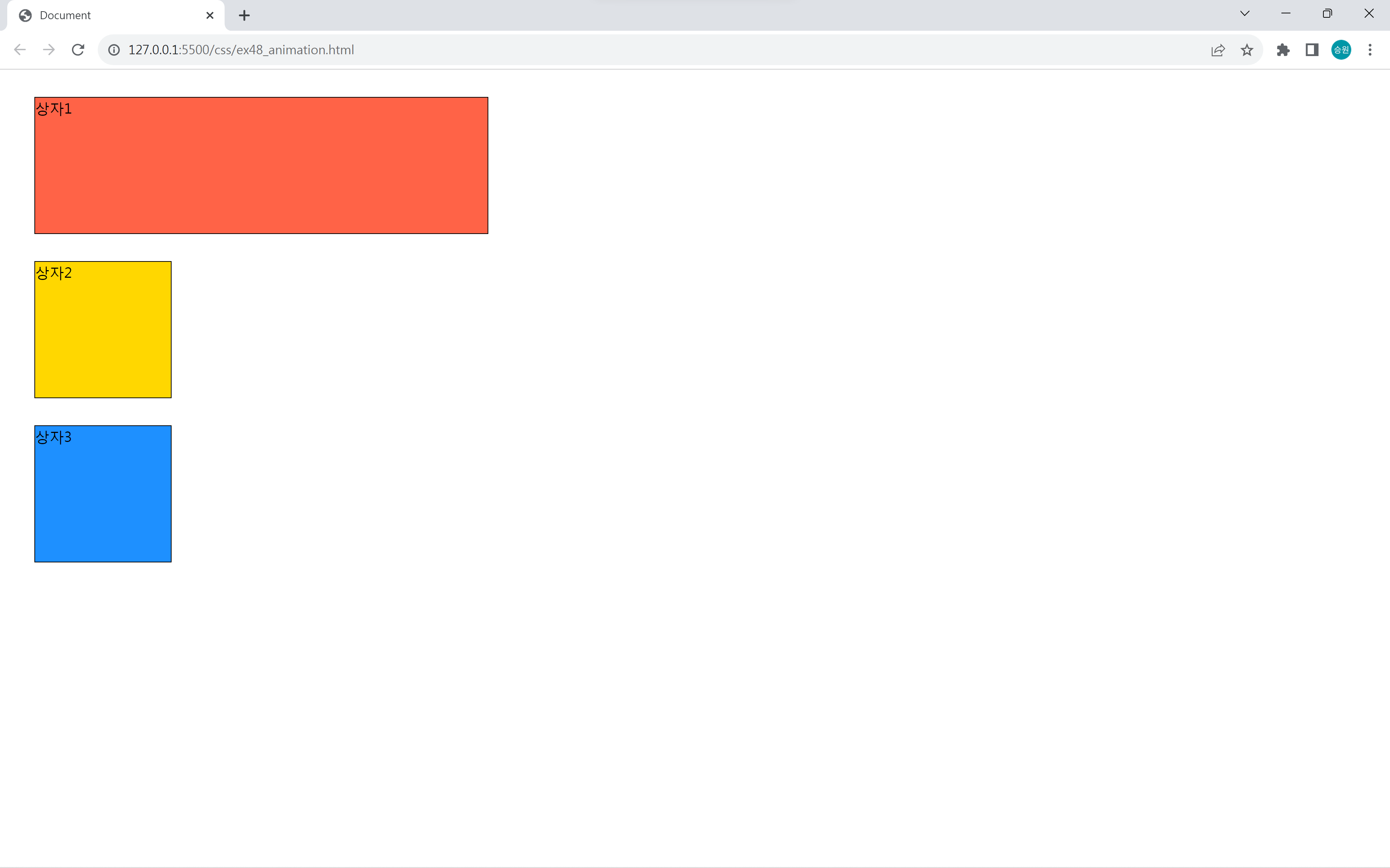
변화를 주고 싶은 시점에 animation을 적용한다.
animation의 duration은 transition의 duration과 같이 지속 시간을 의미하며, keyframes에는 어떤 속성에 어떤 변화값을 줄 것인지를 작성한다.
그리고 animation-fill-mode: forwards 속성은 마지막 변화한 순간에서 애니메이션을 멈춰 있게 하는 속성이다.
마우스를 올려두었을 때 애니메이션이 작동하도록 했으므로 마우스를 올려두지 않으면 순간적으로 돌아오게 된다.
내가 어떤 시점에 animation 또는 transition을 적용했는지를 이해하고 있어야 한다.
단순한 작업에는 transition이 훨씬 편하다!
하지만 animation으로만 할 수 있는 작업이 있다.
🍁animation의 활용
from과 to 대신에 %를 사용한다.
from과 to 대신에 0%과 100%로 작성할 수 있다.
from은 animation이 시작하는 순간(0초 되는 순간)을 말하며, to는 끝나는 순간을 말한다.
%로 작성하면 내가 원하는 구역대를 시간대로 자를 수 있다는 장점이 있다.
@keyframes key2 {
    /* from {
        width: 150px;
    }
    to {
        width: 500px;
    } */
    0% {
        width: 150px;
    }
    50% {
        width: 200px;
    }
    100% {
        width: 500px;
    }
}

body:hover #box2 {
    animation-name: key2;
    animation-duration: 5s;
    animation-fill-mode: forwards;
    animation-timing-function: linear;
}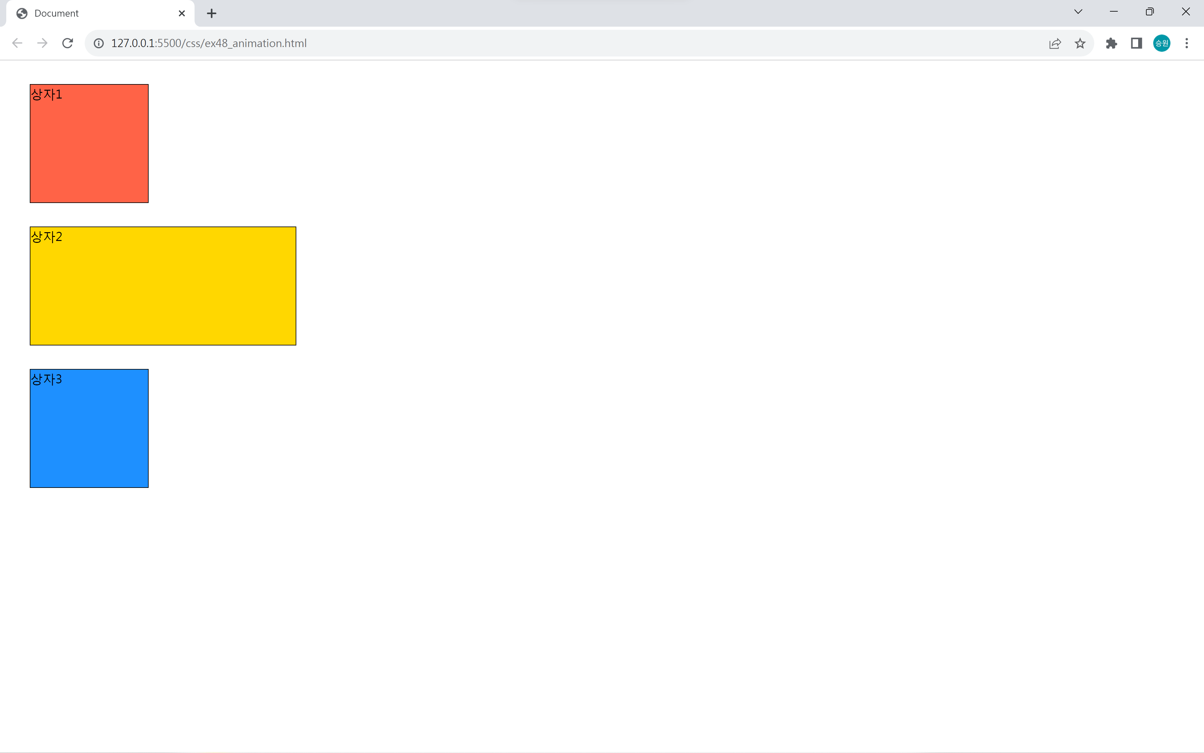
150px에서 200px로 갈 때에는 느리고, 200px에서 500px로 갈 때에는 빠르다.
5초에서 50%는 2.5초이다. 따라서 0초에서 2.5초까지는 50px(200px-150px)을 늘리고, 2.5초에서 5초까지는 300px(500px-200px)을 늘리게 된다.
이처럼 animation 기능은 구간별 통제를 하는 게 가능하다.
@keyframes key2 {
    /* from {
        width: 150px;
    }
    to {
        width: 500px;
    } */
    0% {
        transform: translate(0px, 0px);
    }
    25% {
        transform: translate(300px, 0px);
    }
    50% {
        transform: translate(300px, 300px);
    }
    75% {
        transform: translate(0px, 300px);
    }
    100% {
        transform: translate(0px, 0px);
    }
}

body:hover #box2 {
    animation-play-state: paused;
}

#box2 {
    animation-name: key2;
    animation-duration: 2s;
    animation-timing-function: linear;
    animation-iteration-count: 3;
    animation-direction: alternate; /* alternate, reverse, alternate-reverse */
}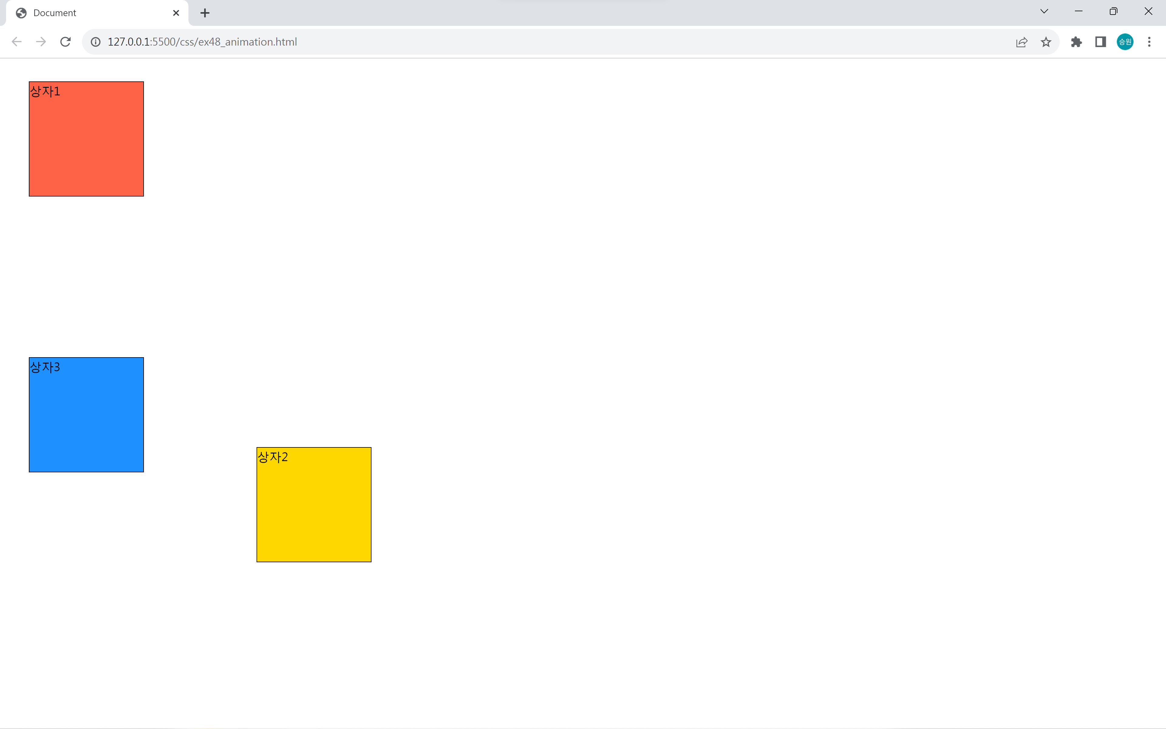
animation-iteration-count: infinite로 적용하면 영원히 animation이 실행된다. 이때 animation-play-stateanimation-play-state: paused 속성을 주면 잠깐 멈춘다.
버튼 만들기
<body>
    <h1>버튼</h1>
    <button class="effect">글쓰기</button>
    <button class="effect">돌아가기</button>
    <button class="effect">가입하기</button>
    <hr>
    <button class="effect3">
        <i class="fa-solid fa-pen"></i>
        글쓰기
    </button>
</body>
.effect {
padding: 10px;
}
.effect:hover {
animation-name: key-effect2;
animation-duration: 0.1s;
animation-iteration-count: 3;
}
@keyframes key-effect {
0% { transform: translate(0px, 0px); }
25% { transform: translate(-5px, 0px); }
50% { transform: translate(0px, 0px); }
75% { transform: translate(5px, 0px); }
100% { transform: translate(0px, 0px); }
}
@keyframes key-effect2 {
0% { transform: scale(1, 1) }
25% { transform: scale(1.2, 1.2) }
50% { transform: scale(1, 1) }
75% { transform: scale(0.8, 0.8) }
100% { transform: scale(1, 1) }
}
.effect3:hover > i {
animation-name: key-effect;
animation-duration: 0.05s;
animation-iteration-count: infinite;
}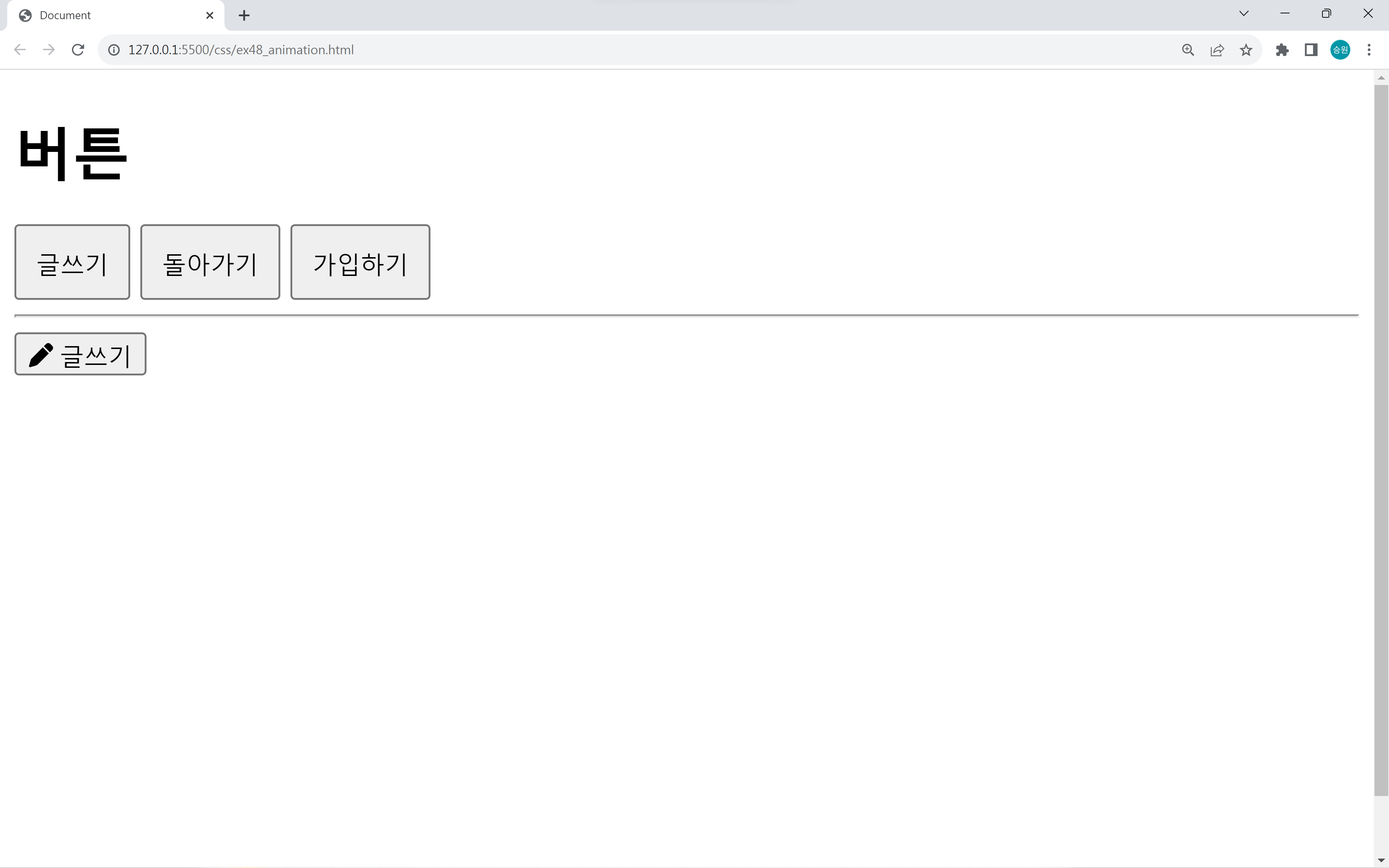
버튼에 hover 속성을 주어서 떨림(진동)을 주는 작업을 해보도록 하자.
animation은 키프레임에 대한 변화를 정해 놓고, 재사용할 수 있다는 장점이 있다.
공 튀기기
<!DOCTYPE html>
<html lang="en">
<head>
    <meta charset="UTF-8">
    <meta name="viewport" content="width=device-width, initial-scale=1.0">
    <title>Document</title>
    <link rel="stylesheet" href="css/ex49.css">
</head>
<body>
    <div id="box">
        <div id="ball"></div>
    </div>
</body>
</html>
#box {
border: 20px solid black;
width: 500px;
height: 800px;
}
#ball {
background-color: dodgerblue;
width: 50px;
height: 50px;
border-radius: 50%;
margin: 0 auto; /* 가운데 정렬 */
animation-name: key-ball;
animation-duration: .7s;
/* animation-fill-mode: forwards; */
animation-iteration-count: infinite;
animation-direction: alternate;
animation-timing-function: ease-in;
}
@keyframes key-ball {
from {
transform: translate(0px, 0px);
}
to {
transform: translate(0px, 750px);
}
}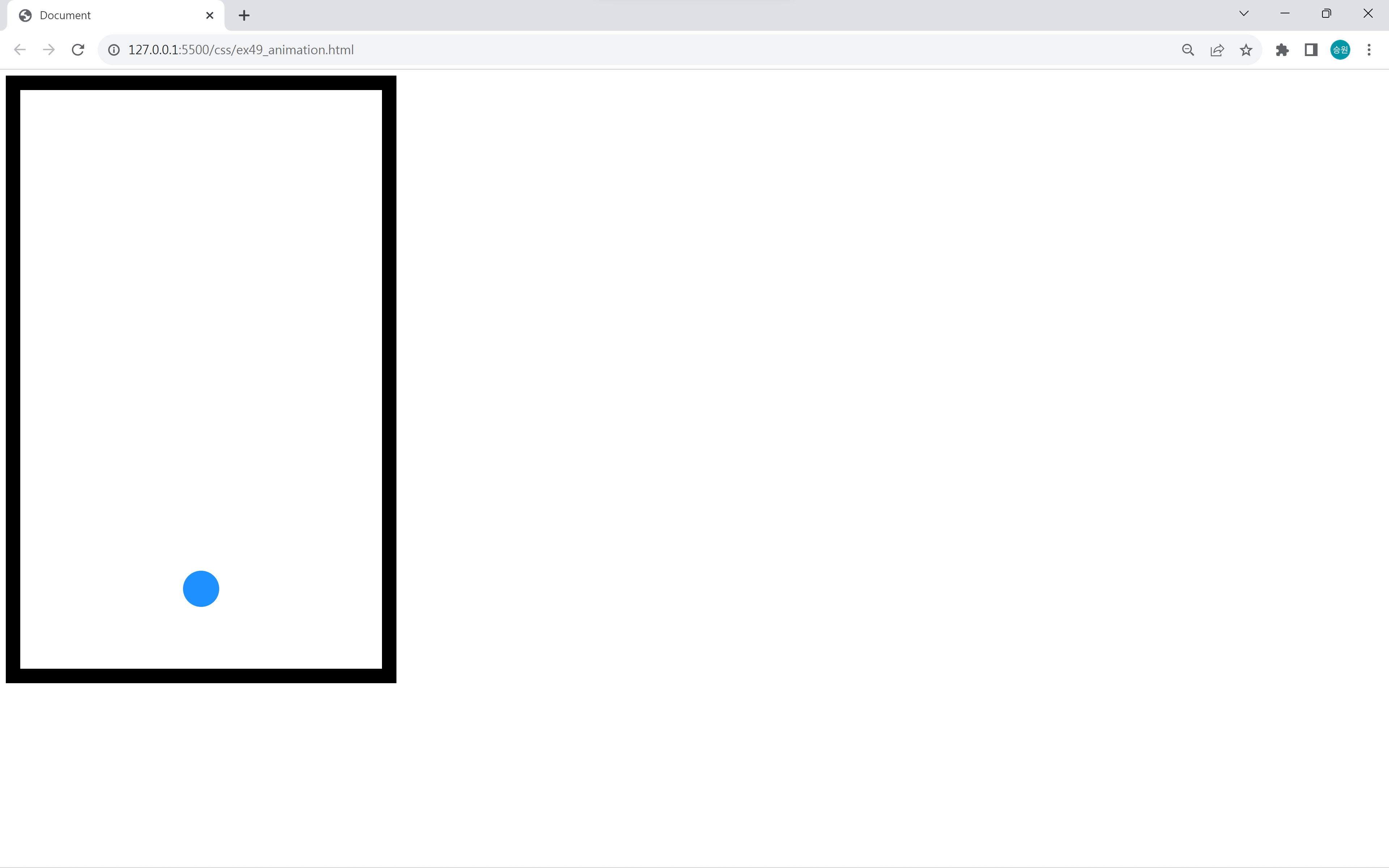
바닥에 통통 튀기는 거 같은 공을 구현했다.
이런 방식으로 게임을 만들 수 있을 거 같지만, 수십 개의 animation을 한 화면에서 구현하면 뚝뚝 끊긴다.
그래서 게임 같은 경우에는 HTML Canvas와 JavaScript를 이용하여 구현한다.
애니메이션은 그래프나 차트에 활용하며, 직접 구현하는 것 보다는 라이브러리로 구현한다.