[CSS] display: flex (레이아웃)
🍁display: flex
flex 속성 하나만으로도 다른 속성 여러 개를 합쳐 놓은 정도로 분량이 크다.
flex는 flex box 또는 flexiable box라고도 부른다.
레이아웃을 작성할 때, 즉 내부의 요소를 어떻게 배치할지를 결정할 때 사용한다.
flex는 float와 position, maingin, padding을 합친 느낌이 든다.
[CSS] display: 인라인 요소의 개행, float
🍁display [CSS] overflow, visibility, display 🍁오버플로우 (overflow) 박스에 담을 수 있는 내용을 초과하면 초과한 내용이 박스를 빠져나간다. 하지만 height: auto; 값을 주면 그만큼 박스가 커지기 때문에
isaac-christian.tistory.com
display와 float에 대해서는 위 글을 참고하도록 하자.
display: flex의 기본 성질
<style>
    #box {
        border: 10px solid black;
        width: 300px;
        height: 300px;
        display: flex;
    }
</style>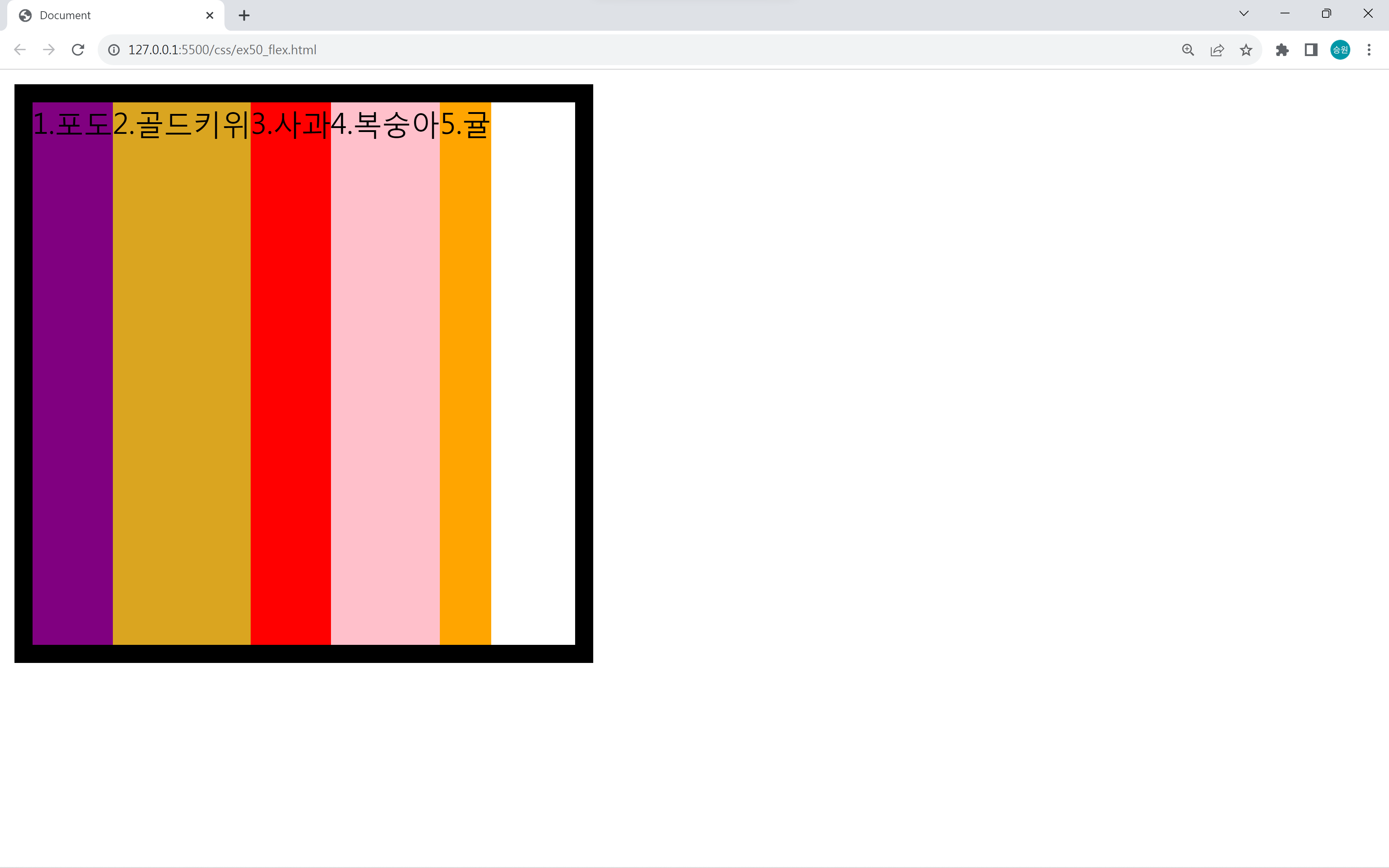
display: flex는 위와 같이 요소가 부모를 꽉 채운다는 특징이 있다.
- 메인축: 아이템을 나열하는 방향 > 가로 (왼쪽 > 오른쪽)
- 수직축: 메인축의 직각 방향 > 세로 (위쪽 > 아래쪽)
- 아이템 너비: 요소만큼
- 아이템 높이: 부모만큼
flex는 축을 따진다. 이때 축은 메인축과 수직축이 존재한다.
위 화면에서는 메인축은 가로이고, 수직축은 세로이다.
flex 관련 속성명
- justify- : 메인축 방향
- align- : 수직축 방향
🍁display: flex의 사용
<!DOCTYPE html>
<html lang="en">
<head>
    <meta charset="UTF-8">
    <meta name="viewport" content="width=device-width, initial-scale=1.0">
    <title>Document</title>
    <style>
        #box {
            border: 10px solid black;
        }
        #box .item:nth-child(1) { background-color: purple;}
        #box .item:nth-child(2) { background-color: goldenrod; }
        #box .item:nth-child(3) { background-color: red; }
        #box .item:nth-child(4) { background-color: pink; }
        #box .item:nth-child(5) { background-color: orange; }
    </style>
</head>
<body>
    <div id="box">
        <div class="item">1.포도</div>
        <div class="item">2.골드키위</div>
        <div class="item">3.사과</div>
        <div class="item">4.복숭아</div>
        <div class="item">5.귤</div>
    </div>
</body>
</html>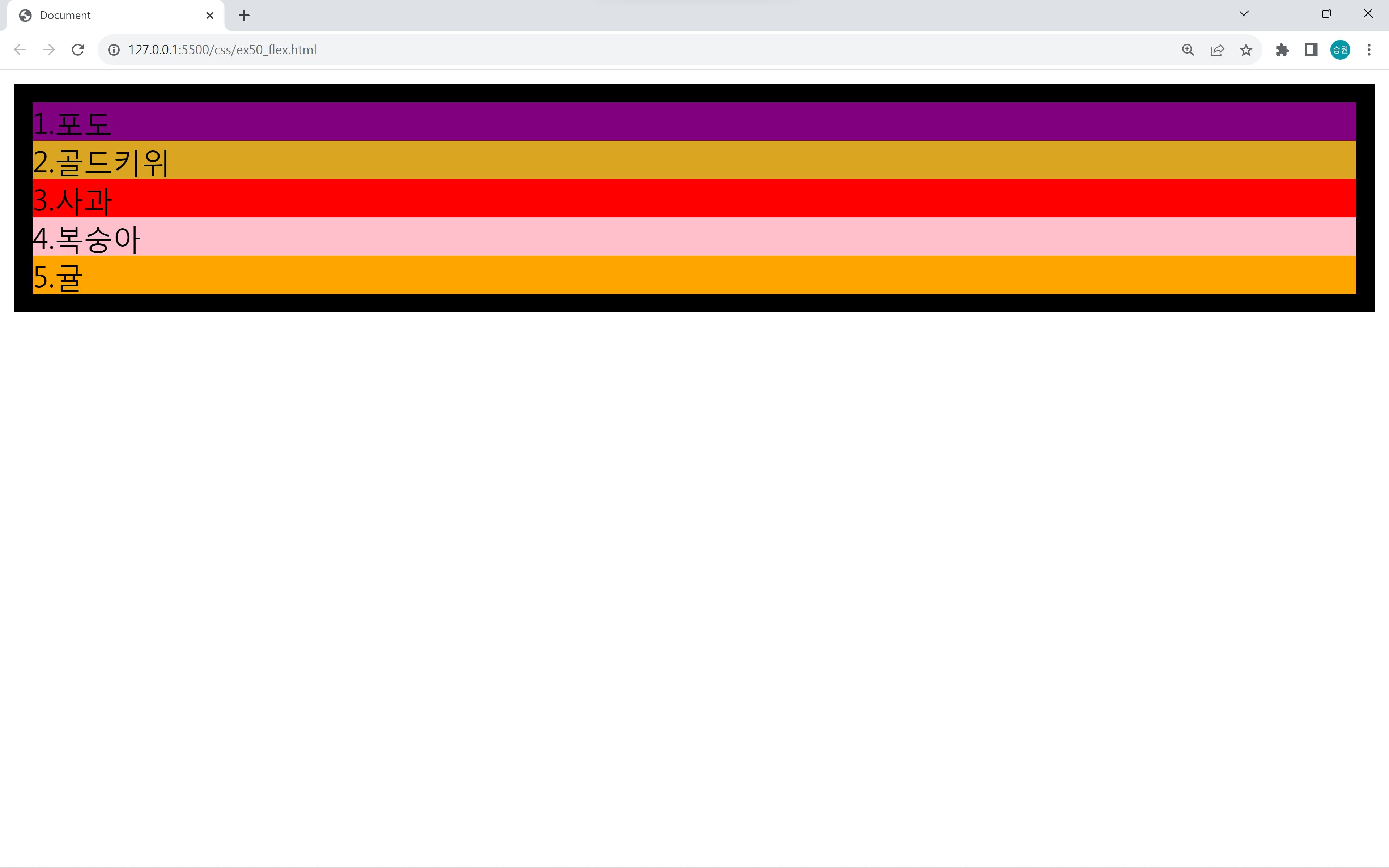
위 박스를 한 줄로 출력하는 화면을 구현해 보도록 하자.
display: inline으로 구현
<!DOCTYPE html>
<html lang="en">
<head>
    <meta charset="UTF-8">
    <meta name="viewport" content="width=device-width, initial-scale=1.0">
    <title>Document</title>
    <style>
        #box {
            border: 10px solid black;
            font-size: 0;
        }
        #box .item {
            display: inline;
            font-size: 1rem;
        }
        #box .item:nth-child(1) { background-color: purple;}
        #box .item:nth-child(2) { background-color: goldenrod; }
        #box .item:nth-child(3) { background-color: red; }
        #box .item:nth-child(4) { background-color: pink; }
        #box .item:nth-child(5) { background-color: orange; }
    </style>
</head>
<body>
    <div id="box">
        <div class="item">1.포도</div>
        <div class="item">2.골드키위</div>
        <div class="item">3.사과</div>
        <div class="item">4.복숭아</div>
        <div class="item">5.귤</div>
    </div>
</body>
</html>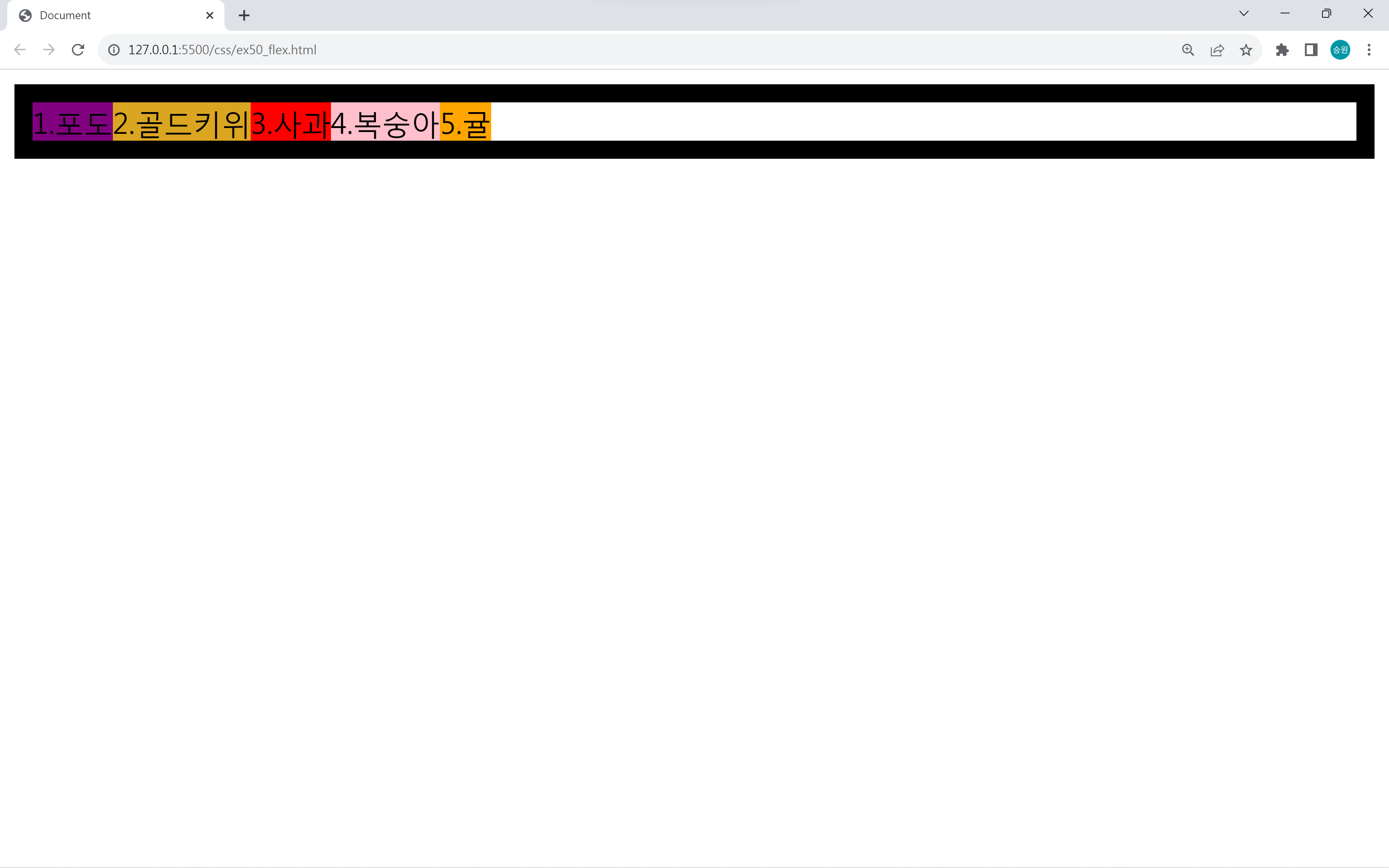
float로 구현
<!DOCTYPE html>
<html lang="en">
<head>
    <meta charset="UTF-8">
    <meta name="viewport" content="width=device-width, initial-scale=1.0">
    <title>Document</title>
    <style>
        #box {
            border: 10px solid black;
        }
        #box .item {
            float: left;
        }
        #box::after {
            content: '';
            display:block;
            clear: both;
        }
        #box .item:nth-child(1) { background-color: purple;}
        #box .item:nth-child(2) { background-color: goldenrod; }
        #box .item:nth-child(3) { background-color: red; }
        #box .item:nth-child(4) { background-color: pink; }
        #box .item:nth-child(5) { background-color: orange; }
    </style>
</head>
<body>
    <div id="box">
        <div class="item">1.포도</div>
        <div class="item">2.골드키위</div>
        <div class="item">3.사과</div>
        <div class="item">4.복숭아</div>
        <div class="item">5.귤</div>
    </div>
</body>
</html>
/* #box::after {
content: '';
display:block;
clear: both;
} */
#box {
border: 10px solid black;
overflow: hidden;
}box::after 대신에 overflow: hidden으로 구현할 수 있다.
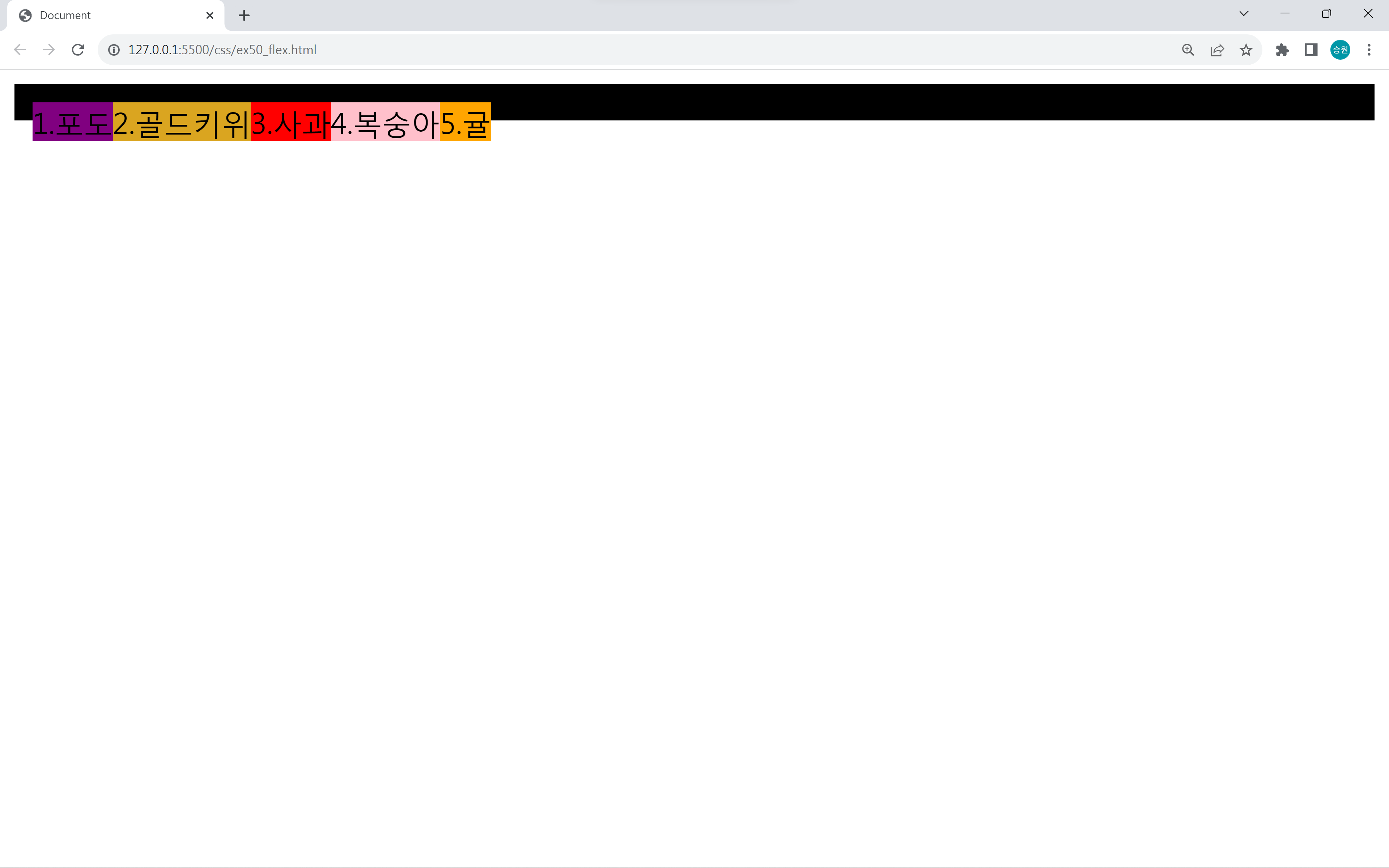
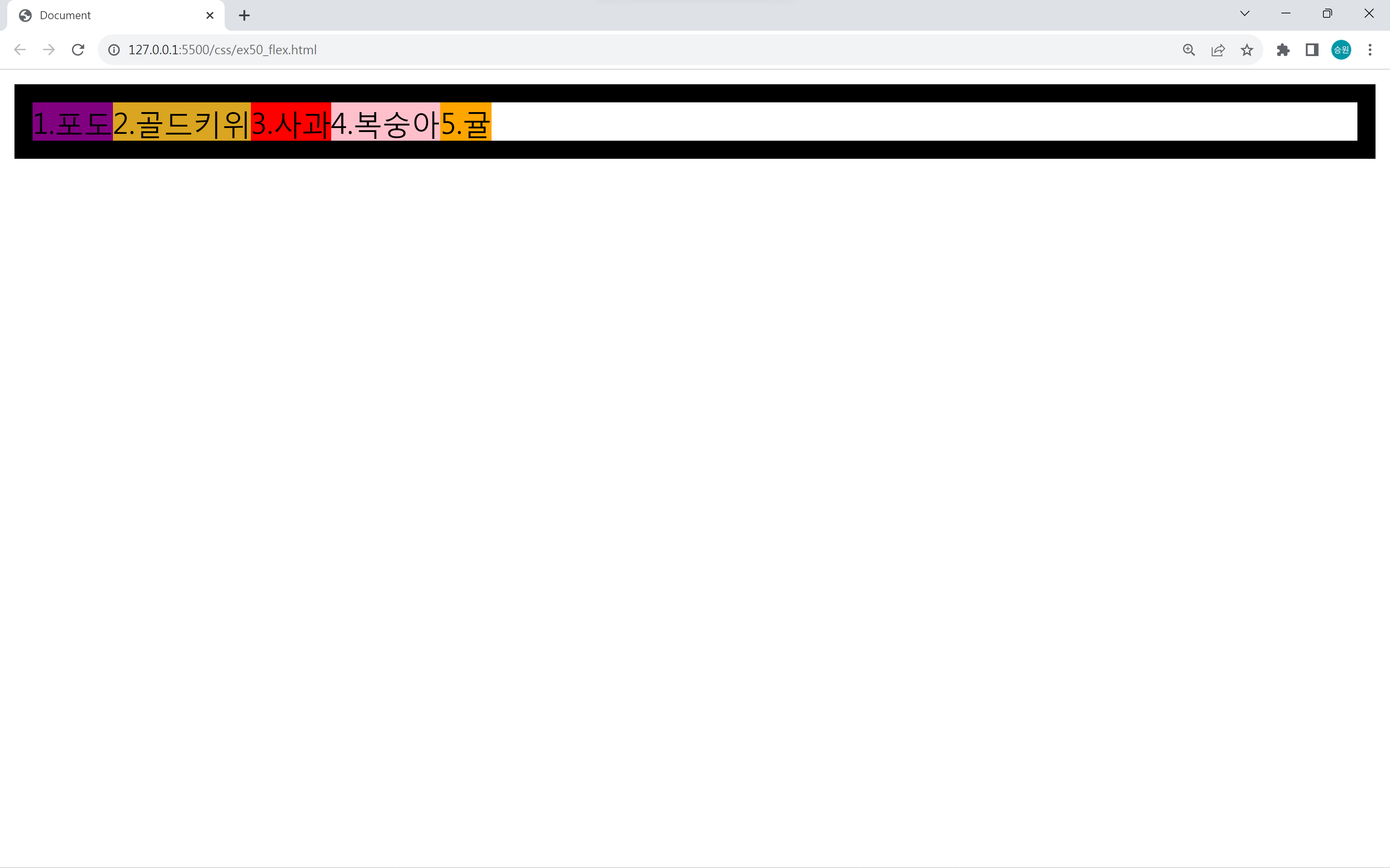
float는 원래 자리에서 벗어나기 때문에 부모가 자식을 인식하지 못한다는 단점이 있다.
자식이 모두 집을 나가버리기 때문에 부모 입장에서는 자식을 없다고 생각한다.
이 현상을 없애기 위해서 다른 방법을 사용할 수 있다.
🍂display: flex로 구현
<!DOCTYPE html>
<html lang="en">
<head>
    <meta charset="UTF-8">
    <meta name="viewport" content="width=device-width, initial-scale=1.0">
    <title>Document</title>
    <style>
        #box {
            border: 10px solid black;
            display: flex;
        }
        #box .item:nth-child(1) { background-color: purple;}
        #box .item:nth-child(2) { background-color: goldenrod; }
        #box .item:nth-child(3) { background-color: red; }
        #box .item:nth-child(4) { background-color: pink; }
        #box .item:nth-child(5) { background-color: orange; }
    </style>
</head>
<body>
    <div id="box">
        <div class="item">1.포도</div>
        <div class="item">2.골드키위</div>
        <div class="item">3.사과</div>
        <div class="item">4.복숭아</div>
        <div class="item">5.귤</div>
    </div>
</body>
</html>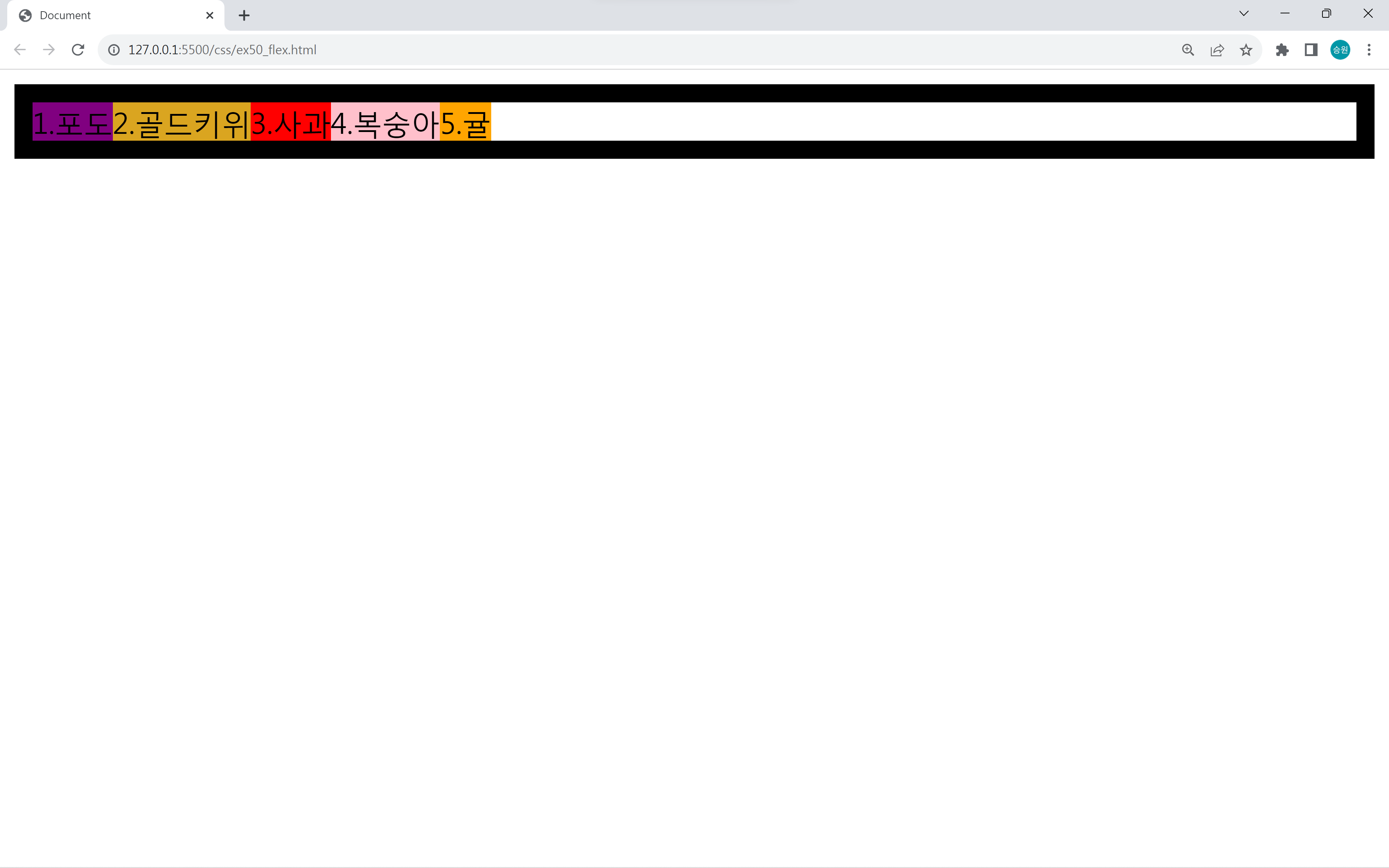
display: flex로 간단하게 구현했다.
flex는 이런 작업을 하기 위해서 만들어진 것이다.
따라서 이제는 inline, float로 구현하지 않고 flex를 사용한다.
🍁display: flex의 활용
flex-direction
- row: 행을 메인축으로
- column: 열을 메인축으로
- row-reverse
- column-reverse
<style>
    #box {
        border: 10px solid black;
        width: 300px;
        height: 300px;
        display: flex;
        flex-direction: column;
    }
</style>
<style>
    #box {
        border: 10px solid black;
        width: 300px;
        height: 300px;
        display: flex;
        flex-direction: row-reverse;
    }
</style>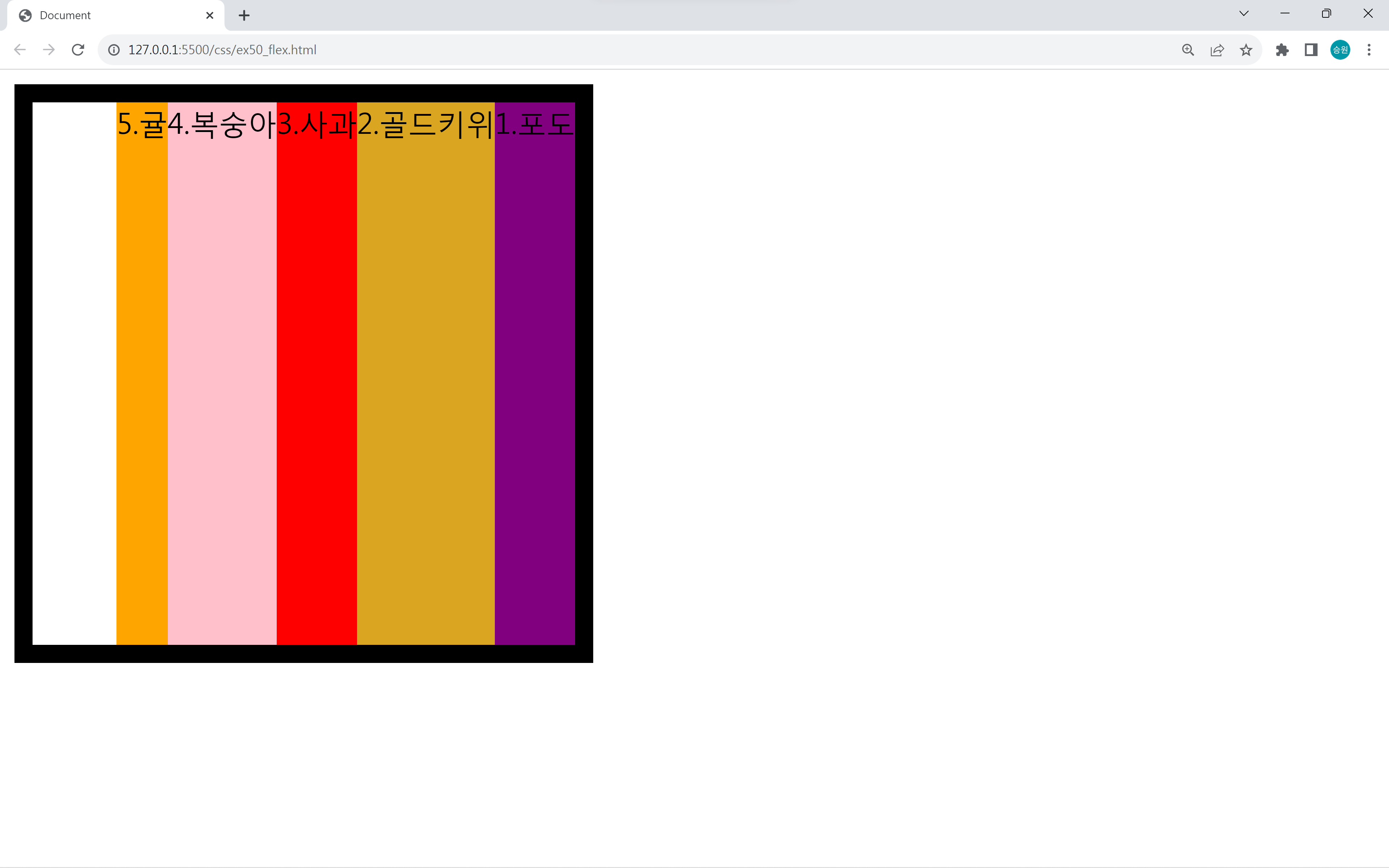
flex-direction은 메인축과 수직축을 결정하는 속성이다.
이때 reverse 속성을 사용하여 반대로 배치할 수 있다.
flex-wrap
flex-wrap은 자동 줄 바꿈 속성이다.
기본값은 nowrap이다.
<!DOCTYPE html>
<html lang="en">
<head>
    <meta charset="UTF-8">
    <meta name="viewport" content="width=device-width, initial-scale=1.0">
    <title>Document</title>
    <style>
        #box {
            border: 10px solid black;
            width: 300px;
            height: 300px;
            display: flex;
            flex-direction: row;
        }
        #box .item:nth-child(5n + 1) { background-color: purple;}
        #box .item:nth-child(5n + 2) { background-color: goldenrod; }
        #box .item:nth-child(5n + 3) { background-color: red; }
        #box .item:nth-child(5n + 4) { background-color: pink; }
        #box .item:nth-child(5n + 5) { background-color: orange; }
    </style>
</head>
<body>
    <div id="box">
        <div class="item">1.포도</div>
        <div class="item">2.골드키위</div>
        <div class="item">3.사과</div>
        <div class="item">4.복숭아</div>
        <div class="item">5.귤</div>
        <div class="item">1.포도</div>
        <div class="item">2.골드키위</div>
        <div class="item">3.사과</div>
        <div class="item">4.복숭아</div>
        <div class="item">5.귤</div>
        <div class="item">1.포도</div>
        <div class="item">2.골드키위</div>
        <div class="item">3.사과</div>
        <div class="item">4.복숭아</div>
        <div class="item">5.귤</div>
    </div>
</body>
</html>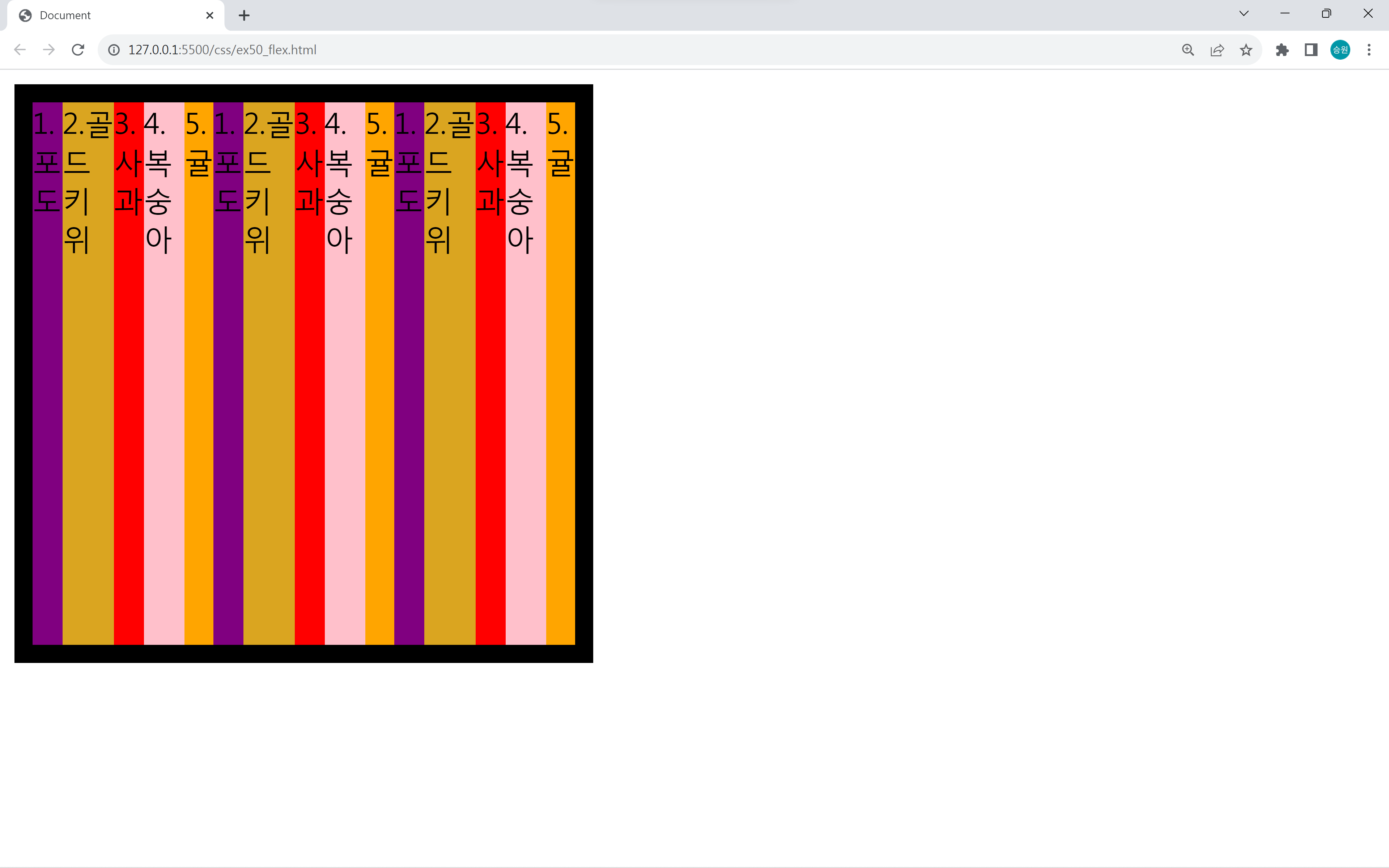
여전히 부모를 꽉 채우지만, 자동 개행이 되므로 내용이 초과되면 두 번째 라인이 생긴다.
flex-wrap: wrap-reverse 속성을 주면 반대(아래)부터 부모를 채우게 된다.
justify-content
justify-content는 메인축 방향으로 아이템을 어떻게 정렬할지를 결정한다.
<!DOCTYPE html>
<html lang="en">
<head>
    <meta charset="UTF-8">
    <meta name="viewport" content="width=device-width, initial-scale=1.0">
    <title>Document</title>
    <style>
        #box {
            border: 10px solid black;
            width: 300px;
            height: 300px;
            display: flex;
            justify-content: flex-end;
            /* flex-direction: row-reverse; */
        }
        #box .item:nth-child(1) { background-color: purple;}
        #box .item:nth-child(2) { background-color: goldenrod; }
        #box .item:nth-child(3) { background-color: red; }
        #box .item:nth-child(4) { background-color: pink; }
        #box .item:nth-child(5) { background-color: orange; }
    </style>
</head>
<body>
    <div id="box">
        <div class="item">1.포도</div>
        <div class="item">2.골드키위</div>
        <div class="item">3.사과</div>
        <div class="item">4.복숭아</div>
        <div class="item">5.귤</div>
    </div>
</body>
</html>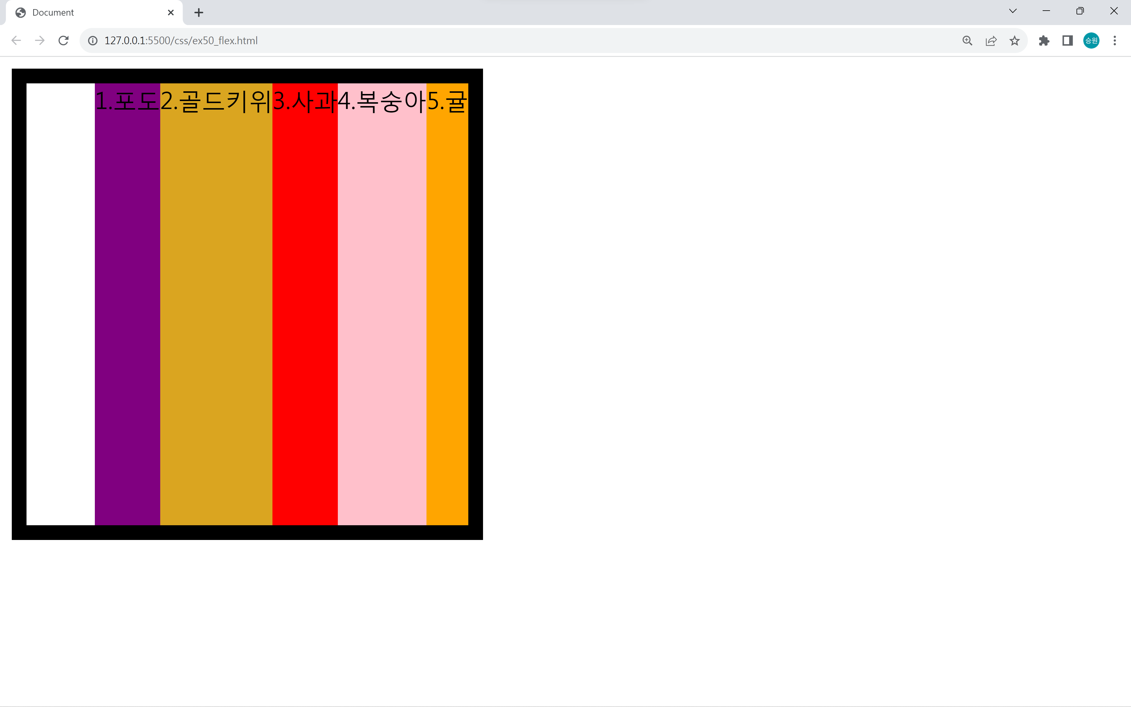
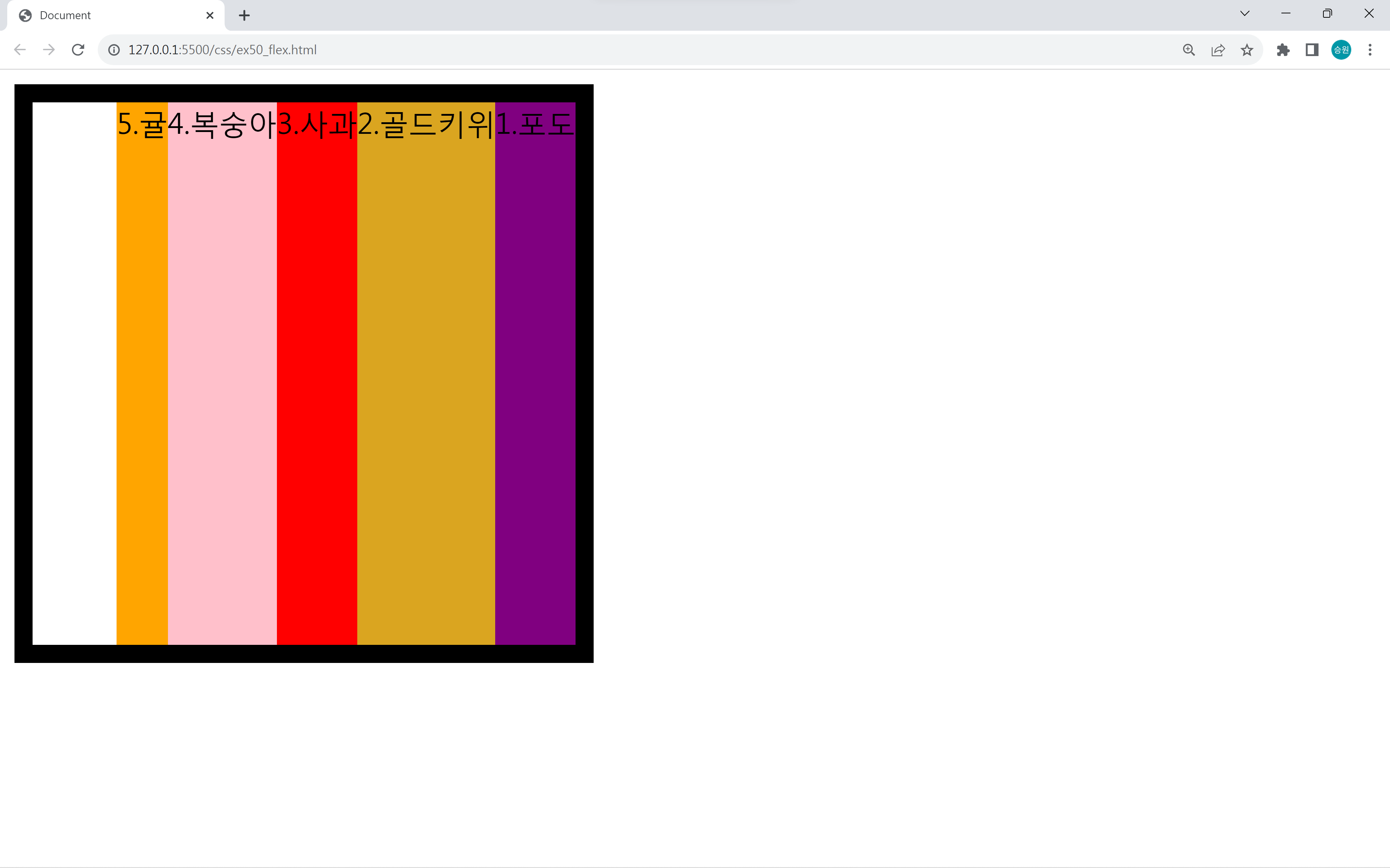
요소들 간의 순서는 flex-direction이, 요소들의 배치는 justify-content가 만든다.
두 속성이 비슷해 보이지만 다르므로 차이점을 알고 이해해야 한다.
<style>
    #box {
        justify-content: center;
        justify-content: space-around;
        justify-content: space-between;
        justify-content: space-evenly;
    }
</style>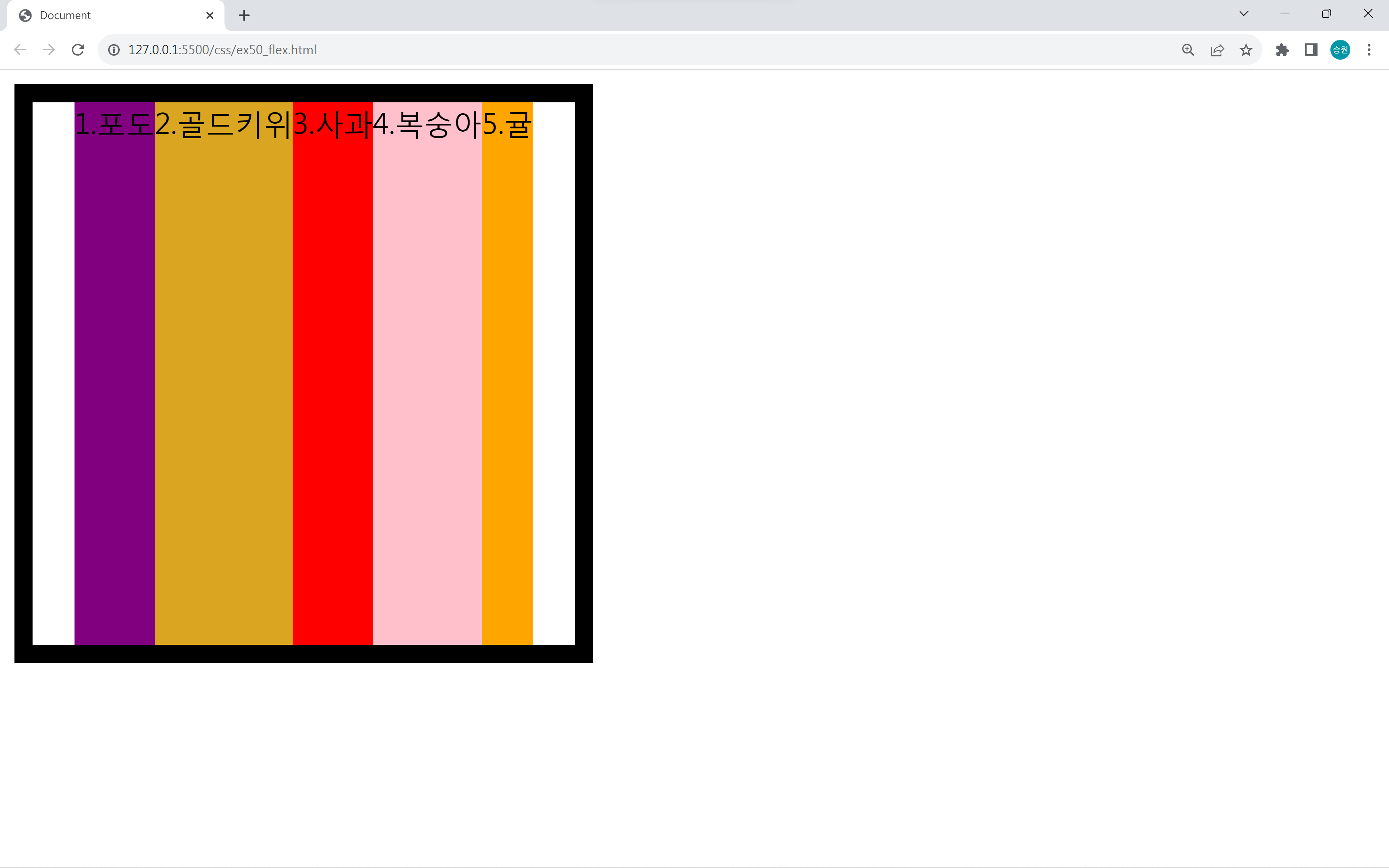
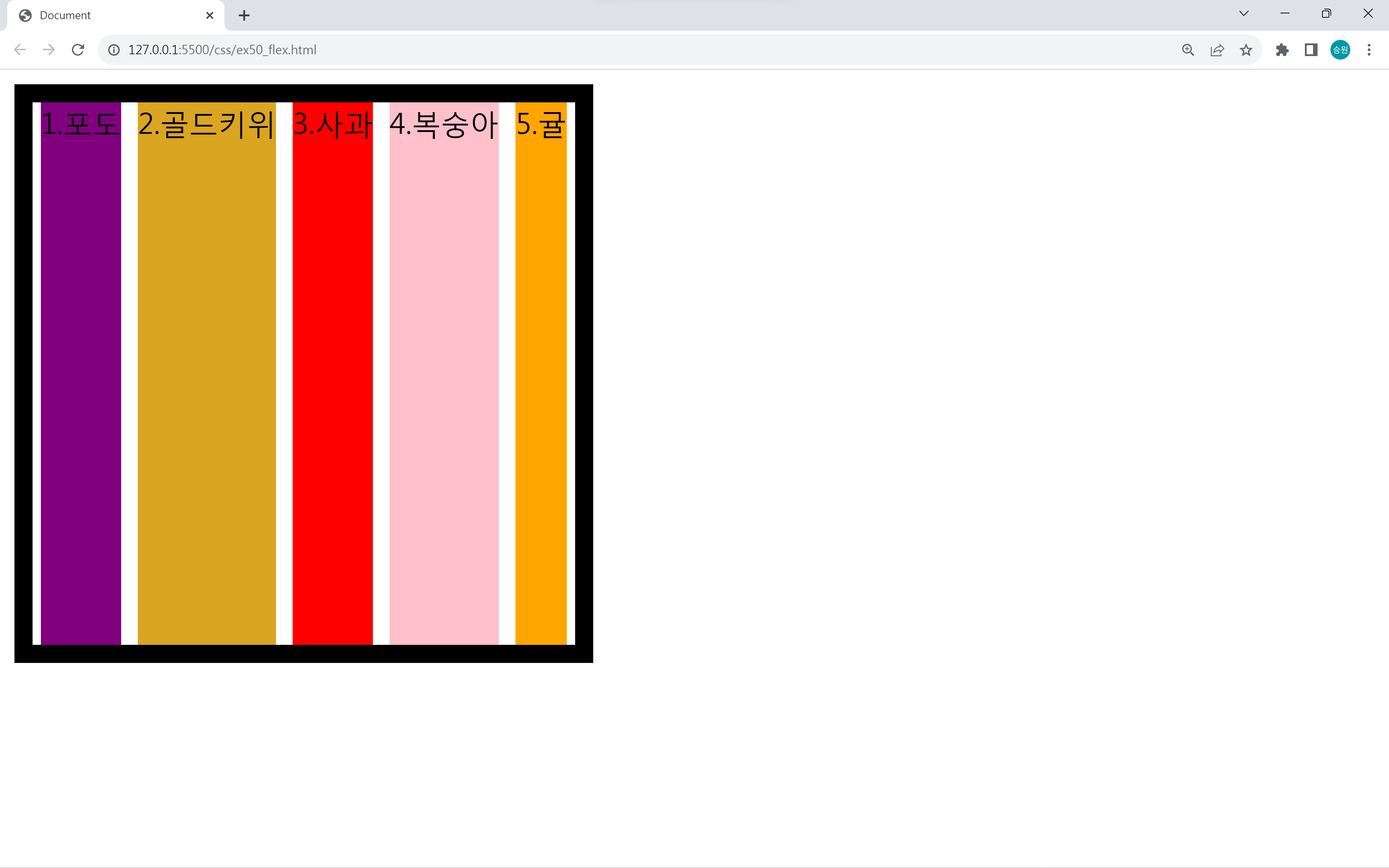
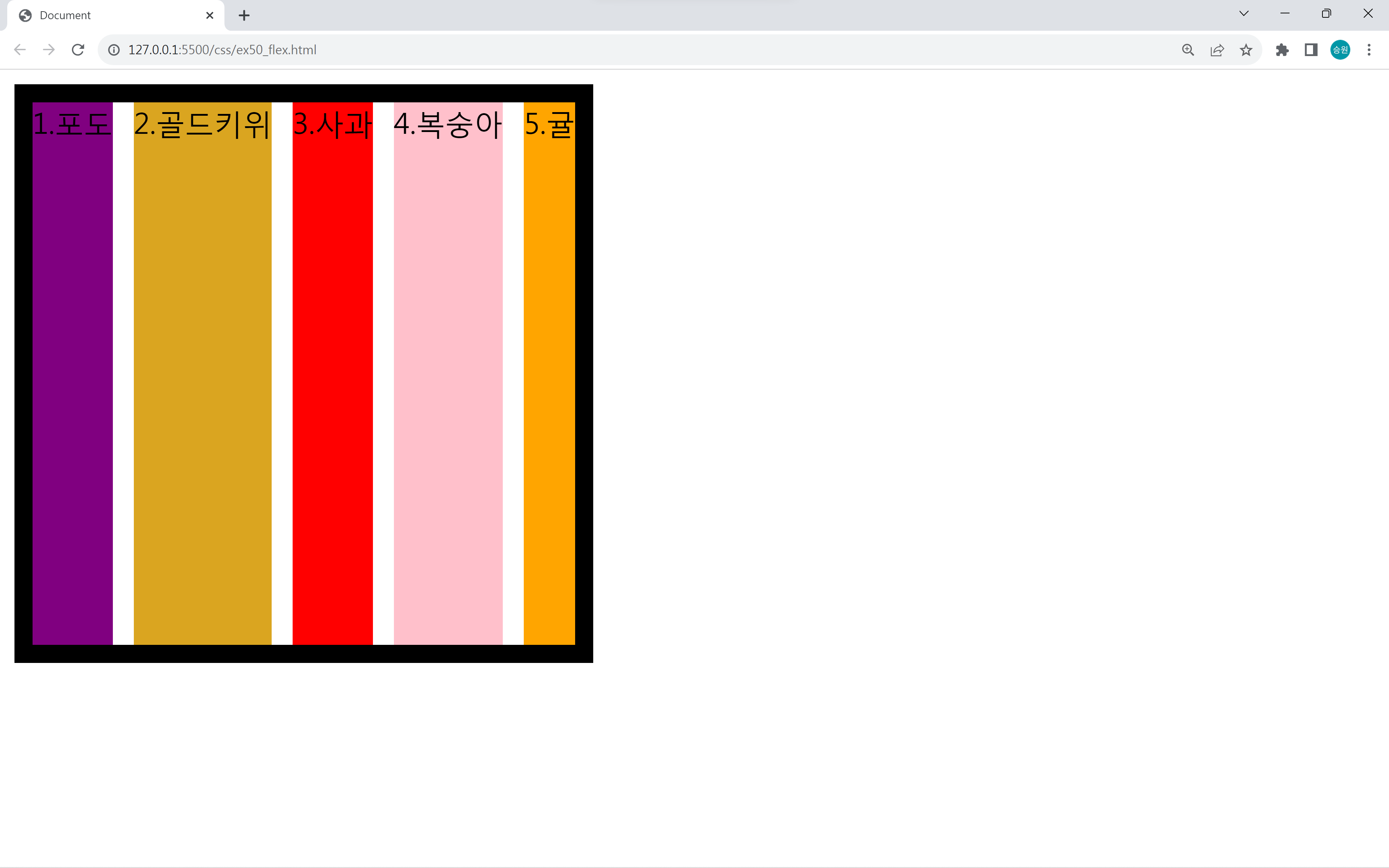
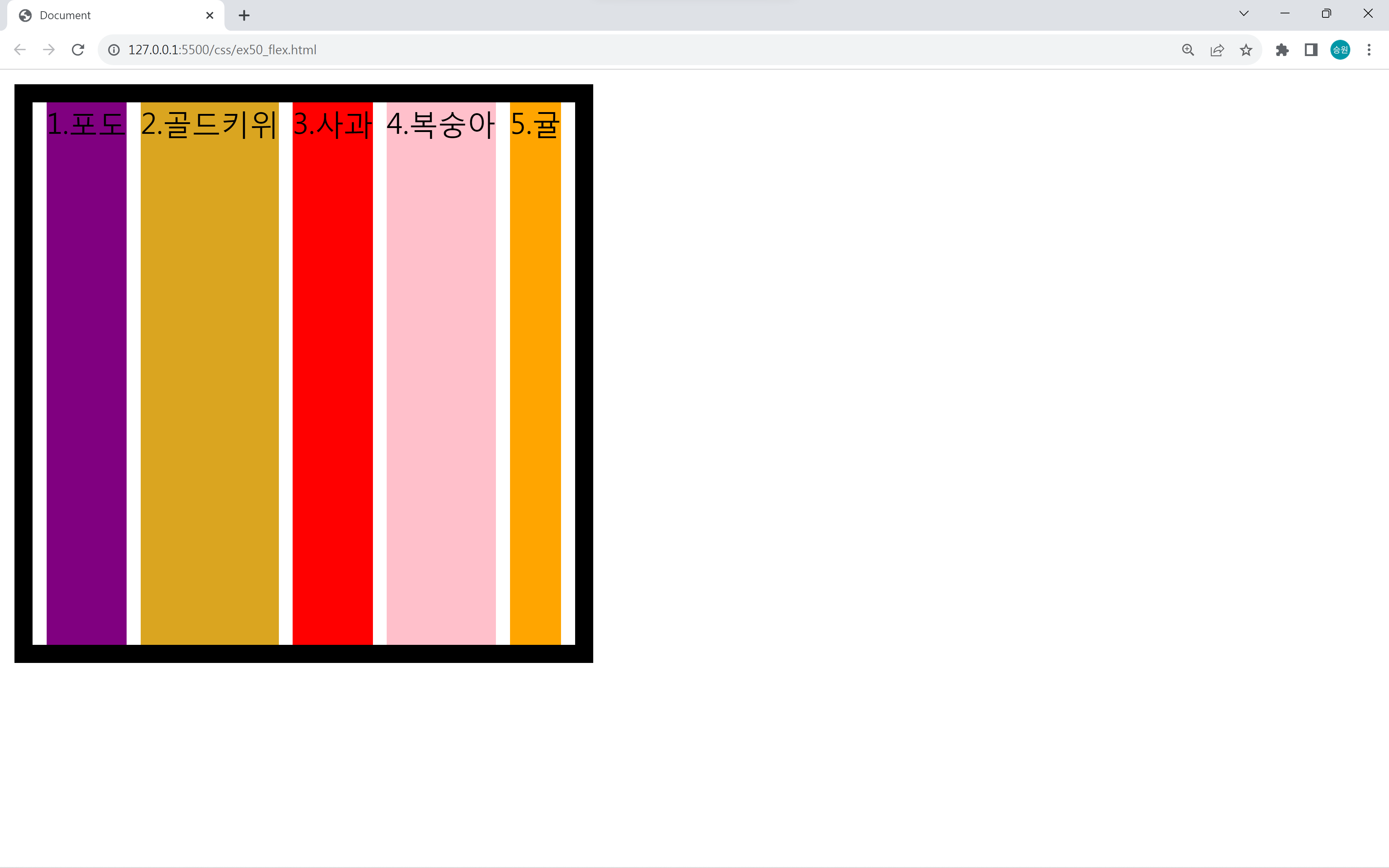
요소들을 균등하게 배치하는 방법으로 center, space-around, space-between, space-evenly를 사용할 수 있다.
align-items
align-items는 수직축 방향으로 아이템을 어떻게 정렬할지를 결정한다.
justify-content의 반대라고 생각하면 된다.
<style>
    #box {
        align-items: stretch;
        align-items: center;
        align-items: flex-start;
        align-items: flex-end;
    }
</style>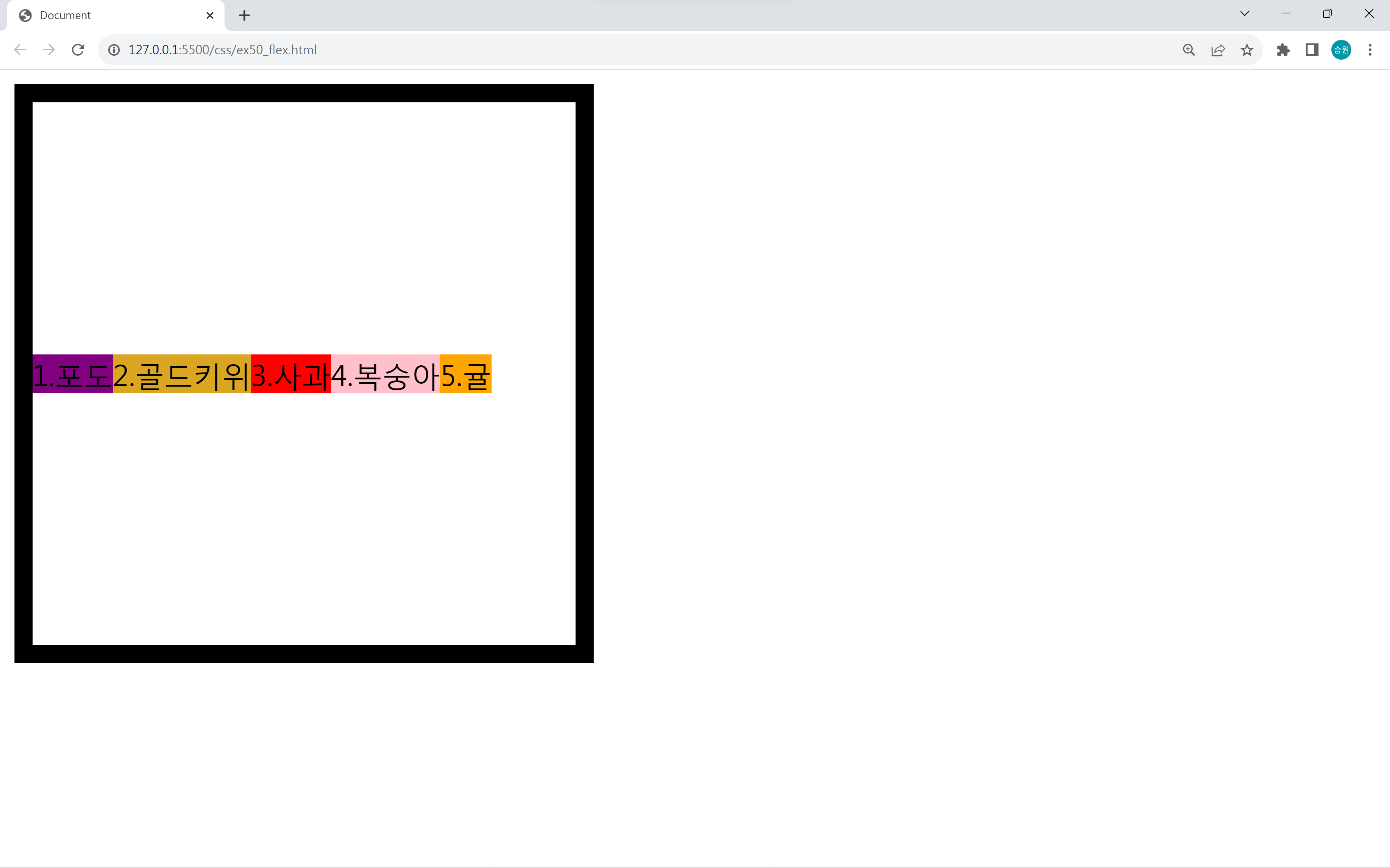

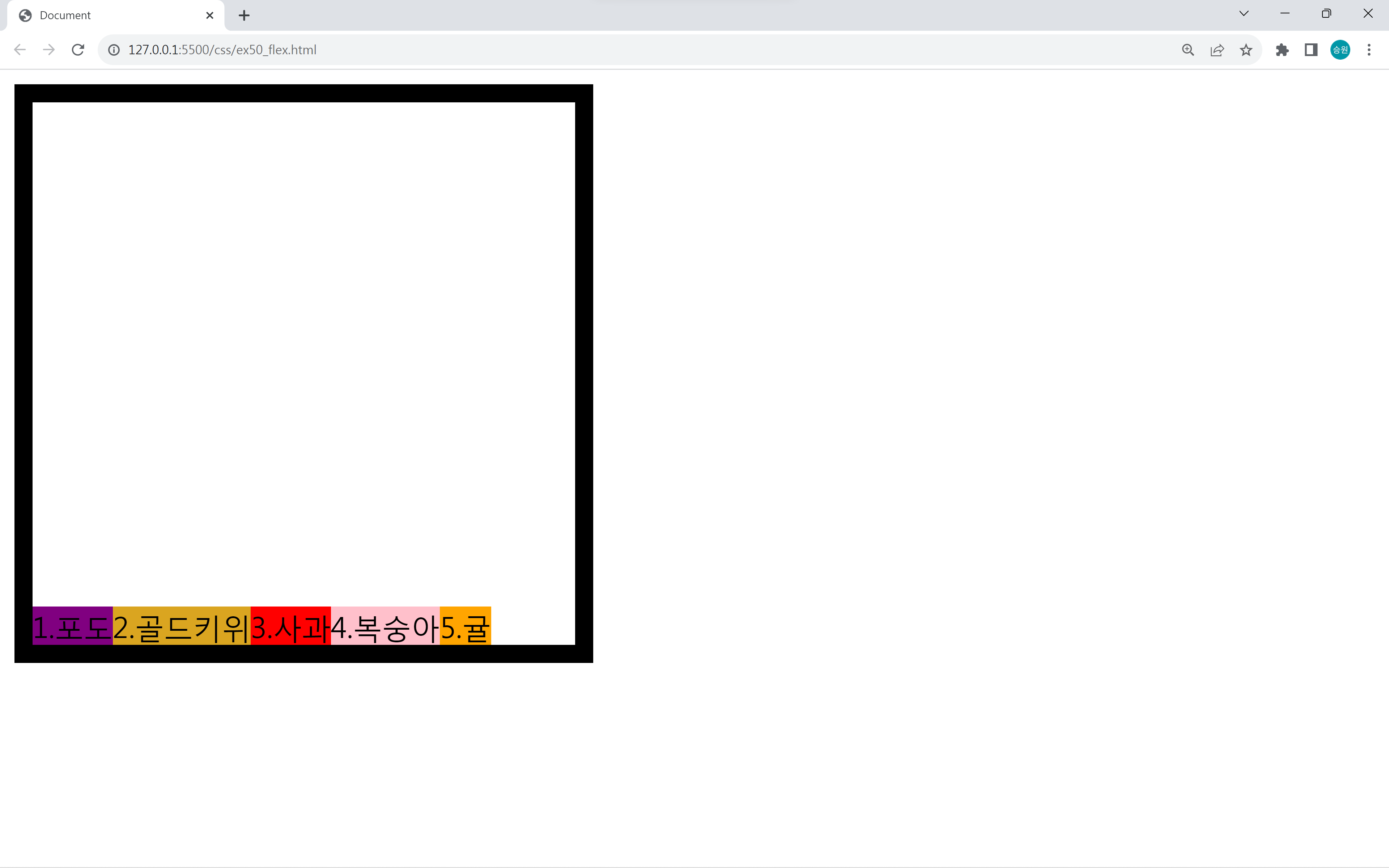
기본값은 stretch이다. align-items 속성에 따라서 수직축 방향의 아이템 정렬이 달라진다.
제목(title) 구현
<!DOCTYPE html>
<html lang="en">
<head>
    <meta charset="UTF-8">
    <meta name="viewport" content="width=device-width, initial-scale=1.0">
    <title>Document</title>
<style>
    #title1, #title2 {
        font-variant: small-caps;
        color: #333;
        font-family: Verdana;
        border-bottom: 1px dashed #999;
        width: 600px;
    }

    /* float로 구현 */
    #title1 small {
        font-size: 1rem;
        float: right;
        margin-top: 16px;
    }

    /* display: flex로 구현 */
    #title2 {
        display: flex;
        align-items: flex-end;
        justify-content: space-between;
    }
    #title2 small {
        font-size: 1rem;
        margin-bottom: 3px;
    }
</style>
</head>
<body>
    <h1 id="title">Main Title <small>Sub Title</small></h1>
    <h1 id="title1">Main Title <small>Sub Title</small></h1>
    <h1 id="title2">Main Title <small>Sub Title</small></h1>
</body>
</html>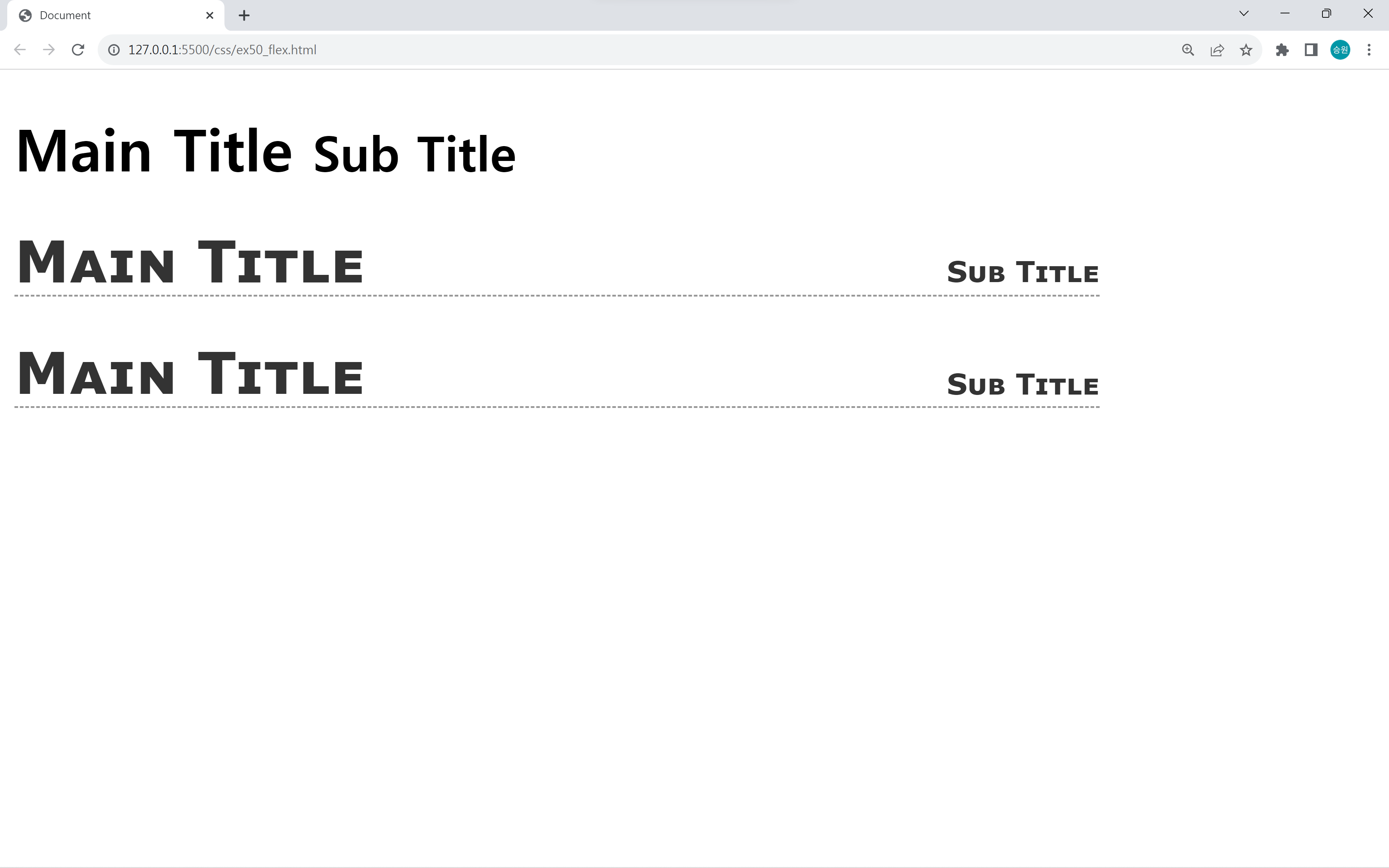
제목을 만들 때, float와 display: flex로 구현할 수 있다.
<body>
    <h1 id="title">Main Title <b>add</b> <small>Sub Title</small></h1>
    <h1 id="title1">Main Title <b>add</b> <small>Sub Title</small></h1>
    <h1 id="title2">Main Title <b>add</b><small>Sub Title</small></h1>
</body>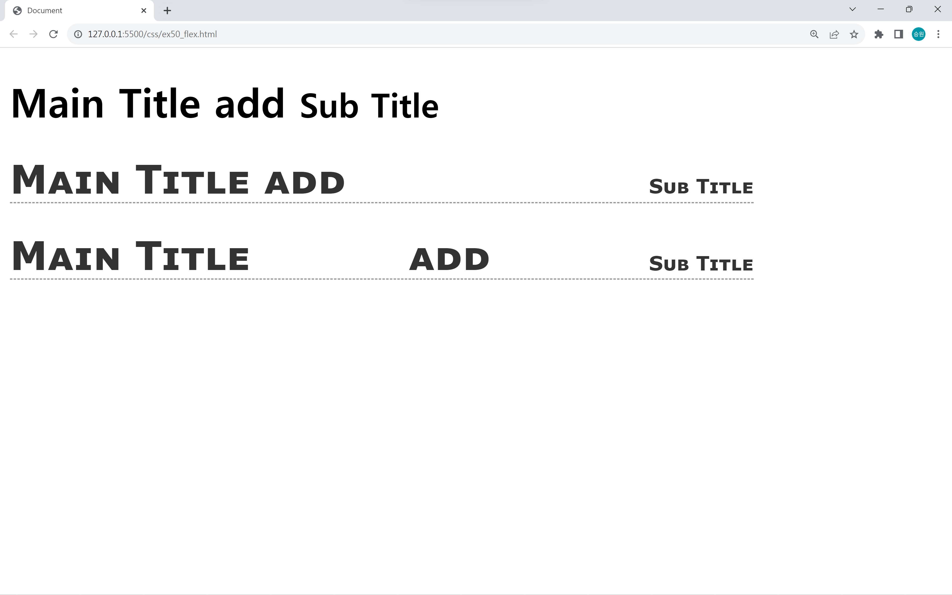
float와 display: flex로 구현한 게 같아 보이지만, 추가 요소가 들어갔을 때 차이가 있다.
부모와 자식 정렬
<!DOCTYPE html>
<html lang="en">
<head>
    <meta charset="UTF-8">
    <meta name="viewport" content="width=device-width, initial-scale=1.0">
    <title>Document</title>
<style>
    #parent {
        width: 500px;
        height: 500px;
        background-color: gold;
        display: flex;
        justify-content: center;
        align-items: center;
    }

    #child {
        width: 100px;
        height: 100px;
        background-color: cornflowerblue;
    }
</style>
</head>
<body>
    <h1>또 다른 내용물</h1>
    <h1>또 다른 내용물</h1>
    <hr>
    <div id="parent">
        <div id="child"></div>
    </div>
    <hr>
    <h1>또 다른 내용물</h1>
    <h1>또 다른 내용물</h1>
</body>
</html>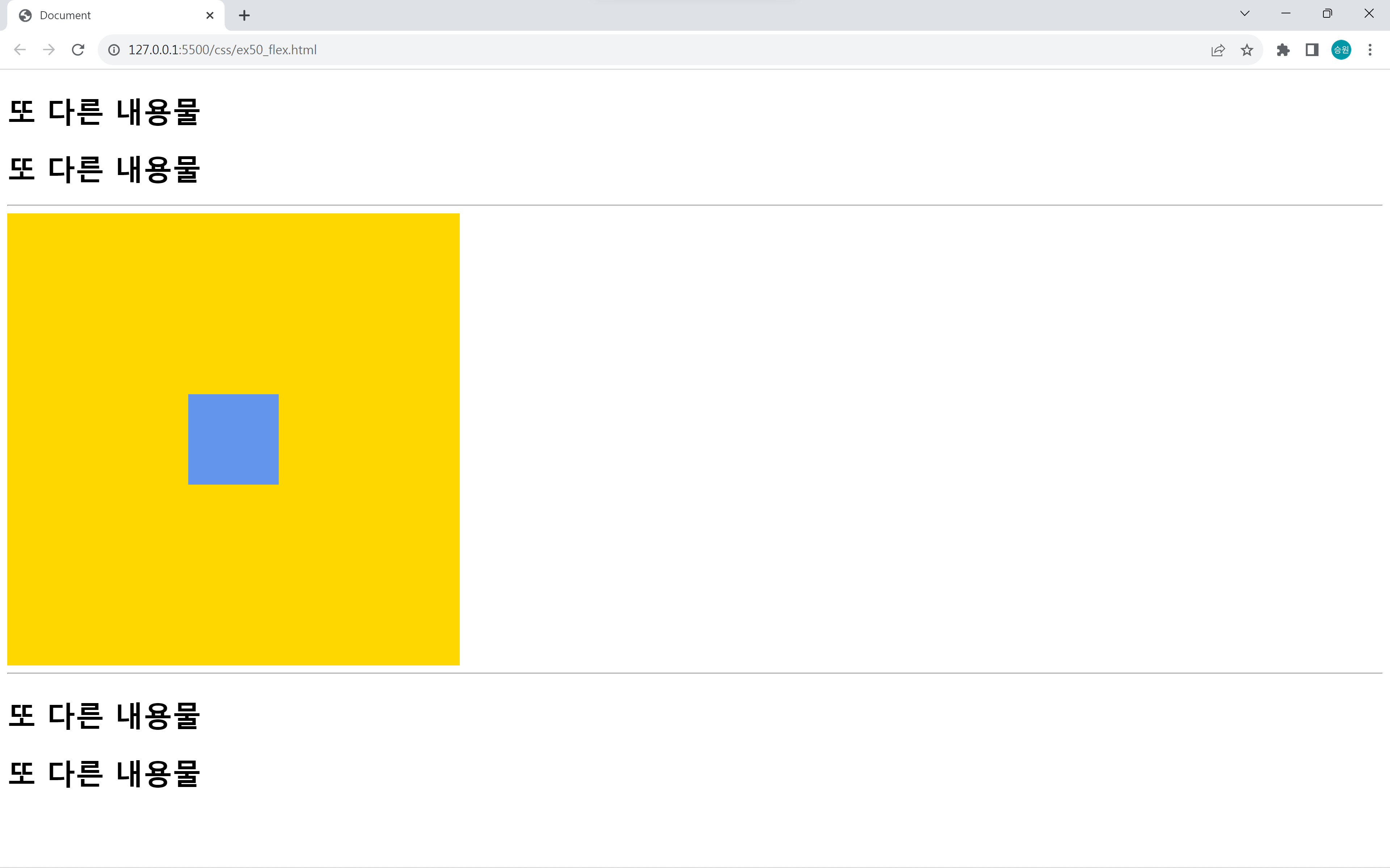
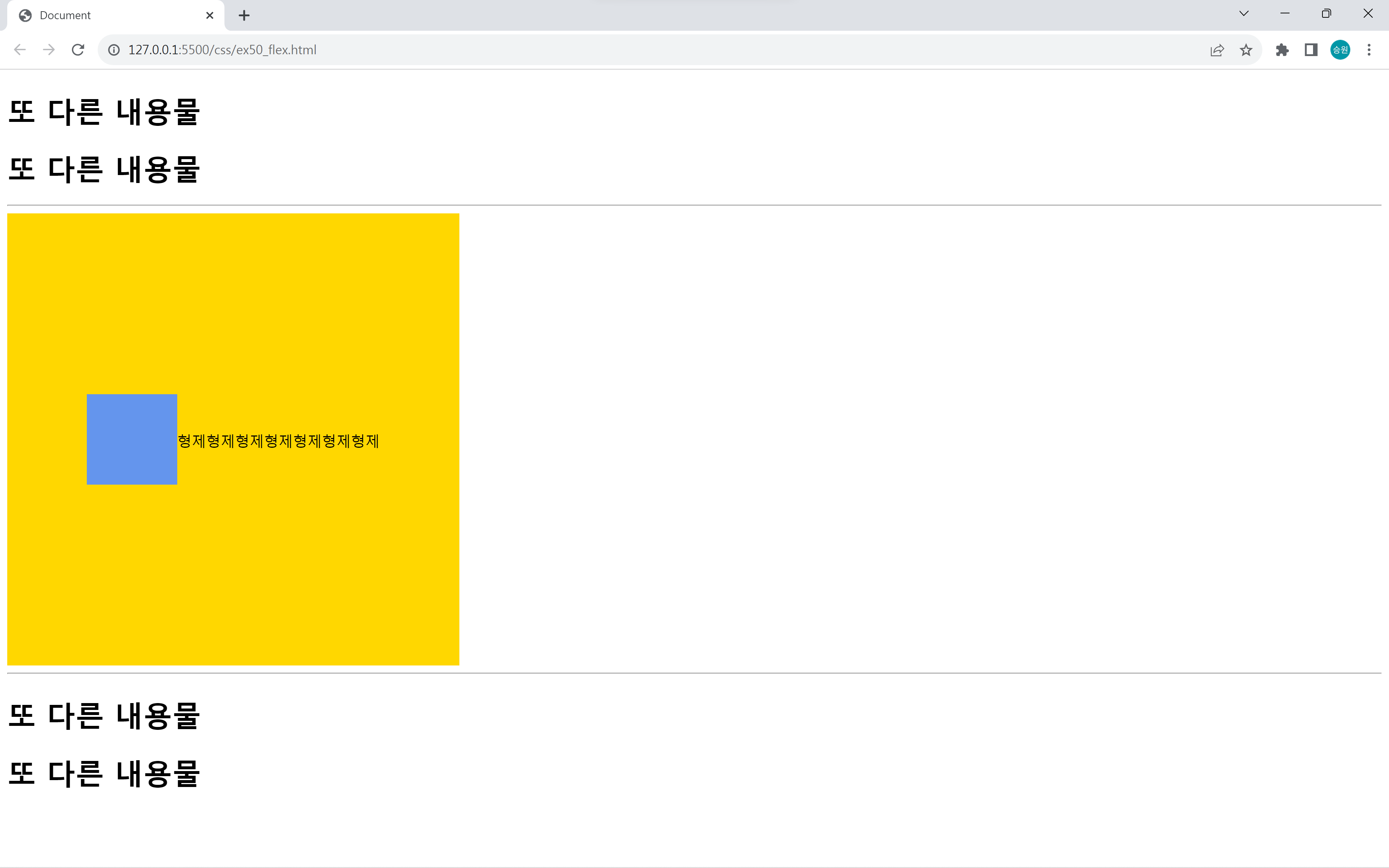
무언가를 정렬할 때에는 flex를 사용하는 게 좋다.
만약 형제가 생기면 자연스럽게 옆에 내용이 추가된다.
Flexbox Froggy
Flexbox Froggy
A game for learning CSS flexbox
flexboxfroggy.com
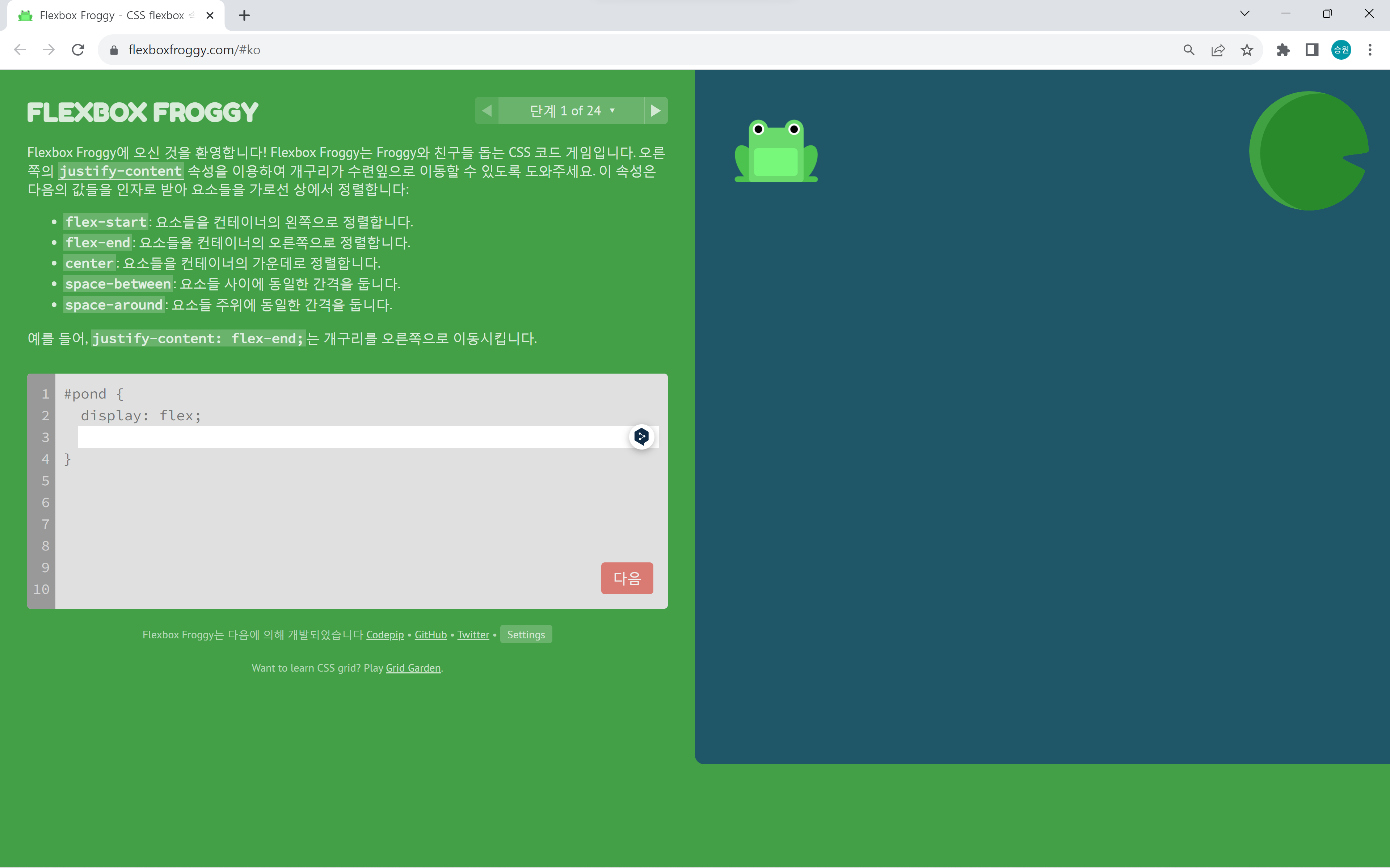
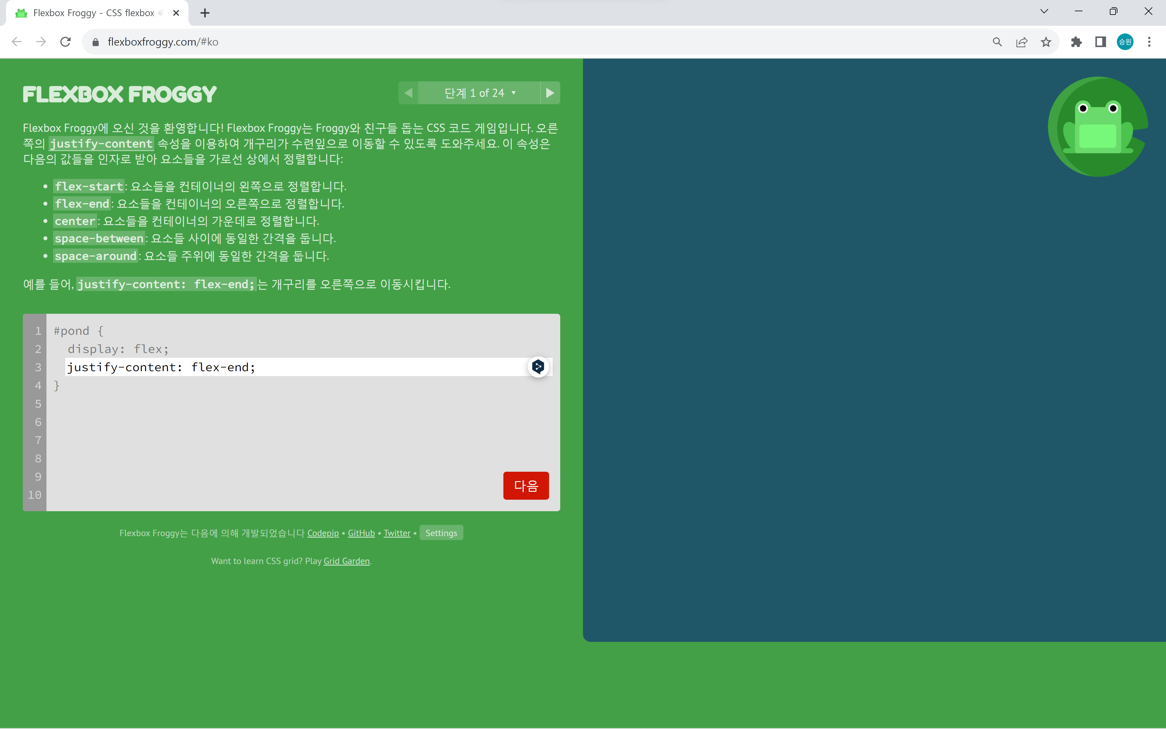
Flexbox Froggy는 개구리들을 연잎 위로 올리는 게임이다.