[CSS] display: grid (레이아웃)
🍁display: grid
grid는 표의 다른 말이라고 봐도 된다.
아래는 grid에 대한 예시이다.
https://www.printablee.com/post_10-by-10-grids-printable_402493/
10 Best 10 By 10 Grids Printable - printablee.com
What is a Number Grid? Number grids are square grids worksheets that have rows and columns with numbers arranged in them. Well, all the numbers in the row and column have a relationship with each other. So, actually, the main concept of the number grid is
www.printablee.com
🍁display: grid의 사용
<!DOCTYPE html>
<html lang="en">
<head>
    <meta charset="UTF-8">
    <meta name="viewport" content="width=device-width, initial-scale=1.0">
    <title>Document</title>
    <style>
        #box {
            display: grid;
            /* grid-template-rows: ; */
            /* grid-template-columns: ; */
            grid-template-rows: 100px 100px;
            grid-template-columns: 100px 100px 100px;
        }

        #box .item:nth-child(1) { background-color: tomato; }
        #box .item:nth-child(2) { background-color: orange; }
        #box .item:nth-child(3) { background-color: gold; }
        #box .item:nth-child(4) { background-color: greenyellow; }
        #box .item:nth-child(5) { background-color: cornflowerblue; }
        #box .item:nth-child(6) { background-color: violet; }
    </style>
</head>
<body>
    <div id="box">
        <div class="item">A</div>
        <div class="item">B</div>
        <div class="item">C</div>
        <div class="item">D</div>
        <div class="item">E</div>
        <div class="item">F</div>
    </div>
</body>
</html>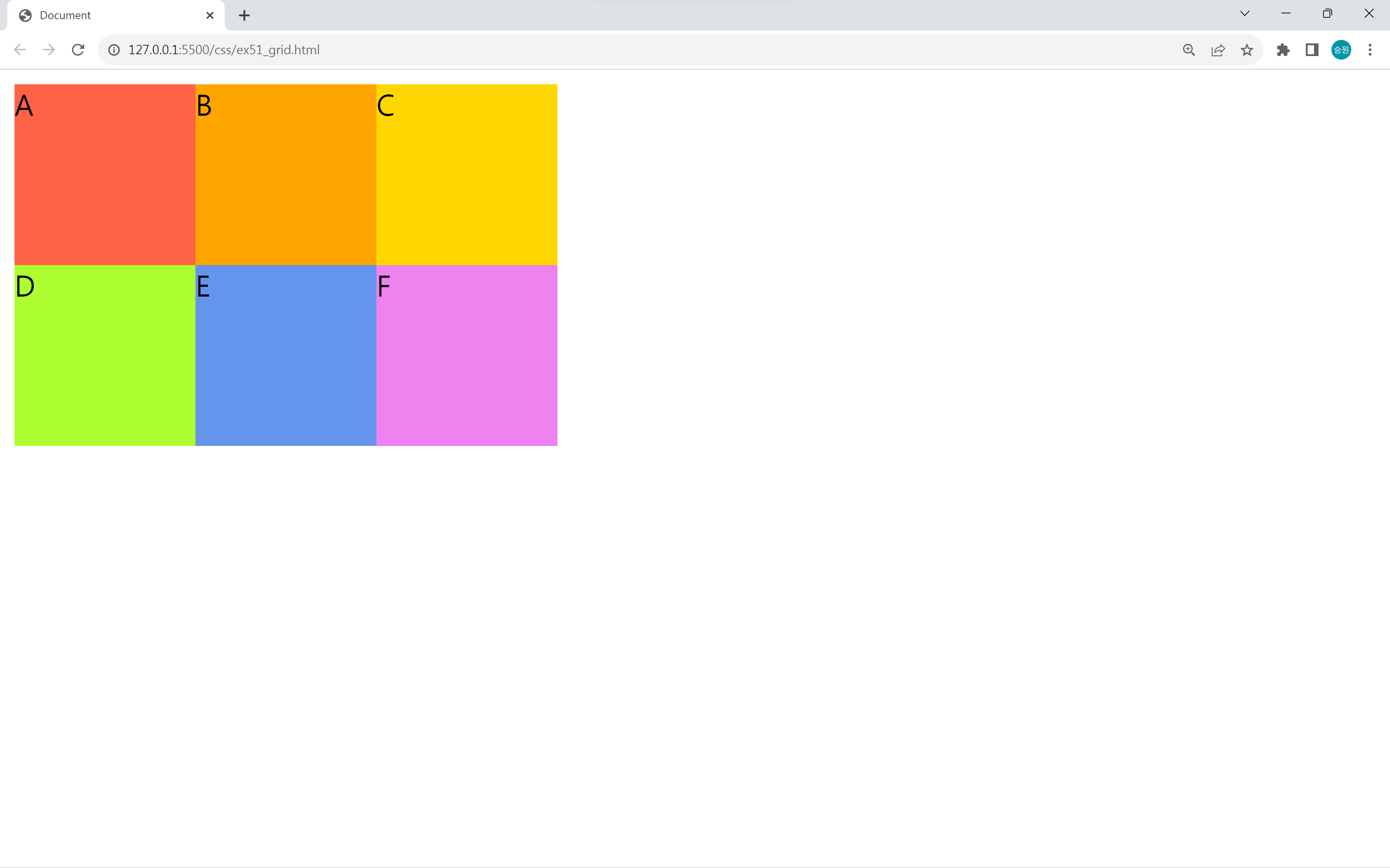
<style>
    #box {
        display: grid;
        /* grid-template-rows: ; */
        /* grid-template-columns: ; */
        grid-template-rows: 200px 200px;
        grid-template-columns: 100px 100px;
    }
</style>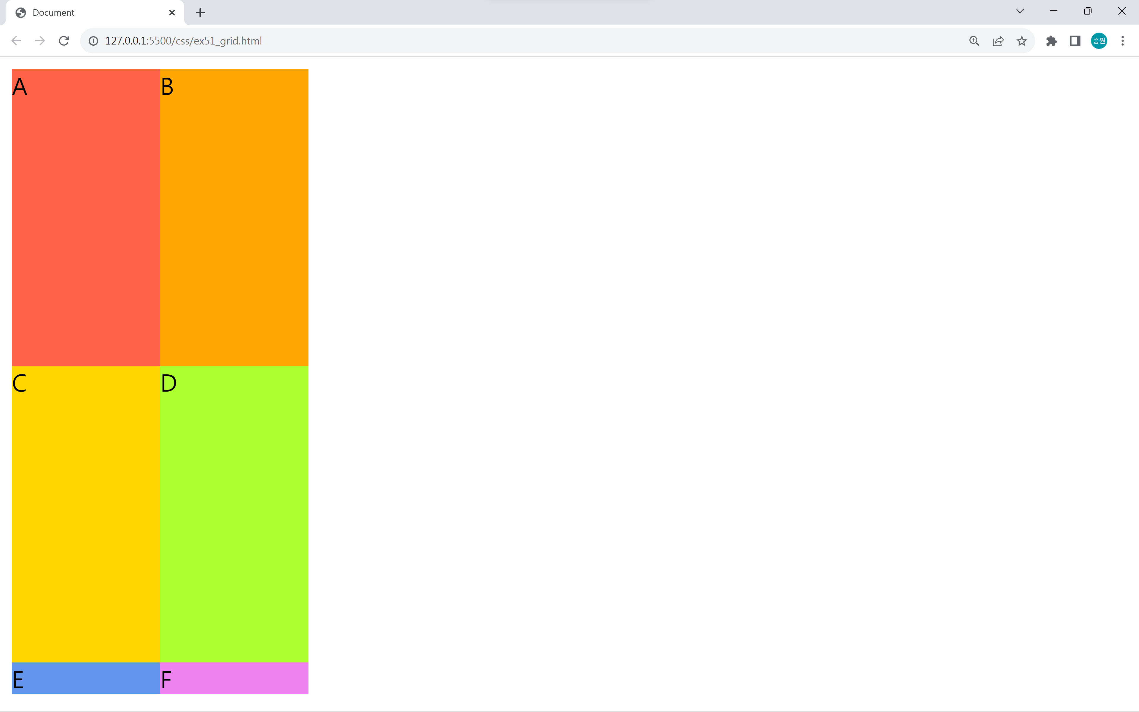
grid는 정의된 요소에 대해서만 지정되며, 정의하지 않으면 auto로 지정한다.
위 코드에서는 E와 F의 높이가 지정되지 않았기 때문에 auto로 설정된 상태이다.
repeat 함수 사용
<style>
    #box {
        display: grid;
        grid-template-rows: repeat(2, 100px);
        grid-template-columns: repeat(3, 100px);
    }
</style>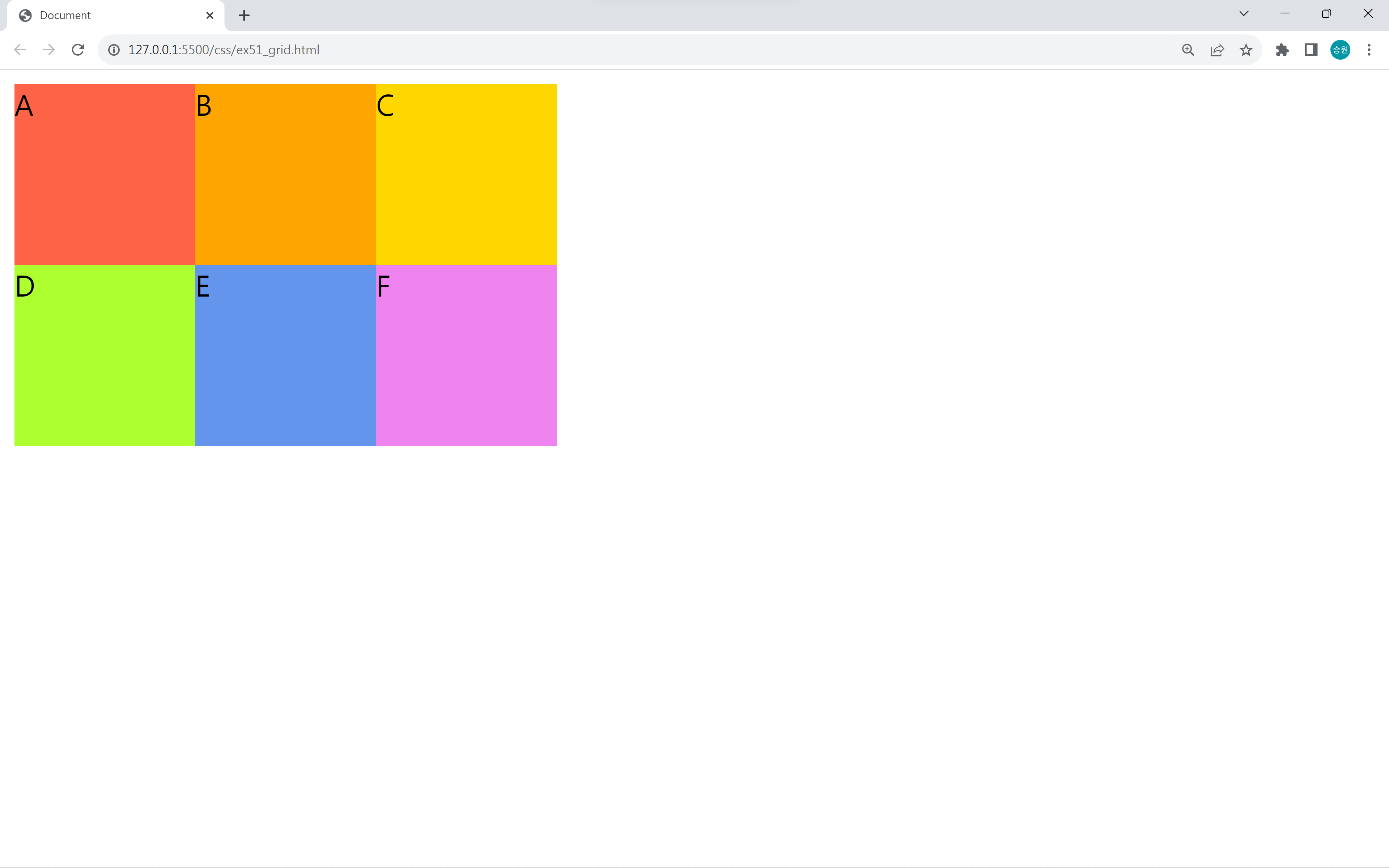
repeat 함수로 너비 또는 높이를 얼마나 반복하여 지정할지를 정해줄 수 있다.
이때 모든 박스의 너비 또는 높이가 동일할 때에만 사용할 수 있다.
fr(fraction) 사용
<style>
    #box {
        /* fraction */
        height: 200px;
        grid-template-rows: 2fr 1fr;
        grid-template-columns: 2fr 1fr 1fr;
    }
</style>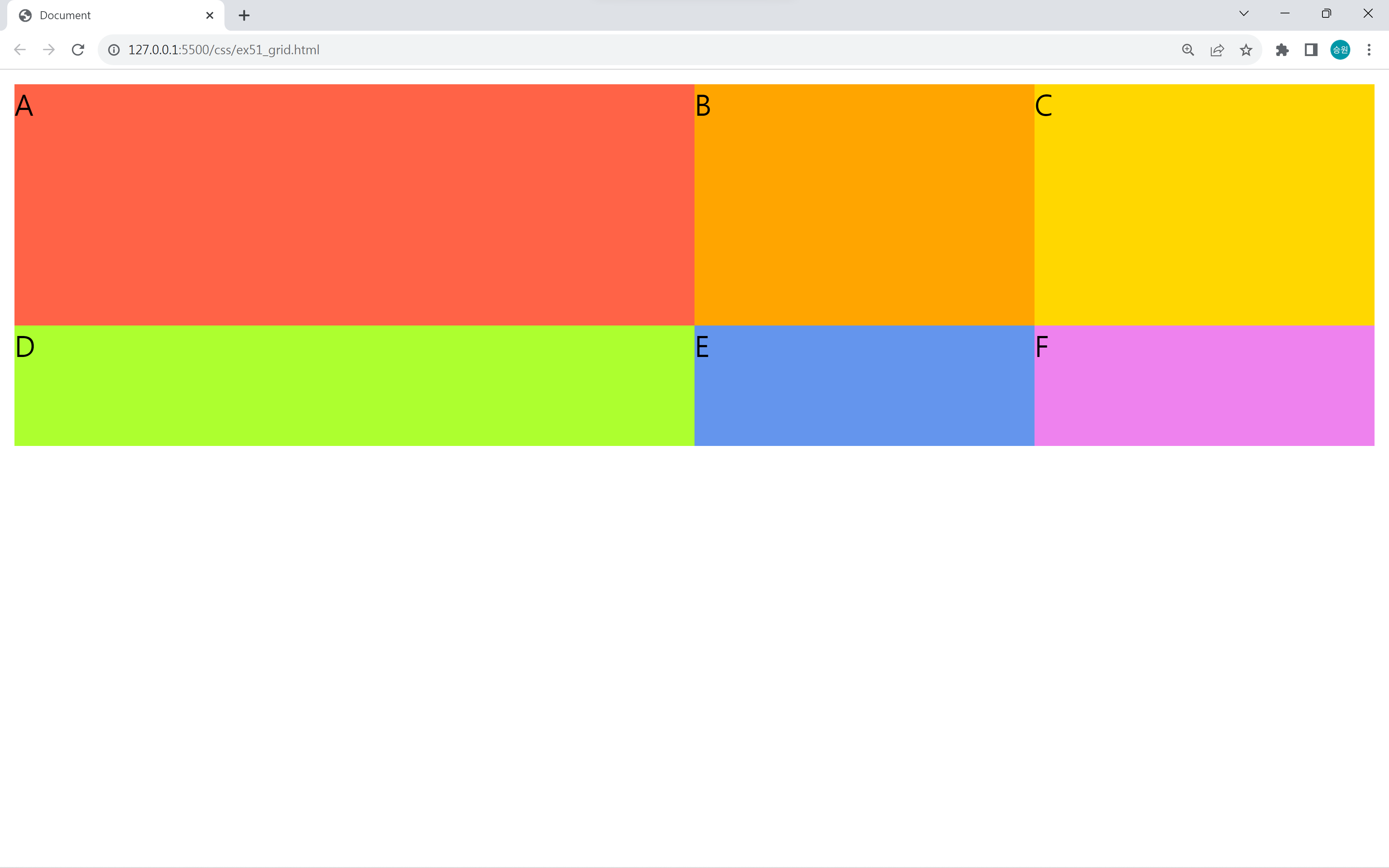
fr로 지정하면 균등 분배(1대 1, 1대 1대 1)하여 크기를 지정할 수 있다.
백분율 단위로도 지정할 수 있다.
<style>
    #box {
        display: grid;
        grid-template-columns: 120px repeat(3, 1fr) 2fr 10%;
    }
</style>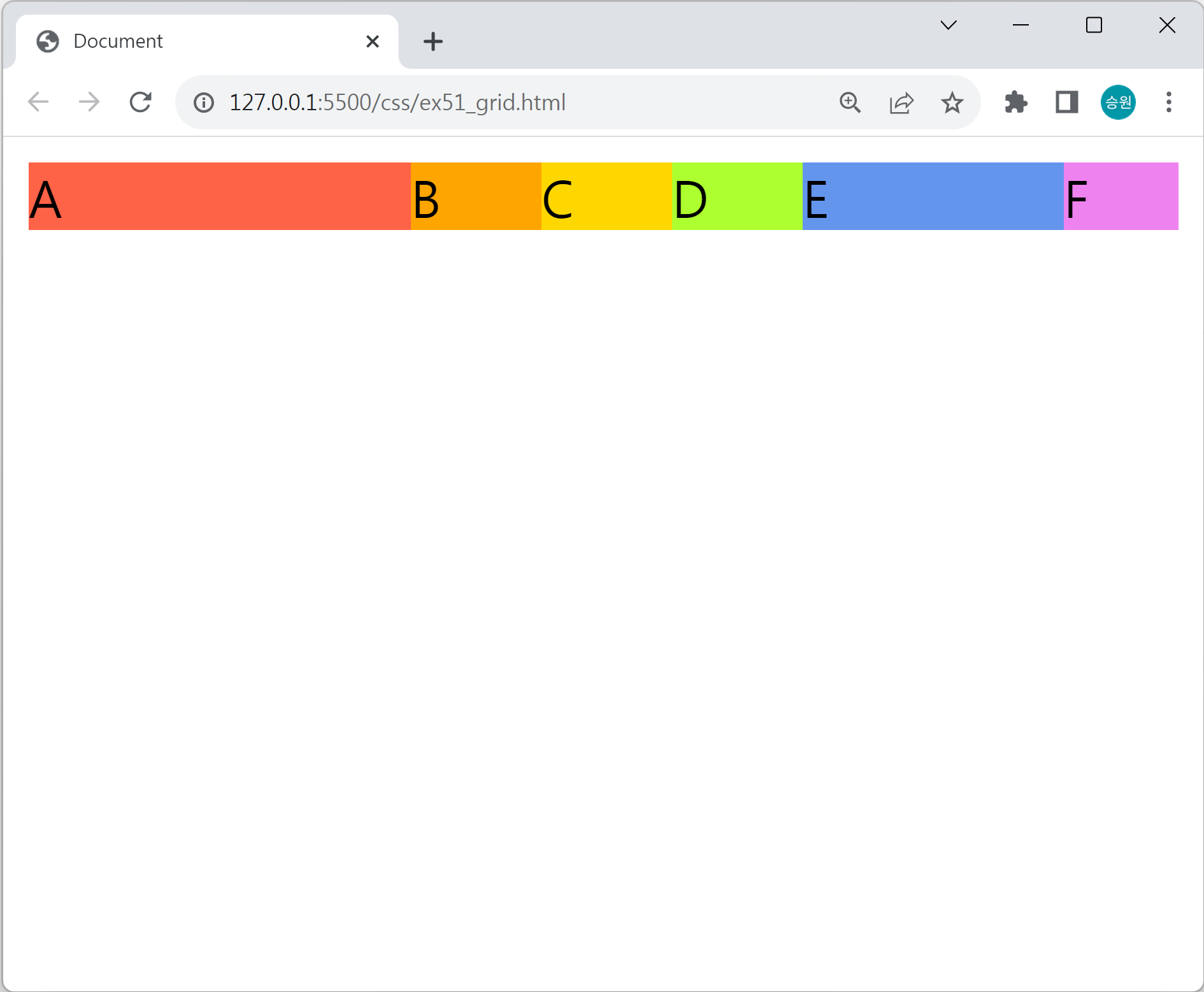
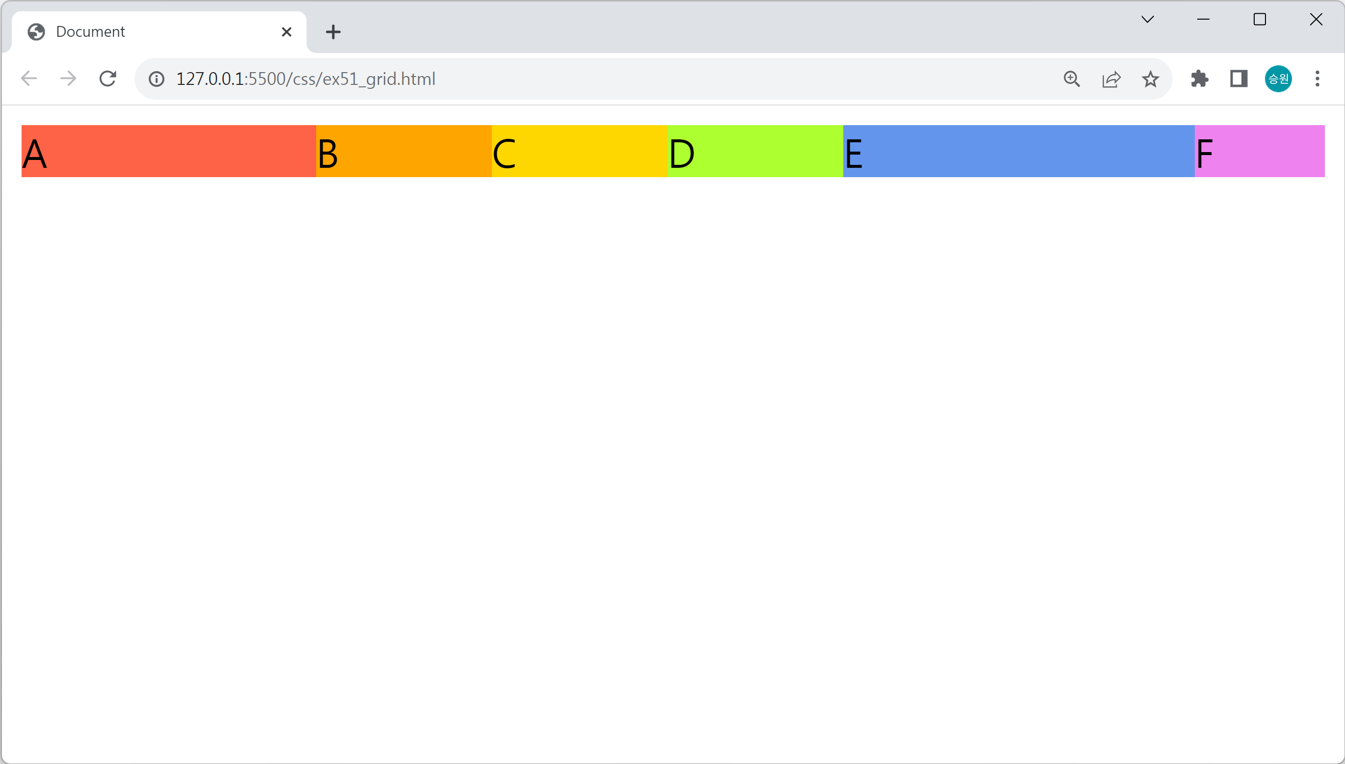
위의 속성을 모두 혼합하여 사용할 수 있다.
셀 병합 작업
<style>
    #box {
        display: grid;
        grid-template-rows: 100px 100px;
        grid-template-columns: repeat(4, 1fr);
    }
</style>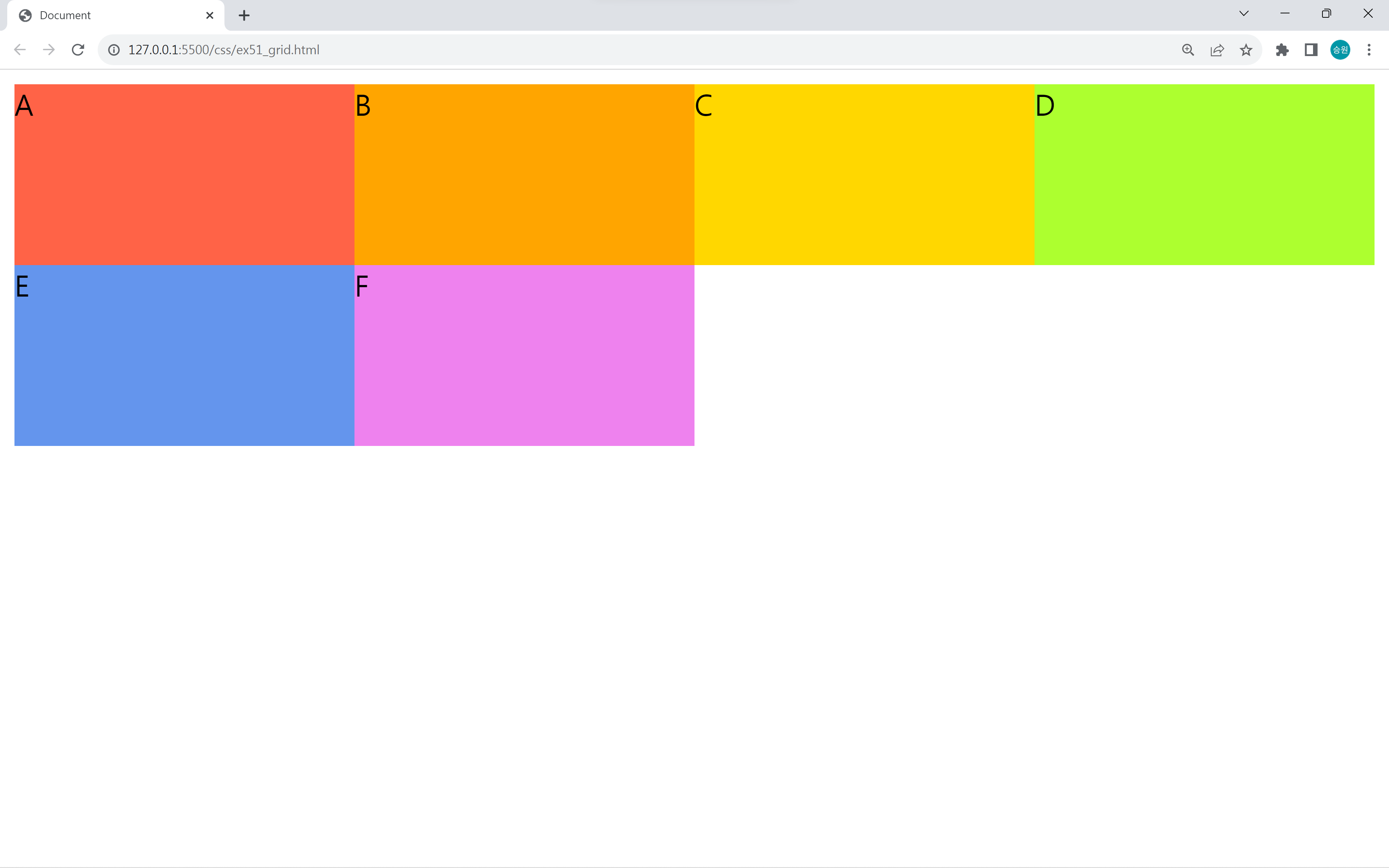
2행 4열의 grid를 만들었다. 그런데 공간이 남는다.
개인 셀에 대한 셀 병합 비슷한 작업을 해서 빈 공간을 채워보자.
grid-line

gird에는 눈에 보이지는 않지만 grid-line이라는 게 있다.
grid-line에는 각 경계선마다 위와 같이 행렬에 번호가 매겨져 있다.
gird-column, grid-row 사용
#box .item:nth-child(1){
    grid-column: 1/3;
    grid-row: 1/3;
}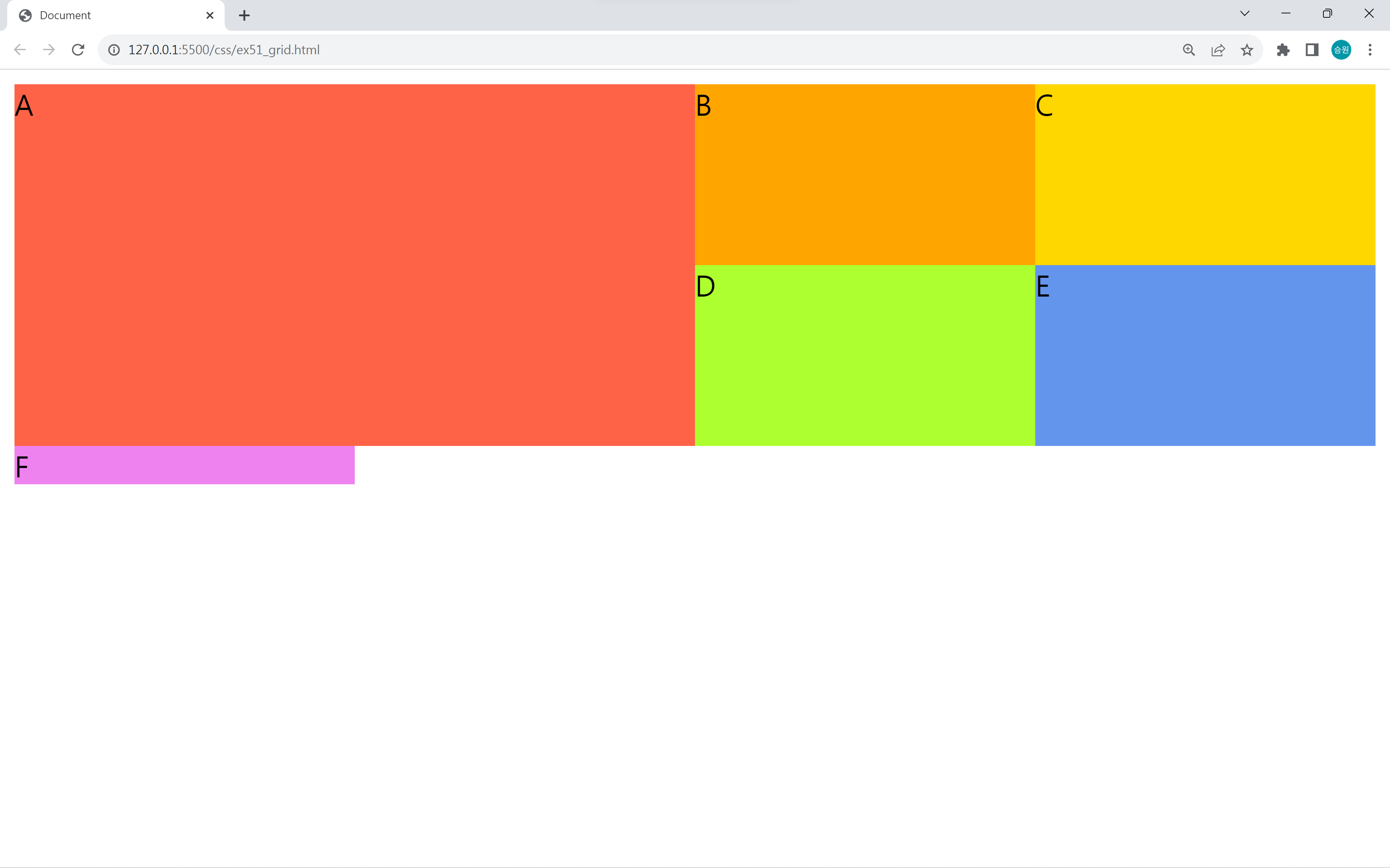
1/3은 1번부터 3번까지 셀병합을 하라는 의미이다.
span 사용
#box .item:nth-child(1){
    grid-column-end: span 3;
}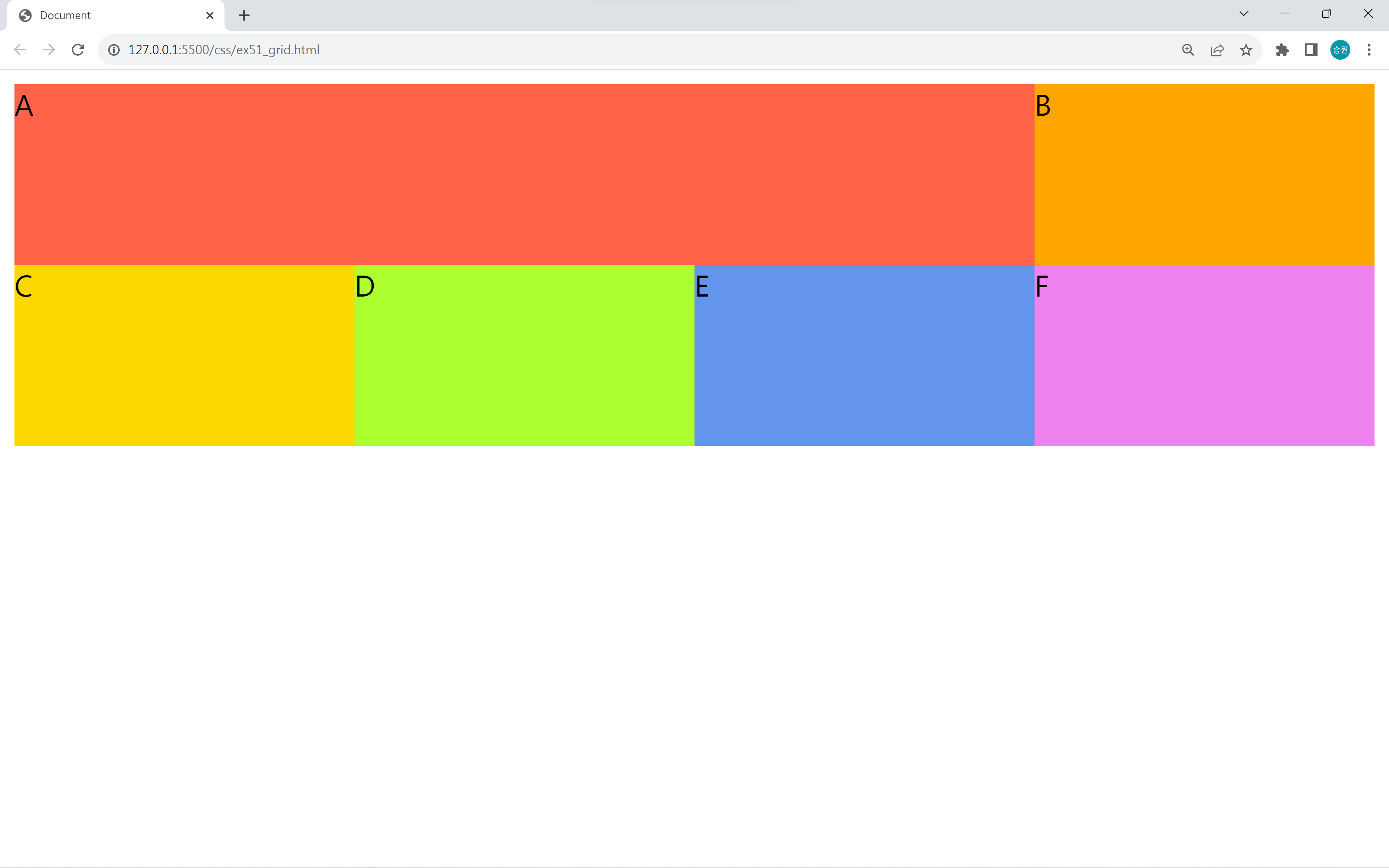
grid-column, grid-row를 이용하는 방법 또는 span을 이용하는 방법으로 셀 병합을 할 수 있다.
🍁display: grid의 활용
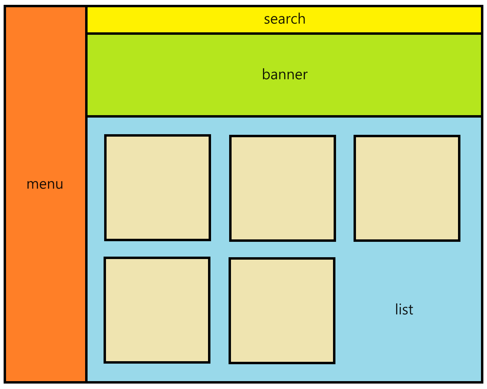
위와 같은 형식으로 grid를 만들고, 화면을 구현해 보도록 하자.
<!DOCTYPE html>
<html lang="en">
<head>
<meta charset="UTF-8">
<meta name="viewport" content="width=device-width, initial-scale=1.0">
<title>Document</title>
<style>
html, body {
margin: 0;
padding: 0;
}
main {
display: grid;
grid-template-rows: 50px 200px auto;
grid-template-columns: 200px minmax(800px, 1fr); /* minmax 콘텐츠가 작아질 수 있는 최소치 지정 */
height: 100vh; /* viewport-height: 브라우저 창 만큼의 채우기 */
}
#menu {
background-color: orange;
grid-row: 1/4;
text-align: center;
}
#menu > h1 {
color: white;
}
#menu > hr { /* 가장 가는 선 */
border: 0;
border: 1px dashed white;
}
#menu > ul {
padding: 0;
color: white;
}
#menu > div {
color: white;
font-size: 14px;
padding: 20px;
}
#search {
background-color: yellow;
display: flex; /* 콘텐츠 정렬 */
justify-content: center; /* 콘텐츠 정렬 */
align-items: center; /* 콘텐츠 정렬 */
}
#search input[type=text] {
border: 1px solid cornflowerblue;
width: 430px;
padding: 5px;
outline: none;
}
#search button {
width: 100px;
height: 27.2px;
border: 1px solid cornflowerblue;
background-color: yellow;
}
#banner {
background-color: green;
}
#banner > img {
object-fit: cover; /* 이미지 맞춤 */
width: 100%;
height: 100%;
}
#list {
background-color: skyblue;
display: grid;
grid-template-columns: repeat(4, 1fr);
grid-template-rows: repeat(2, 1fr);
gap: 20px; /* 콘텐츠 사이 간격 */
padding: 20px;
}
#list > div {
background-color: beige;
}
#list > div > img {
display: block; /* margin 속성을 주기 위한 block */
margin: 20px auto;
border: 3px solid white;
padding: 3px;
}
#list > div > div {
margin: 30px;
font-size: 14px;
color: #555;
}
/* 스마트폰 ~ 태블릿 세로 */
@media screen and (max-width: 768px){
main {
display: gfid;
grid-template-columns: 1fr;
grid-template-rows: 210px 50px 200px auto;
height: 100vh;
}
#menu {
grid-row: auto;
}
#menu ul {
display: flex;
justify-content: center;
margin: 0;
}
#menu li {
list-style-type: none; /* 불릿 없애기 */
margin: 0px 7px;
}
#menu hr {
display: none;
}
#list {
grid-template-columns: repeat(3, 1fr);
}
}
</style>
</head>
<body>
<main>
<div id="menu">
<h1>Study</h1>
<ul>
<li>Java</li>
<li>Oracle</li>
<li>HTML</li>
<li>CSS</li>
<li>JavaScript</li>
</ul>
<hr>
<ul>
<li>Class</li>
<li>Method</li>
<li>Interface</li>
<li>Property</li>
<li>Attribute</li>
</ul>
<hr>
<div>
©Copyright test.com<br>
All rights reserved.
</div>
</div>
<div id="search">
<input type="text">
<button>Search</button>
</div>
<div id="banner">
<img src="../../asset/images/gimbal.jpg">
</div>
<div id="list">
<div>
<img src="../../asset/images/rect_icon01.png" alt="">
<div>Lorem ipsum dolor sit amet consectetur adipisicing elit. Eum quasi commodi deleniti? Earum recusandae dolorem corporis obcaecati blanditiis esse fuga, quidem veritatis aliquid quibusdam mollitia odit modi quam rerum explicabo.</div>
</div>
<div>
<img src="../../asset/images/rect_icon02.png" alt="">
<div>Consequuntur repudiandae optio necessitatibus, amet officia quo eos fugit fuga eveniet mollitia obcaecati adipisci numquam nemo. Deleniti est quis voluptas odit corrupti assumenda molestiae enim voluptates. Neque sed tenetur unde.</div>
</div>
<div>
<img src="../../asset/images/rect_icon03.png" alt="">
<div>Quasi asperiores quas ab? Aliquid magnam quibusdam cum quaerat rem vitae aperiam tempore eum numquam repellat voluptatum, natus nisi possimus molestias aspernatur itaque provident ut a labore quod assumenda quos?</div>
</div>
<div>
<img src="../../asset/images/rect_icon04.png" alt="">
<div>Et veritatis rem vel vitae quae sit ullam obcaecati, illo ad dolores, est, provident optio qui! Deleniti sed illum, voluptatibus ad voluptates quisquam tenetur sapiente, ipsam nostrum totam officiis vitae!</div>
</div>
<div>
<img src="../../asset/images/rect_icon05.png" alt="">
<div>Dicta quis explicabo non odit et harum ipsa ducimus, laudantium perferendis! Voluptates velit suscipit dolorem, vero, sed maxime ex cumque a quia, fuga magni cupiditate doloremque placeat nemo distinctio id.</div>
</div>
<div>
<img src="../../asset/images/rect_icon06.png" alt="">
<div>Dolor voluptates rerum nobis, harum nemo impedit perferendis dolore dolores mollitia ut culpa aliquid similique delectus inventore sunt eos officia, commodi, ab hic repellendus placeat aspernatur sit! Similique, dolores saepe.</div>
</div>
</div>
</main>
</body>
</html>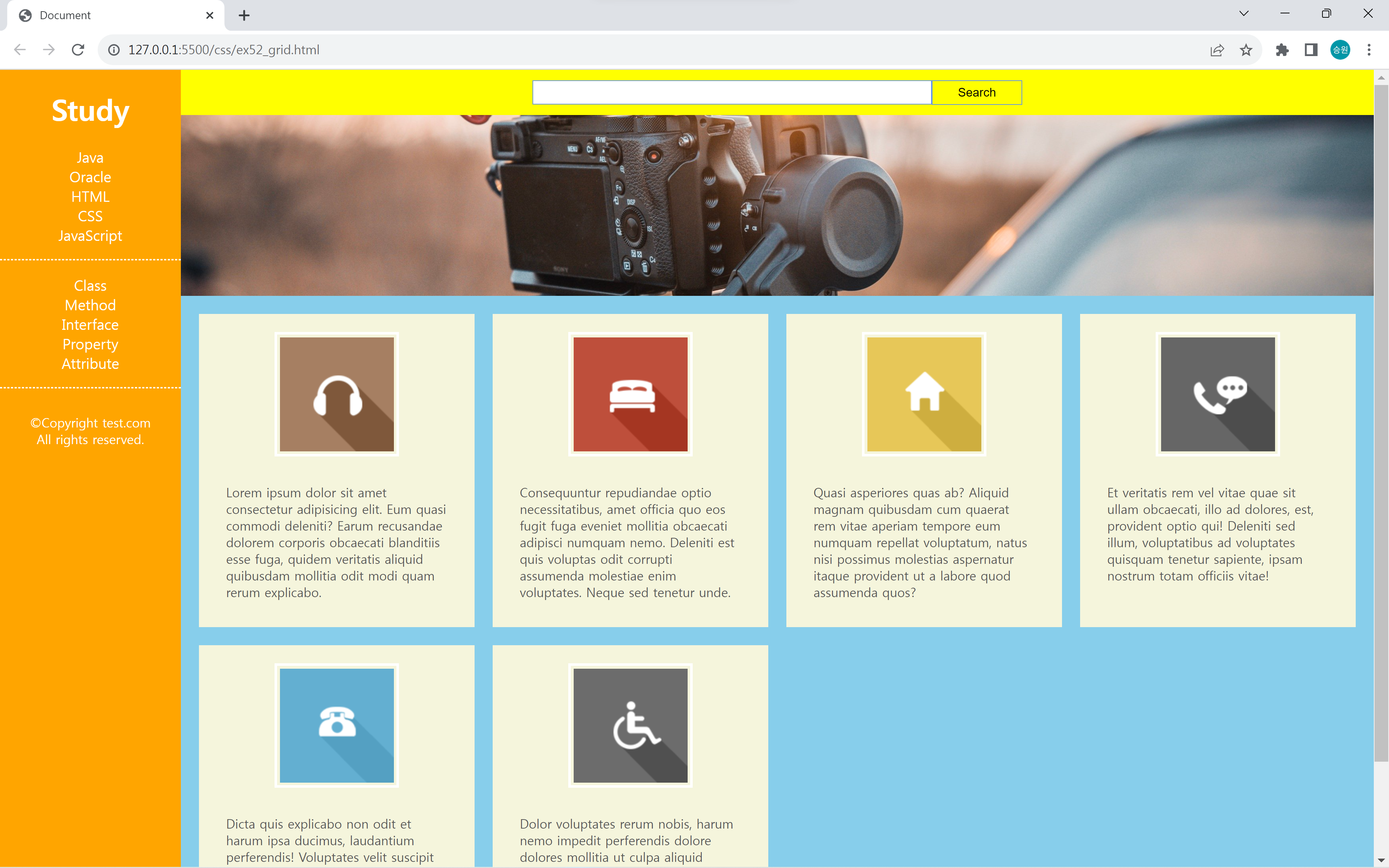
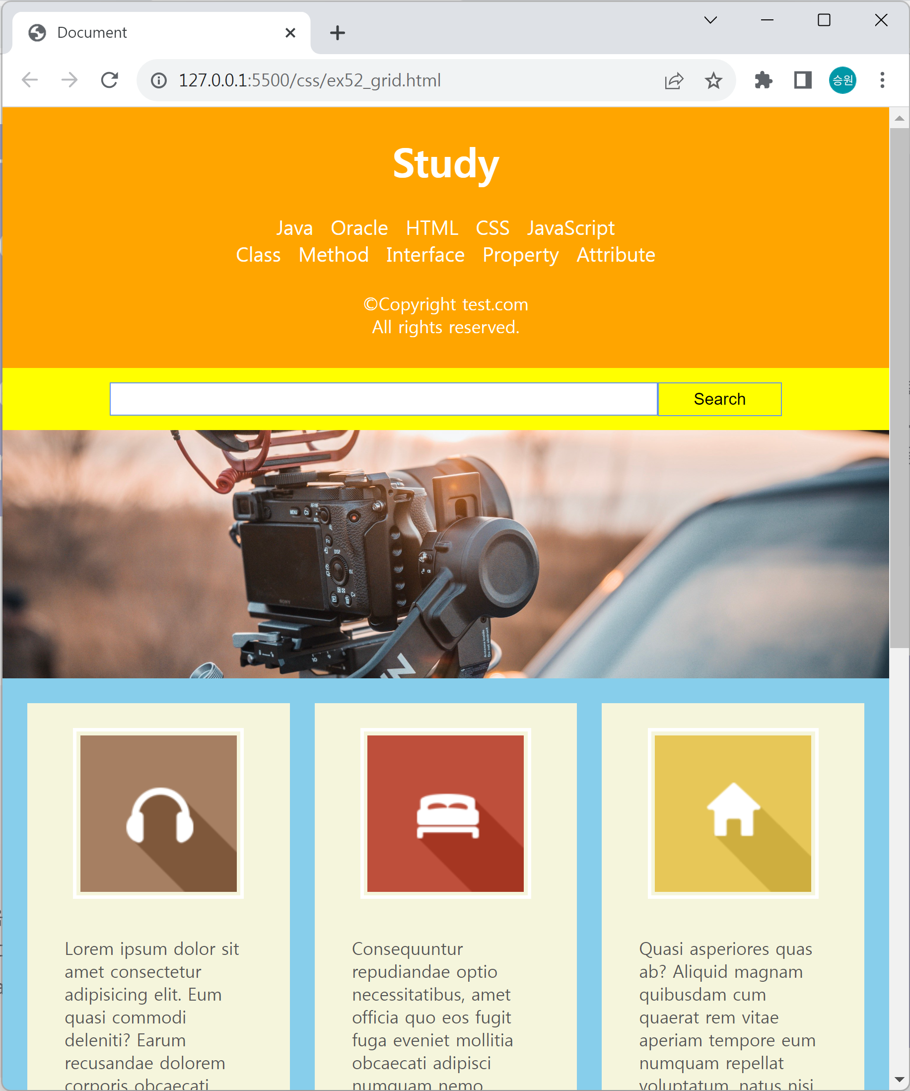
콘텐츠 사이 간격을 gap 속성으로 줄 수 있다.
minmax 함수로 콘텐츠가 작아질 수 있는 최소치와 커질 수 있는 최대치를 지정할 수 있다.
이때 최대치는 1fr로 균등 분배하였다.