[CSS] shadow (그림자)
🍁shadow
그림자 효과는 텍스트와 상자에 줄 수 있다.
그림자 효과를 적당히 주게 되면 요소 간에 더욱 명확하게 구분 지어 보이게 할 수 있다.
1. text-shadow
x y blur color 값을 부여한다.
x, y는 그림자 방향, blue 효과는 뿌옇게 만드는 것을 의미하며, color는 그림자의 색깔이다.
숫자가 작을수록 광원이 작아진다고 생각하면 된다.
<!DOCTYPE html>
<html lang="en">
<head>
    <meta charset="UTF-8">
    <meta name="viewport" content="width=device-width, initial-scale=1.0">
    <title>Document</title>
    <style>
        .box {
            margin: 20px;
        }
        #box1 {
            text-shadow: 2px 2px 2px #999;
        }
    </style>
</head>
<body>
    <!-- div#box$.box{상자$}*3 -->
    <div id="box1" class="box">상자1</div>
    <div id="box2" class="box">상자2</div>
    <div id="box3" class="box">상자3</div>
</body>
</html>
텍스트에 붙는 그림자이기 때문에 text-shadow라고 한다.
2. box-shadow
x y blur color 값을 부여한다.
#box2 {
    box-shadow: 2px 2px 3px #999;
}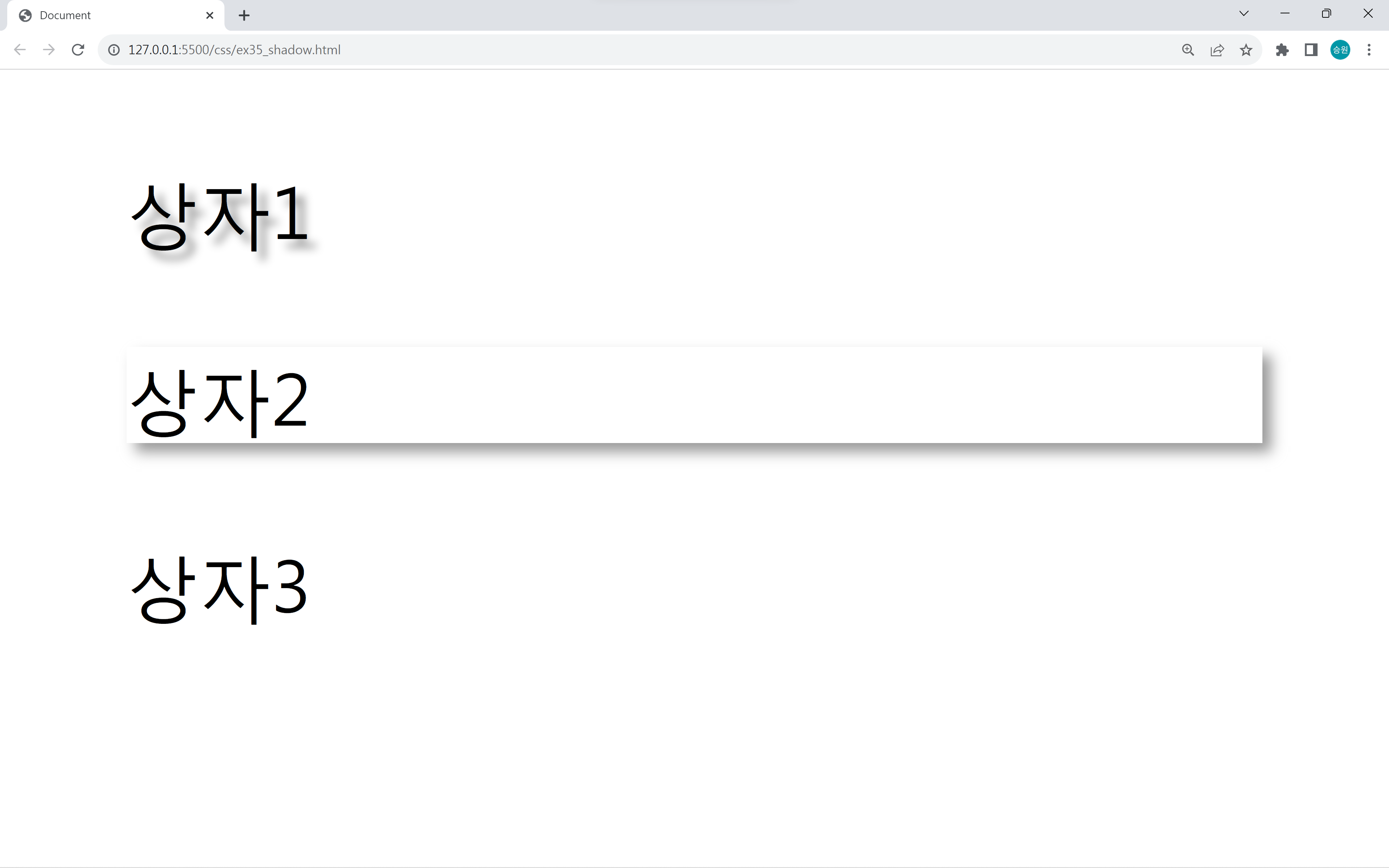
box-shadow는 텍스트가 아닌 박스 자체에 그림자가 생긴다.
🍁shadow 활용
Box Shadow CSS Generator
https://cssgenerator.org/box-shadow-css-generator.html
Box Shadow CSS Generator
A box-shadow CSS Generator tool to quickly generate box-shadow CSS declarations.
cssgenerator.org
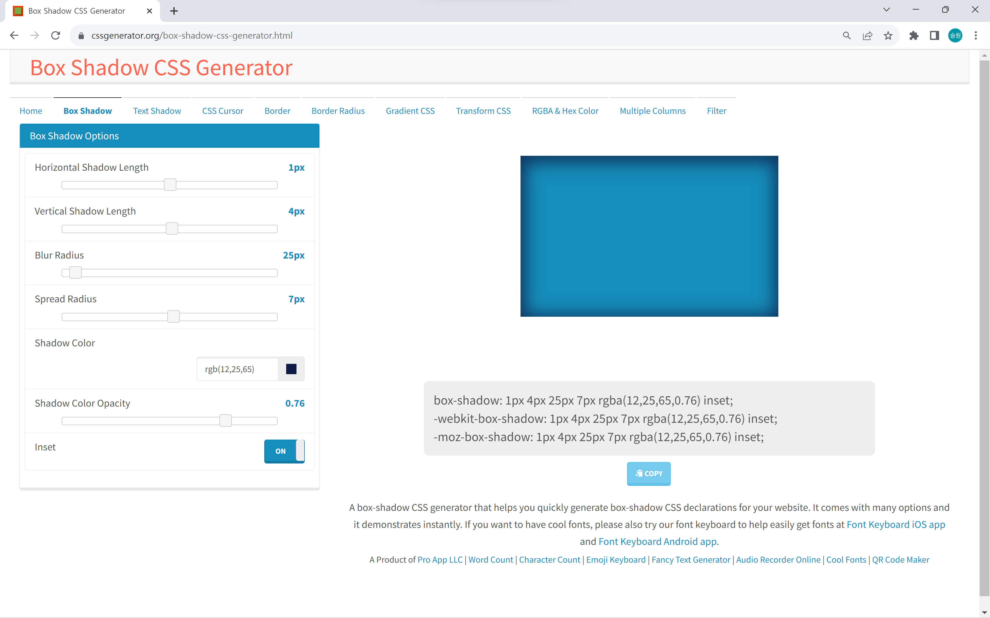
사이트에서 만들어질 shadow를 미리 확인해볼 수 있다.
개발자 도구
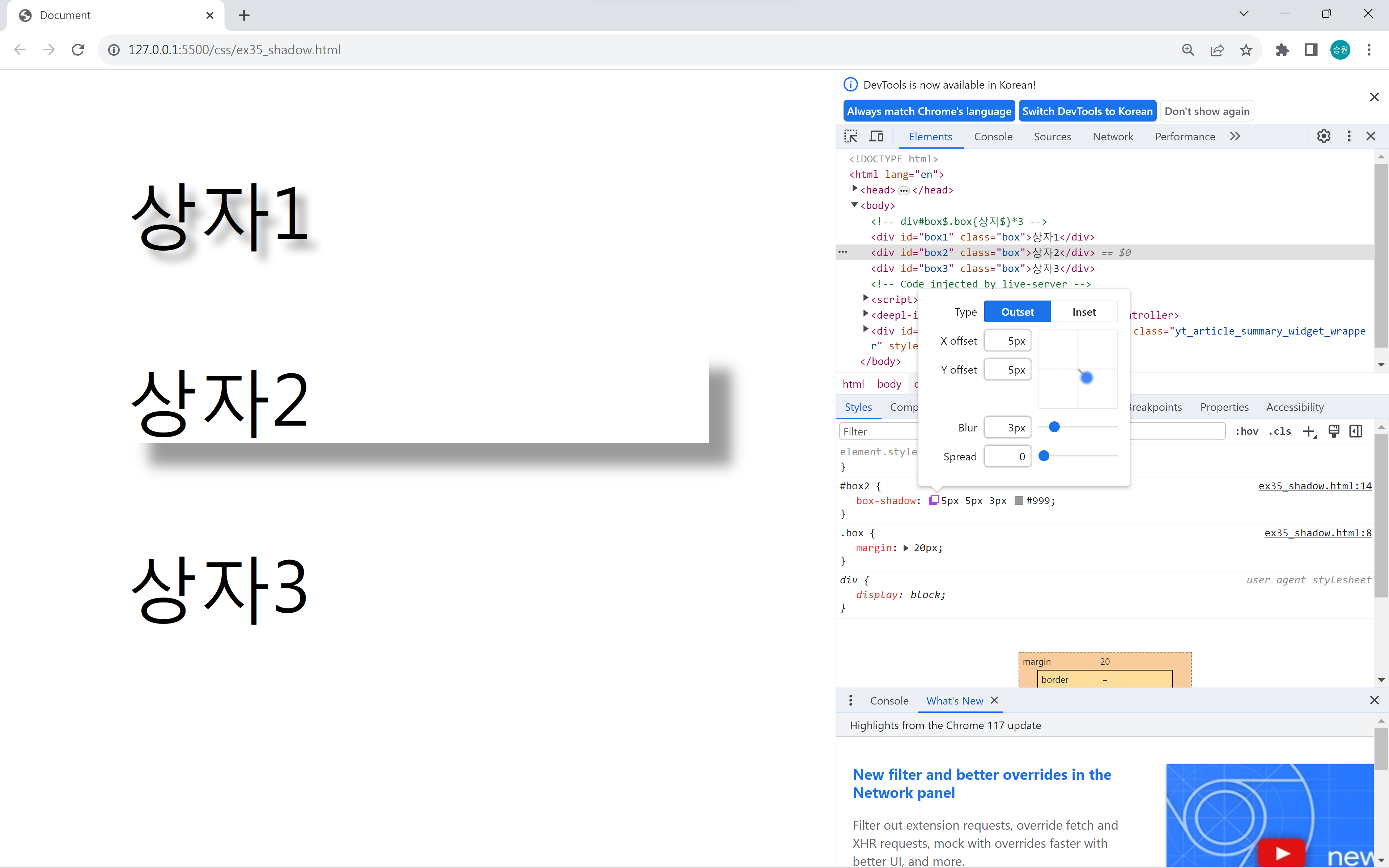

개발자 도구에서 위 아이콘을 클릭하여 그림자가 어떻게 만들어질지 테스트할 수 있다.
이때 수정한다고 해서 바로 소스에 적용되는 게 아니므로 복사해서 코드에 적을 수 있도록 한다.
css box shadow examples
https://getcssscan.com/css-box-shadow-examples
CSS Scan - The fastest and easiest way to check and copy CSS
Goodbye to "Inspect Element" — Visualize the CSS of any element you hover over, instantly, and copy its entire rules with a single click.
getcssscan.com
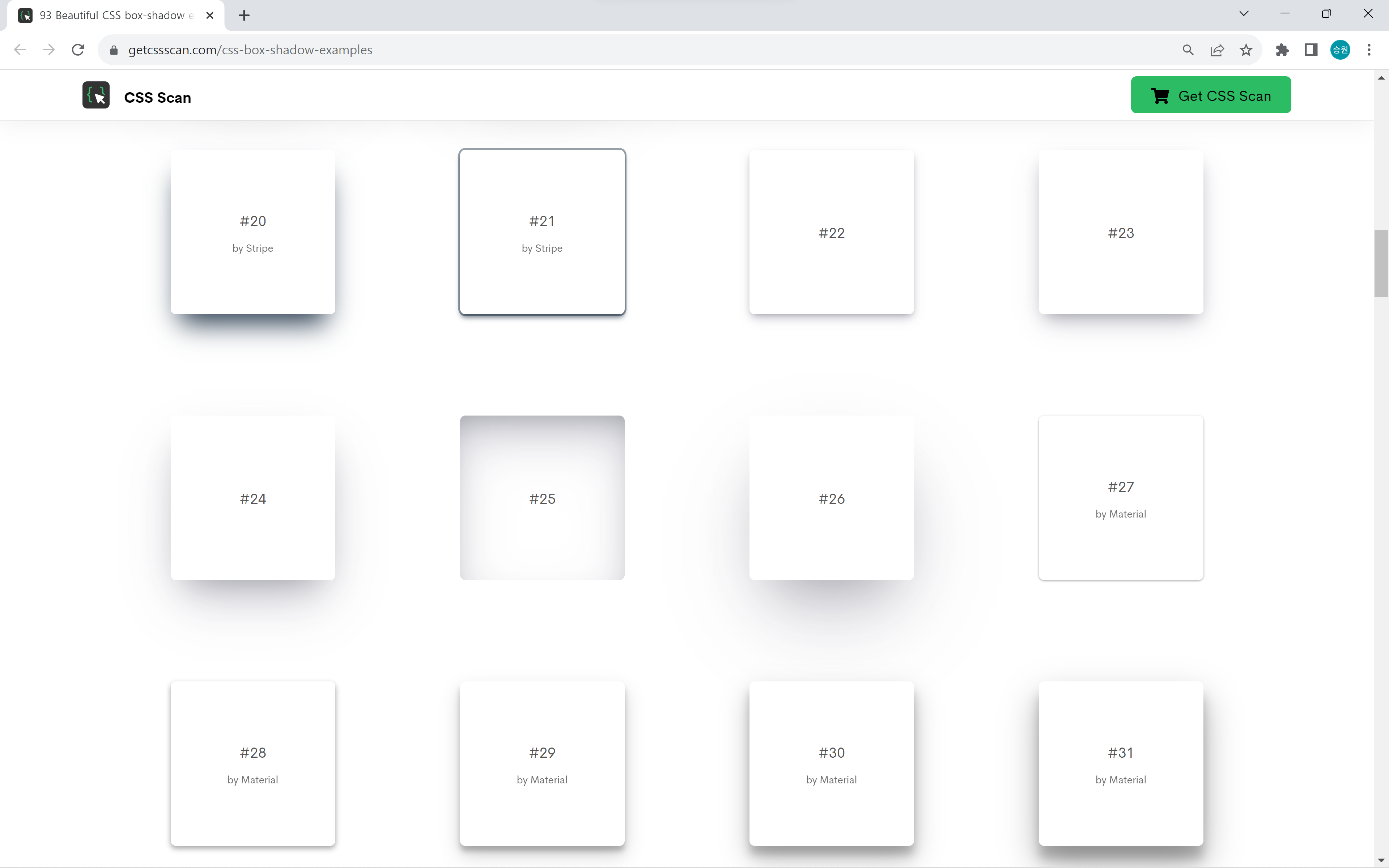
그림자를 sample 사이트에서 베이스를 깔고 추가로 구현하고 싶은 부분을 구현하는 게 좋다.
처음부터 만들려고 하면 시간이 오래 걸리기 때문에 이러한 도움을 받는 편이 좋다.