[CSS] transition (전환)
🍁transition
transition은 객체의 속성(상태) 값이 변화되는 과정을 시간 순서대로 보여주는 애니메이션 속성이다.
이 작업은 본래 JavaScript에서나 할 수 있는 것이었다. 하지만 지금은 CSS에서 간단하게 구현할 수 있다.
transition의 사용
<body>
    <div id="box">상자</div>
</body>
body {
padding-bottom: 500px; /* body의 영역을 넓힘 (margin은 객체의 영역이 아니므로 padding을 사용) */
}
#box {
border: 10px solid black;
width: 200px;
height: 200px;
background-color: gold;
margin: 100px;
transition-property: width;
transition-duration: 1s;
}
body:hover #box {
width: 600px;
}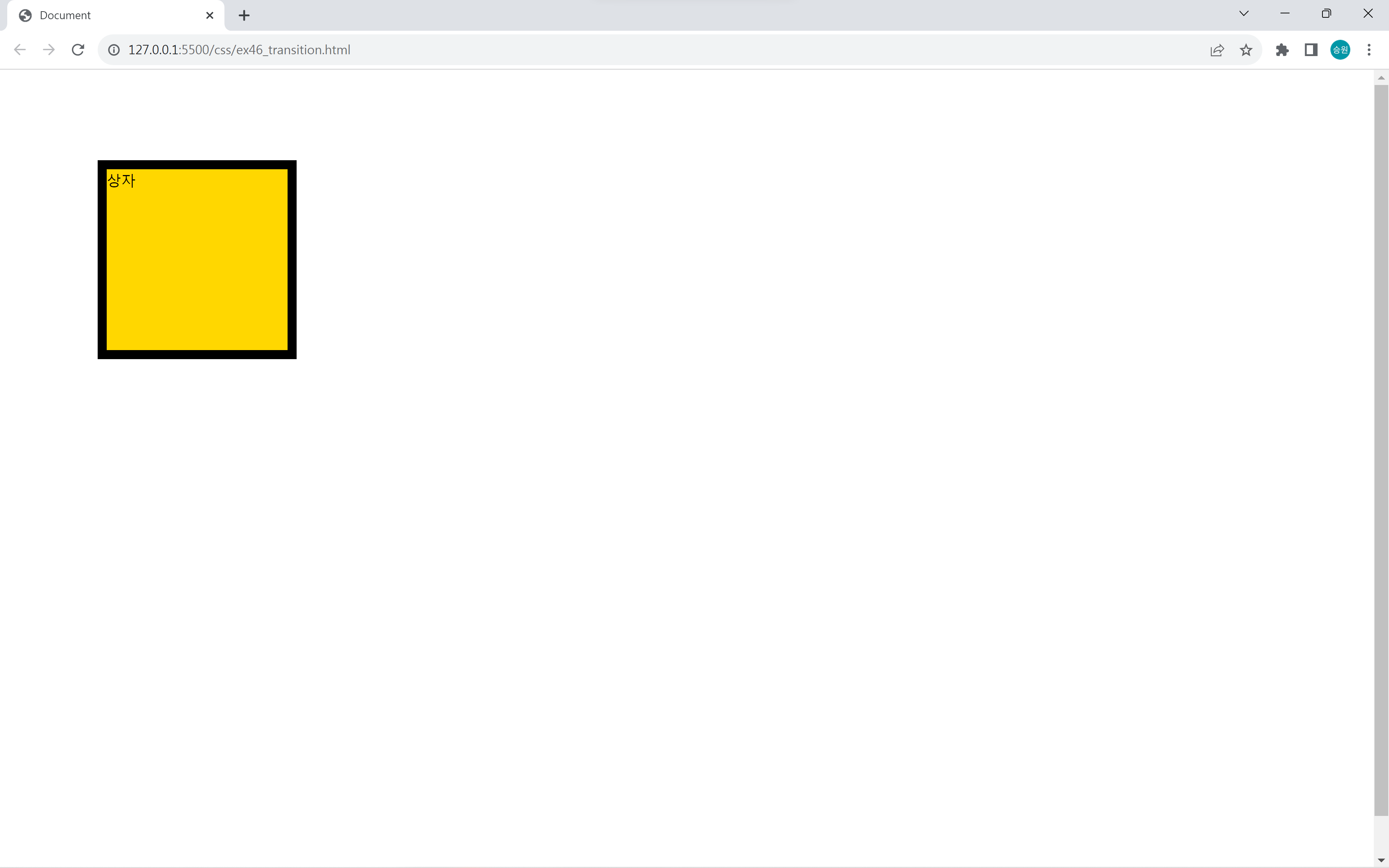
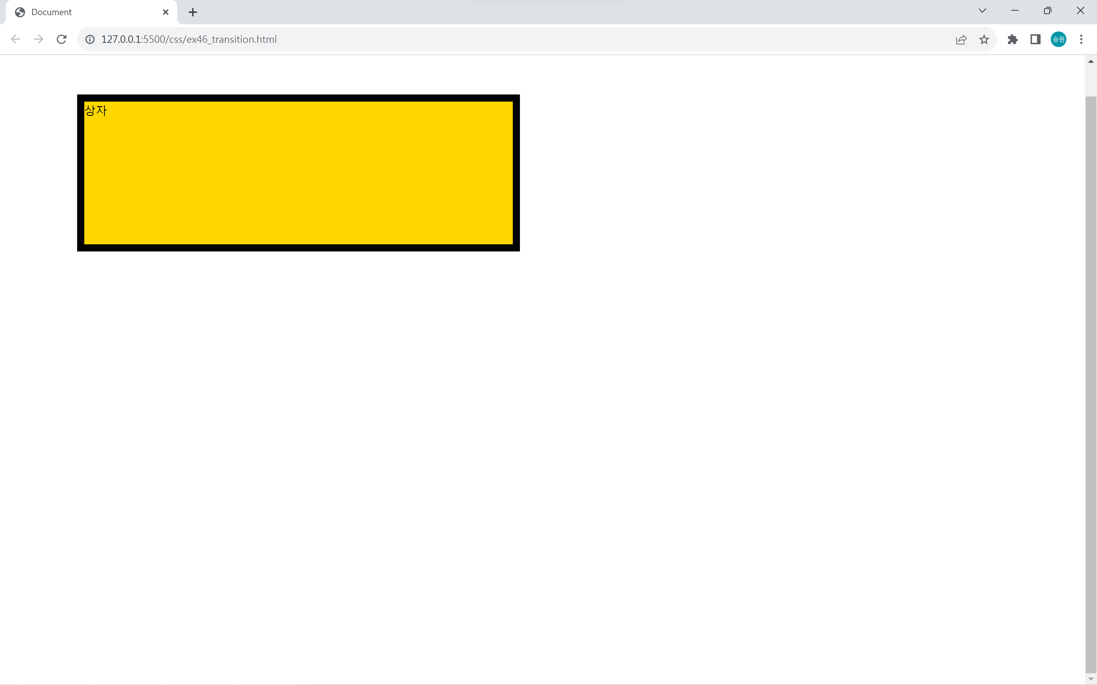
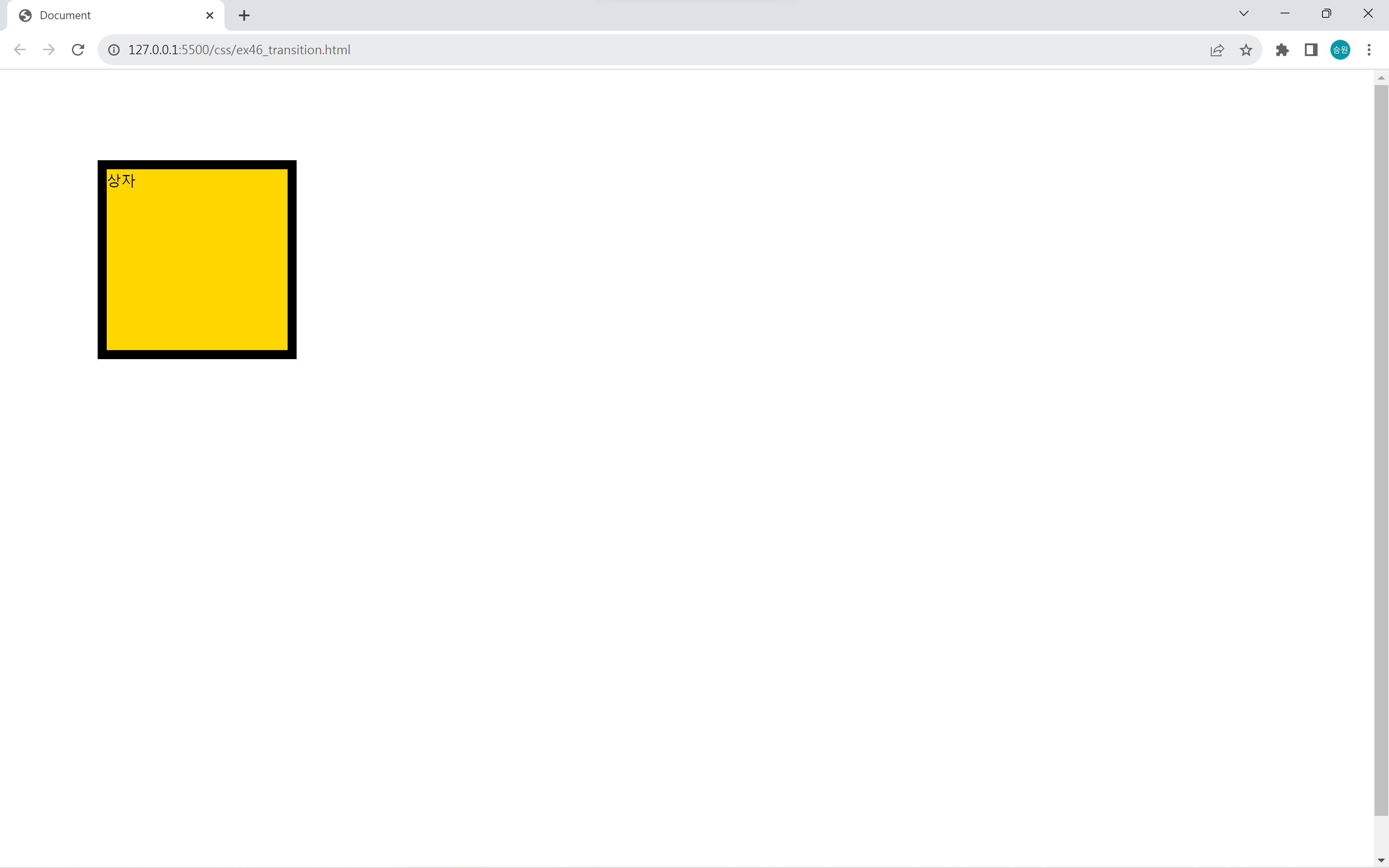
현재는 정적으로 밖에 볼 수 없지만, transition을 적용하면 200에서 즉시 600이 되는 게 아니라 200에서 600이 될 때까지 변화되는 과정을 볼 수 있다.
property는 변화를 적용시킬 요소의 속성을 작성하며, duration은 ms단위(밀리초) 와 s단위(초)를 사용하여 변화 지속 시간을 작성한다.
86400초
86400s가 하루이다. duration을 86400s로 두면 하루 사이에 변화한다.🌌
duration(변화 지속 시간)을 빠르게 할수록 애니메이션이 뚝뚝 끊어지는 느낌이 들 수 있다. 따라서 적절한 속도감을 주는 것이 중요하다.
수치를 갖는 속성
#box {
    border: 10px solid black;
    width: 200px;
    height: 200px;
    background-color: gold;
    margin: 100px;
    transition-property: width, height, background-color;
    transition-duration: 1s;
}

body:hover #box {
    width: 600px;
    height: 600px;
    background-color: tomato;
}
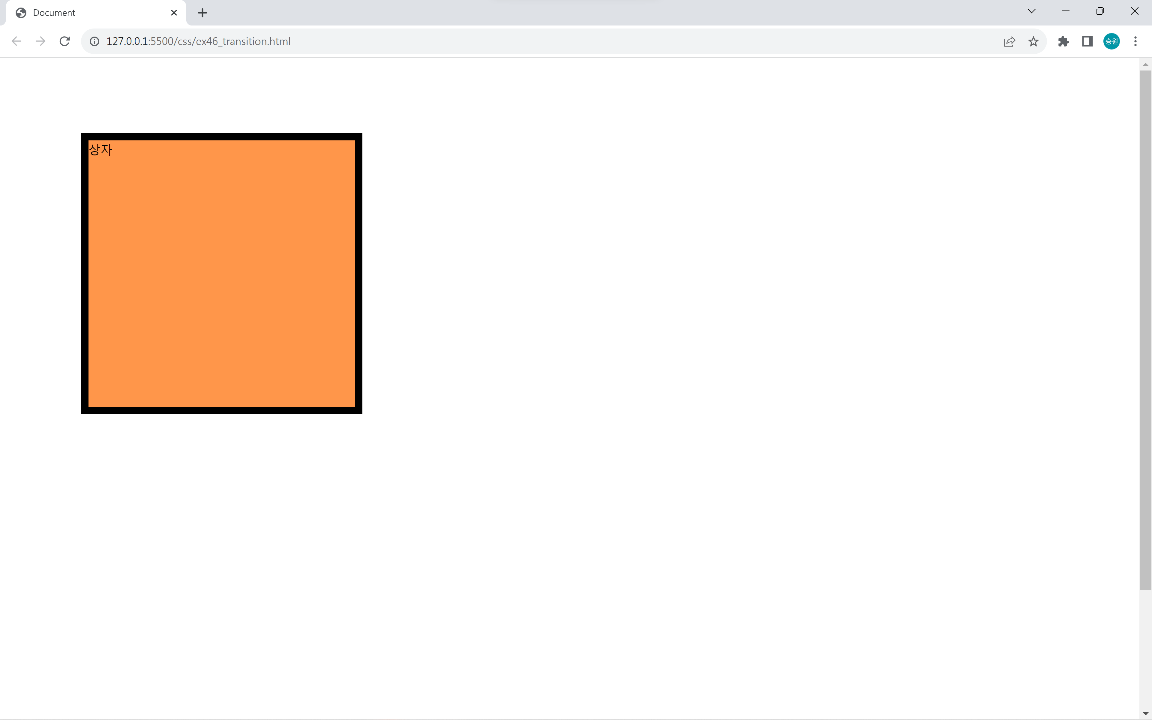
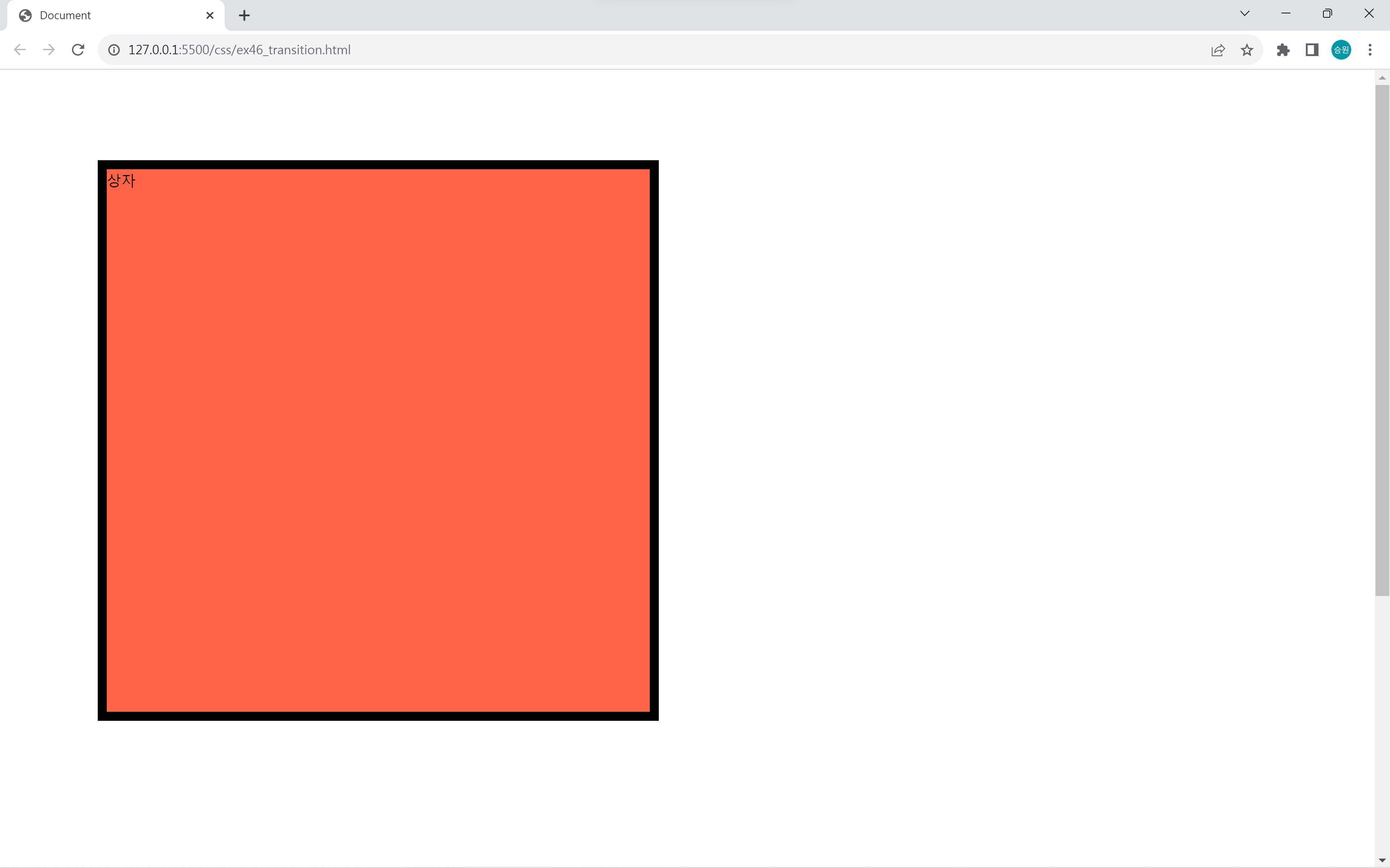
상자의 background-color가 gold에서 tomato로 변화하는 과정에 주황색이 되면서 자연스럽게 색이 변화하는 것을 볼 수 있다.
이처럼 중간 단계를 보여주기 때문에 transition은 수치를 갖는 속성에만 적용할 수 있으며, 폰트와 같이 수치가 없는 속성에는 적용할 수 없다.
property: all
transition-property: all;property 속성을 와일드카드(all)로 하면 width, height 등등을 지정해 주지 않아도 된다.
그러나 transition을 부여하기 원하지 않는 속성이 있을 수 있으므로 와일드카드 사용 시 주의가 필요하다.
transition의 활용
#box {
    border: 10px solid black;
    width: 200px;
    height: 200px;
    background-color: gold;
    margin: 100px;
    transition-property: all;
    transition-duration: 1.2s;
    overflow: hidden;
}

body:hover #box {
    width: 600px;
    height: 600px;
    background-color: tomato;
    font-size: 10rem;
    opacity: 0.9;
    border-radius: 10%;
    box-shadow: 5px 5px 10px #555;
    margin-left: 300px;
    border-width: 20px;
    transform: translate(10px, 10px);
    transform: rotate(360deg);
}
transition에 다양한 속성을 부여할 수 있다.
위 상자에 부여한 속성으로는 너비(width), 높이(height), 색(background-color), 글자 크기(font-size), 투명도(opacity), 둥글기(border-radius), 그림자(box-shadow), 왼쪽 마진(margin-left), 외곽선 두께(border-width), 위치(translate), 회전(rotate)이 있다.
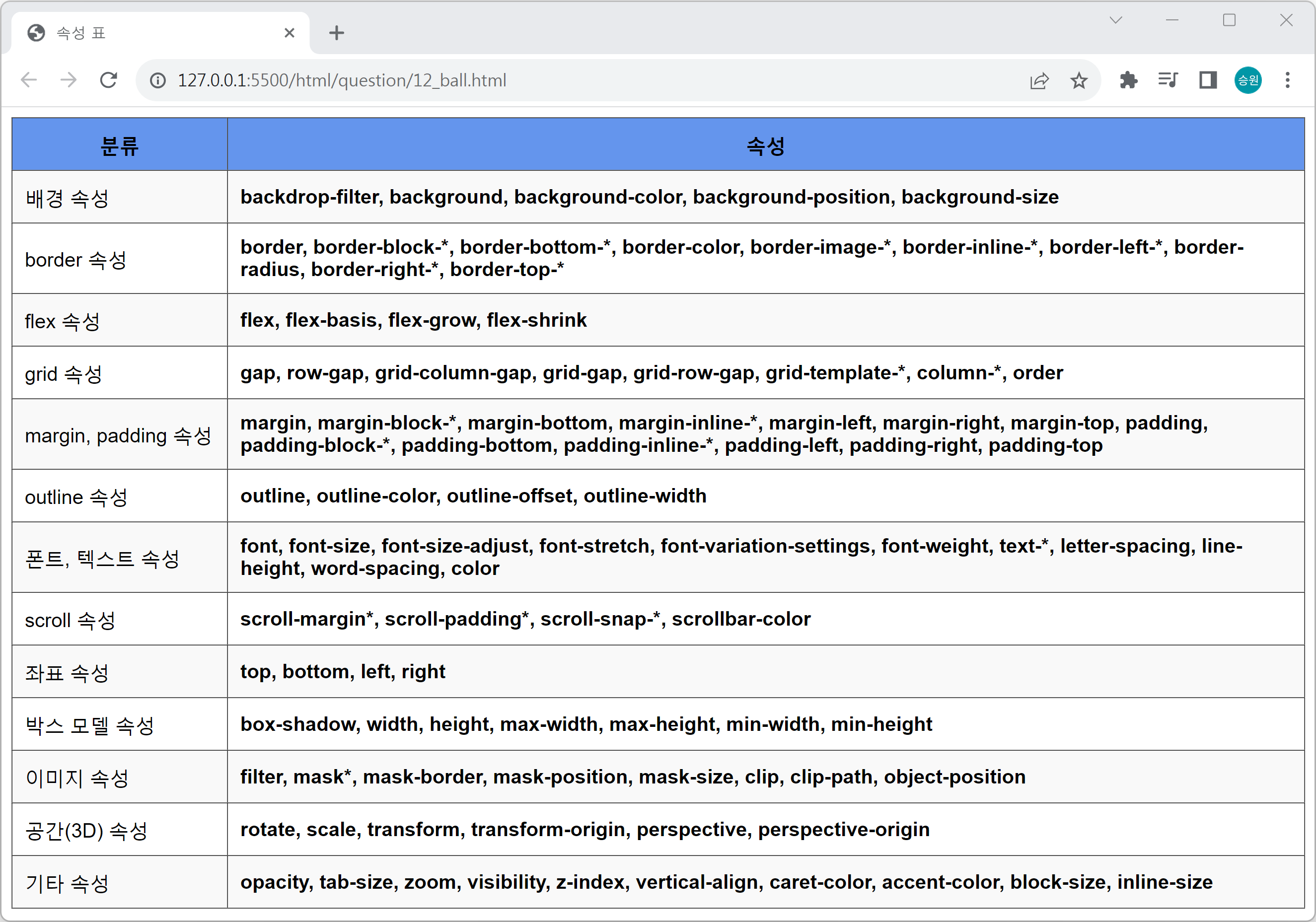
이외에도 적용 가능한 속성들이 굉장히 많다. 아래의 속성 표를 참고하도록 하자.
속성 표
delay
<body>
    <div id="list">
        <!-- div#box$.box*5 -->
        <div id="box1" class="box">linear</div>
        <div id="box2" class="box">ease(default)</div>
        <div id="box3" class="box">ease-in</div>
        <div id="box4" class="box">ease-out</div>
        <div id="box5" class="box">ease-in-out</div>
    </div>
</body>
#list {
border: 1px solid black;
width: 1200px;
}
#list .box {
width: 100px;
height: 50px;
margin: 15px 0;
transition-property: margin-left;
transition-duration: 5s;
}
#box1 {
background-color: tomato;
transition-delay: 0s;
}
#box2 {
background-color: orange;
transition-delay: 0.5s;
}
#box3 {
background-color: gold;
transition-delay: 1.5s;
}
#box4 {
background-color: yellowgreen;
transition-delay: 2s;
}
#box5 {
background-color: cornflowerblue;
transition-delay: 2.5s;
}
#list:hover .box {
margin-left: 1100px;
}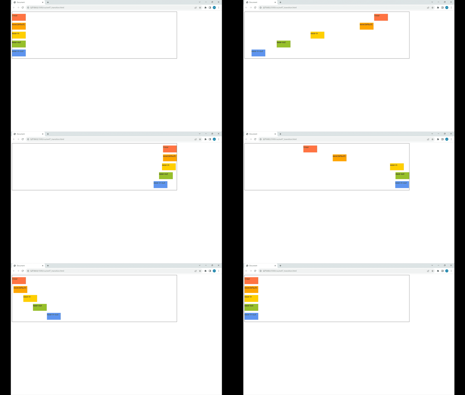
delay는 동작을 바로 시작하는 게 아니라 지정한 만큼 나중에 시작한다.
timing-function
#list {
    border: 1px solid black;
    width: 1200px;
}
#list .box {
    width: 100px;
    height: 50px;
    margin: 15px 0;
    transition-property: margin-left;
    transition-duration: 5s;
}
#box1 {
    background-color: tomato;
    transition-timing-function: linear;
}
#box2 {
    background-color: orange;
    transition-timing-function: ease(default);
}
#box3 {
    background-color: gold;
    transition-timing-function: ease-in;
}
#box4 {
    background-color: yellowgreen;
    transition-timing-function: ease-out;
}
#box5 {
    background-color: cornflowerblue;
    transition-timing-function: ease-in-out;
}

#list:hover .box {
    margin-left: 1100px;
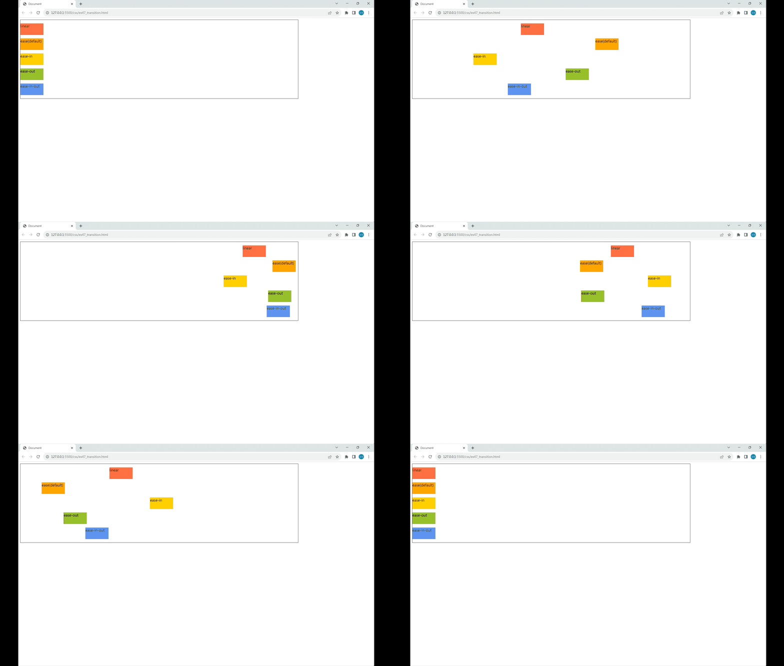
}
- linear
- ease(default)
- ease-in
- ease-out
- ease-in-out
https://cubic-bezier.com/#.17,.67,.83,.67
cubic-bezier.com
cubic-bezier.com
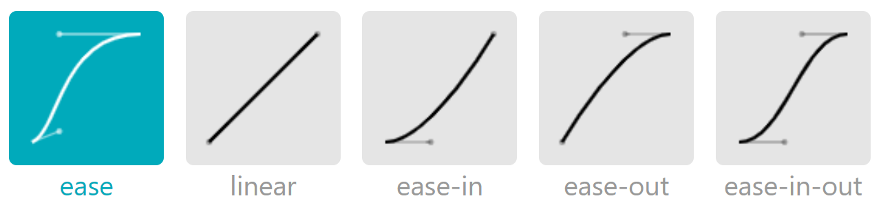
timing-function은 등속과 관련이 있다.
모든 속성의 출발하는 시점과 도착하는 시점은 동일하지만, 속성에 따라서 출발할 때의 속도와 도착할 때의 속도에 차이가 있다.